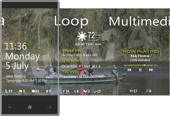
It’s all about the little things. The little details that add up to make the big picture all that much grander. When it comes to a smartphone there are so many different little things, so many gears in the whole machine that have to come together to make the device great, worthwhile, and eye-catching for the target audience. When we talk about a smartphone, we talk about all sorts of different things, and that’s the way it should be. There’s never going to be just one single feature that sells the whole thing – it’s about the way that they come together. But, it’s those single features that we talk about so much, and how they compare to the competition. So what about the lock screen? After all, it’s a point of entry for your phone, and as manufacturers are showing us more and more these days, it’s obviously a pretty important aspect of our everyday lives, at least when it comes to our phones.
Way back in the day when we turned on our phones, they just went right into the details. We went to the home screen, and we were presented with options to get to the things we needed to get to, like contacts, missed phone calls or waiting messages. Over the years, and especially with the release of Android, it’s been getting better. The lock screen is now an integral part of the whole equation. They aren’t there just to make sure that your phone doesn’t do crazy things while it’s in your pocket anymore. No, now it’s a bastion of information, telling you all the important things even before you get into the phone proper.
And then there are the lock screens that actually let you access specific activities without having to completely unlock the phone. We’ve seen in (some versions of) Android and HP’s webOS how accessing missed calls, voicemails, messages and emails is as easy as touching that specific icon. Other names that could be thrown into the lock screen discussion are Apple and Research In Motion, as well as Windows Phone. They all offer up some sort of notification on the lock screen, but the functionality is quite different.
At least, it is right now for iOS. Here soon, as soon as Apple releases iOS 5 for the rest of the world, Apple will no longer be part of the “limited” lock screen discussion. After all, their lock screen in iOS 5 now shows plenty of information, broken down into specific sections, and lets you swipe on a message, email or calendar event to get to what you want. Actually, Apple has made sure that developers for all the applications in the App Store can make use of Apple’s Notification Center and provide notifications on that lock screen, so that’s a pretty interesting and in-depth feature.
But then we’ve got Research In Motion’s lock screen on BlackBerry devices, and Microsoft’s lock screen on Windows Phone handsets. In comparison to Apple, Google and HP, these are pretty minimal in their features. For both of these mobile operating systems, you just get an icon and a number, telling you how many things of a particular feature you’ve missed. I say limited because that’s all there is, but that’s not a bad thing. In fact, the way that RIM and Microsoft handle those notifications in such a minimalist fashion actually works for those particular operating systems, and not being able to launch into the email application from the lock screen on Windows Phone isn’t necessarily a bad thing. After all, just a quick swipe up and you’ve got the Live Tile right there, ready to be touched and accessed.
But the lock screen also has to be interesting to look at. Which is why, thankfully, custom wallpapers make that a non-issue. You can make your phone look like whatever you want, so if your lock screen isn’t all that attractive to look at, you’ve only got yourself to blame.
So when it comes to a lock screen, what do you look for? More information or the ability to access specific elements of the phone, like missed calls and texts, right from that initial display? Or are you all about the minimalist approach? Let me know in the comments below.