Being a long-time Android, I have come to accept that few of the applications are, well … lookers. After years of sifting through Google Play and checking out new applications, my typical "form over function" mentality has gone to the wayside.
With Android, it has practically always been a bit backwards. There's no question, it was definitely function over form.
With Ice Cream Sandwich in late 2011, that slowly started to change. With the trained hand of Matias Duarte at the helm, Ice Cream Sandwich was the much-needed interface overhaul Android needed to begin attracting users a little more in tune with design language and beautiful interfaces. It was the update that visually indicated that Android was finally maturing.
Shortly after Android 4.0, Google released the Android design guidelines in hopes that third-party developers would also reflect the maturing interface. It was meant to encourage said developers to work towards a more cohesive and consistent experience throughout the entire system, including applications from the Play Store.
Almost immediately, larger developers from Google Play started publishing updates with new interfaces. They began to adopt the unified holo theme and made Android look and feel like everyone was on the same page. Finally, Android started to feel like a more distinguished platform with a thriving ecosystem, not just another operating system with pot-luck for an application catalog.
Then something happened. Applications started to lose personality and everything started to feel somewhat … uninspired. It was the product of developers taking Google's design suggestions to the extreme without applying their own personal touch.
Fast forward nine months, and a few gems – applications that adhere to Android design guidelines while still invoking personality and creativity – started to appear. Some developers that first updated their applications soon after the guidelines were released are refreshing their own interfaces once again. And new applications are arriving and taking the Play Store by storm.
It was this past weekend when I finally realized this. Carbon for Twitter, a long-awaited Twitter client for Android users, finally landed in the Play Store. Immediately after installing, I opened the application and started sliding panes around and playing with the animations. I'm not huge on animations – I never have been. But there is one thing about Carbon that shouldn't go unsaid: it's beautiful. In fact, it's one of the best looking Android apps … ever.
This made me think back to all the gorgeous Android applications that I've installed or used recently. Falcon Pro, for example, hit the Play Store last month and quickly became regarded as one of the best Twitter clients Android users have every seen. Many – myself included – called it the Tweetbot of Android, which certainly says a lot.

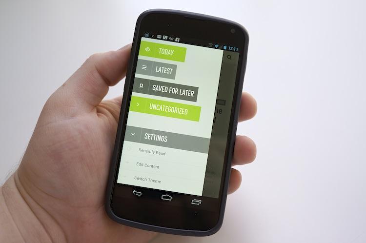
Feedly, one of my favorite Google Reader clients, underwent a pretty major interface refresh in September 2012. Not only did it incorporate the Android design language, but it brought a whole new level of creativity along with it. Sliding panels, gorgeous typography and just an absolutely beautiful design.
Another Google Reader client hit the Play Store recently, too. Press. It, too, adheres to the Android design language, but it incorporates gesture navigation, gorgeous visuals and easily the best RSS experience I have ever had on Android. Reeder is regarded as the gold standard for Google Reader on iOS. Press is Android's Reeder – not only because they look and feel a lot a like, but because Press seriously ups the ante in design and quality.
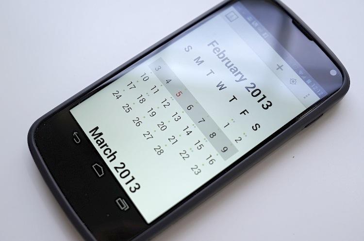
Agenda Calendar, one of the most popular calendar applications on iOS, finally made its way over to Android, as well. It's a minimalistic calendar application that focuses heavily on typography and gestures. Albeit less strictly, Agenda Calendar also utilizes Android design language.
These are only some of the rapidly increasing number of high quality Android apps. Path, Carbon for Twitter, Eventbrite, Eye In Sky Weather, Camera ZOOM FX, BaconReader (reddit), Pinterest, Pocket and many more are helping Android look and feel a lot more like a quality platform.
Many of Google's own applications – ones that we thought may have been forgotten – are beginning to look a lot more mature and pretty, such as Google Translate, Google Voice, Google Search (Google Now), Google Wallet and some others. Google+ looks better with each and every update.
Have you noticed that there are far more great looking applications for Android now than there were just a few months ago, readers? Was this bound to happen in due time? Or was this a direct reaction to Google's Android design guidelines? What do you think is the best looking Android application available right now?