Until recently, the stock Android interface was widely viewed as beta-like, rough around the edges and dated. Over the course of three years (2008 to 2011), the interface had been through three major overhauls, yet it still needed a touch of a polish to really set it off.
As a whole, it wasn't cohesive – colors didn't match, interface options were inconsistent and had a very "engineered" feel. Android green accents were added to the notification bar and various icons, but select an icon or a menu item and you would get a flash of orange. And the keyboard accents were the very same orange. The interface design, while better with each update than the one before, was omnidirectional and bi-polar.

Who remembers those horrendous legacy tabbed interfaces?
This lack of direction and unified design trickled down into third party applications from what was then known as Android Market (now Google Play Store). Thousands upon thousands of applications filled the digital store and were, for a lack of better words, downright ugly.

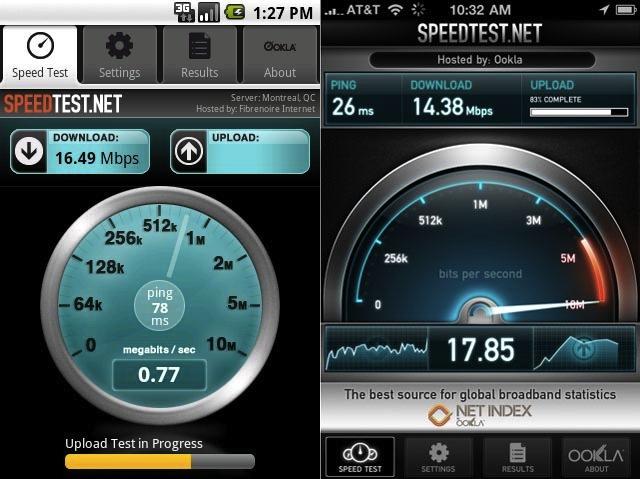
Back in April of last year, Evan provided a side by side comparison to show the differences in the attention to detail and extra effort in design that developers gave iOS applications versus their Android counterparts. The application in Evan's example was the SpeedTest.net app. On iOS, this application has a textured background, smooth, rounded corners and gradients that give the application a high quality feel. The Android version, however, came with a drab, gray and white tabbed interface with very simple graphics. Form didn't hinder function, but in no way were Android users clocking their download speeds in style. SpeedTest.net has since updated the Android application's interface to match the iOS version. But the former version is a prime example of the difference in quality and design one could find in just about any Android application versus its iOS foe.
And the "form versus function" argument is a valid one. Why should form – in this case, design – matter if the application functions properly? In many instances, Android applications have a bit more freedom and functionality than iOS applications. But no one has ever complained about software that looks nice and performs well.
Enter Matias Duarte and Android Design.
When Google picked up Matias Duarte, the man behind the curtain during the creation of the webOS interface design and user experience, they did so to improve and mature the Android platform's interface. The first example of Duarte's touch on Android can be found as far back as Honeycomb. But it's pretty well-known that Honeycomb was not a finished product but a stepping stone. Ice Cream Sandwich is his true pride and joy, an interface that works wonders for giving direction and meaning to the Android interface. It's polished, beautiful, clean and simple. It's not perfect, but it's leaps and bounds better than any Android iteration before it.
What's more important than that, however, is what Duarte and his team have done to make the Android SDK design-friendly.
You may recall a few months back when Google announced that all Android 4.0 devices would have to support the "Holo" theme in order to have access to Android Market Google Play. This was meant to separate manufacturers' customized interfaces from the stock interface and speed up the software update process. But, more importantly, it's to help developers create applications that retain a consistent look on all devices.
Just a few days later, Google introduced Android Design, which is a set of instructions, guidelines and tutorials that aim to help developers create more aesthetically pleasing applications for Android and keep that same consistent Holo theme.

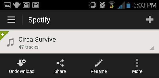
Since January, there have been quite a few applications to adopt the new Android look, leaving their legacy Android interfaces behind. Spotify, for instance, announced a beta build of their new Android application, which consistently uses the Holo theme throughout. The application before used the framework from application drawer in Android 1.0. Needless to say, it was atrocious and dated. It was the equivalent of running Windows 8 and opening a program that uses Windows 98 framework. While completely functional, it was an eyesore. The beta, on the other hand, is gorgeous, clean and fresh.
Another one of my favorite applications that recently updated (just last week, actually) is Plume, a popular Twitter client. While their interface overhaul was a bit more subtle, the application now uses the updated tabbed interface, much like the stock ICS application drawer. Plume isn't the most gorgeous application I've ever seen, but it's a testament to what Matias Duarte and the rest of the Android team have done to fix one of Android's biggest problems.

But there is one application in particular that is a perfect example of just how beautiful an Android application can be. On Tuesday, Read it Later announced their new brand, Pocket, and a totally revamped application. Best of all, it is no longer a paid application – it's totally free. Using the Holo dropdown menus for sorting and filtering, and action overflow, the Pocket interface is extremely clean and intuitive.
Initially, I scoffed at the new name and look. I've been a Read it Later user for ages and couldn't stand the thought of having to get used to an entirely different interface. I've been using Pocket since Tuesday, and I must admit, I was wrong. I love it. And I love the new app.
What's truly comical about it, however, is how Pocket designed their new iOS app. Usually, iOS applications get ported over to Android without dropping the iOS elements. Instagram for Android is a great example of that. But Pocket is the other way around. Elements of the Holo theme have found their way into the iOS application. Irony at its best.
It's great to finally see the affects of Android Design and what Duarte's penchant for beautifully simplistic design has done for the few applications that have adopted the new Holo theme. And I'm especially happy to see Android, as a whole (OS and applications alike), graduating from its beta-like state. I am also excited to see what other applications adopt Holo and how they can throw their own spin on it.