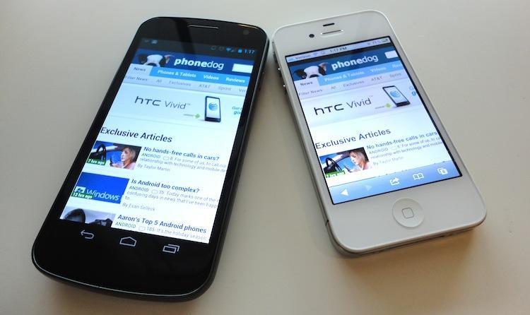
The constant fighting and bickering that goes on between mobile platforms – both by their creators, partner manufacturers and even die-hard fanboys – is easily one of the most over-exacerbated fights in history. Not a single aspect of the phones, from hardware design to quality of content in their respective application stores (even lock screens) goes unmentioned in the pitting of mobile platforms against one another. Time and time again, one person after another tries to settle the score once and for all: which operating system is the best?
Of course, answering that question is impossible, but it doesn't keep people from trying.
Of all the capabilities of a smartphone, one of the most important aspects is the browser. It's what makes your smartphone more ... well, smart and PC-like. Instead of the mobile browsers of yesteryear, they are now capable of desktop-like rendering and are faster and better in almost every way. In normal fashion though, HTML5 framework development house, Sencha, put both Android and iOS to the test to find which has the best browser.
Their findings? From a developer's standpoint, iOS still edges out the browser featured in Android 4.0. Put through the Acid3 test, both scored perfectly with some negligible rendering artifacts. They then put them through the SunSpider test which as Greg Kumparak of TechCrunch explains, "SunSpider is a series of tests built to push Javascript to its limit, testing a device’s performance on heavy-duty tasks that are currently (or likely to soon be) commonplace." The iPad 2, PlayBook, Kindle Fire and Galaxy Nexus scored mostly the same throughout the test. And lastly, they put the two platforms through an HTML5 capabilities test where iOS clearly took the cake.
(For the full report from Sencha, check out their website here.)
For a developer, Safari on iOS should offer better performance. The differences in performance between the browser in iOS or Android for the average consumer, however, are much harder to put to the test. Every person has different preferences and needs in a mobile browser, thus what may be perfect for you might not be for me.
So which do I find to be the best?
For me, there is a clear-cut winner, and the most important feature doesn't even boil down to software. Most Android phones come with a much larger display than the iPhone. Simply put, I have to scroll, pan and zoom less. Browsing on the Galaxy Nexus' 4.65-inch 720p display has been a dream.
But say we're talking tablets and size isn't an issue. Then what? Android still takes the cake. Android has spoiled me with text-wrapping. Zooming in on some text and having to pan left and right to read everything in a line is probably one of the most nerve-wracking things about a mobile browser. I would say it's a necessary evil that goes hand in hand with having a pocket-sized computer. But with Android, when you zoom in on text, (most of the time) the text adjusts to fit the display. Other features like sharing a Web site with literally any application or being able to search for words within a specific page make the Android browser irreplaceable.
Another feature that has been added to the stock browser in Ice Cream Sandwich is the ability to request the desktop site. There is nothing I hate more in a mobile web browser than a mobile site (that is, if you can even tell it's a mobile site). Most Web pages that default to mobile sites offer a link at the bottom of the page that allows you to switch to the full site. However, there are numerous sites that I visit often where the "Full Site" link at the bottom of the page does absolutely nothing. Some don't even have a link to revert to the desktop view. In Ice Cream Sandwich, simply open Settings and check "Request desktop site." I have only ran into on site that it didn't work on. Having this option in the settings menu, always in the same exact spot, versus having to track down the link to revert on the site (if they even have the link) is fantastic and makes my life easier.

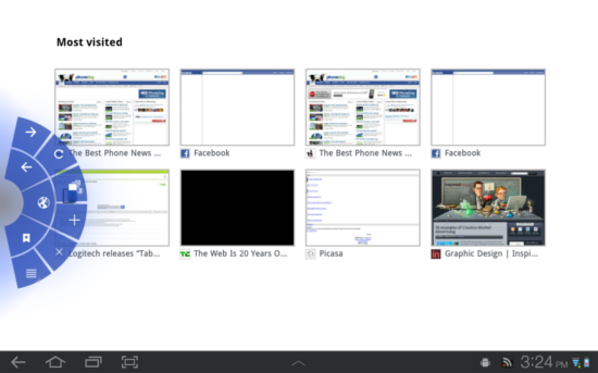
(A screen shot of Quick controls on the Galaxy Tab 10.1 with TouchWiz UX.)
Lastly, quick controls and full screen. The iOS browser has a navigation bar at the bottom of the display at all times with back, forward, share, bookmarks and tabs buttons. In Android 3.0 and up, there is a sub-menu in the Settings called Labs. In different versions of Android, Labs has different options. In 4.0, there are two: Quick controls and Fullscreen. Both of these options ensure you can squeeze every last pixel out of your display when browsing. Instead of displaying the address bar at the top of the page at all times, you can activate it by a quick swipe of the finger from the side edges in, which gives you all of your browser controls in a radial pattern. It's quick, easy and removes unnecessary obstructions from the already-small display.
The winner for me is clear. It doesn't come down to rendering, speed, checkerboarding (or lack thereof) or how smooth pinch zooming is. It's about being packed to the brim with features and making the browsing experience from a small device that much easier to cope with. You guys, on the other hand, may disagree. Tell me, which mobile platform has the best browser? You're not limited to just Android or iOS; other platforms have great browsers, too. Take our poll and sound off in the comments below!