When I first learned that Samsung would be adding their increasingly popular custom interface to Honeycomb, I cringed at the thought. I'm not particularly a fan of TouchWiz to begin with (or any custom UI, for that matter), but I felt that Honeycomb was polished enough, as is. I love the black with neon accents – which has always reminded me of Tron – and the overall look and feel of stock Honeycomb. But once I had some eyes-on time with a TouchWiz UX video, that all changed and I couldn't wait to get my hands on the software.
The Galaxy Tab 10.1's TouchWiz update hit the masses on the 5th and was available for download OTA (roughly 180MB file). I've been searching it from inside out, looking for all of the ups and downs of Samsung's UI overhaul. Does Honeycomb need a custom UI and is TouchWiz UX a worthy update for being the first to make major changes to the Honeycomb interface? Here is my take.

The TouchWiz UX update (Android 3.1, not 3.2) brings several changes to stock Honeycomb, many of them being in the form of applications or services. Samsung's press release for the update lists Amazon Kindle, Amazon MP3 and Words With Friends as the only pre-installed applications. If you count Samsung's apps and services, however, you will also notice Music Hub, Music player, Social Hub, Pen memo, Memo, eBook, Music Player, My files, Quickoffice, Photo editor and Samsung Apps.
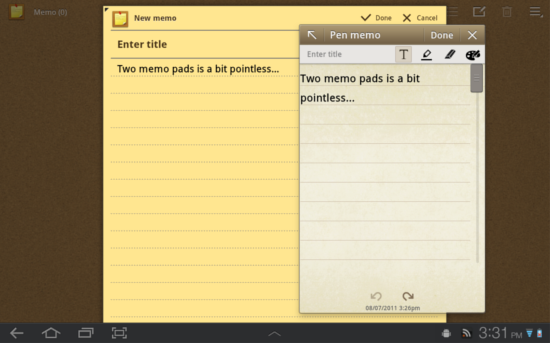
As you may have already noticed, several of these applications are a bit redundant, especially when you consider the native applications included in Honeycomb, too. For instance, Samsung includes two memo applications: Memo and Pen memo. Pen memo is also featured in the Mini Mode Tray, so I originally figured it would only be a mini app. Instead, they're both fully featured memo applications that, in full size, look almost identical. I hate to sound nitpicky, but I despise redundancy, particularly when it can't be avoided – or in this case, uninstalled.
With applications like eBook, I'm sure Samsung will be hearing from Apple again as it looks like a blatant rip-off, down to the page turn animations and book shelf layout.

If you have used the original Galaxy Tab, all of these widgets will look very familiar. In what Samsung is calling the Live Panel, you will find Accuweather, Agenda, AP Mobile, Yahoo! Finance, Bookmark, Program monitor, Gallery and two clock widgets. Samsung describes the Live Panel as a “Magazine-like widget view for immediate access to weather, social updates, email, news, photo gallery, all on the home screen.” I found it a little confusing that they named all of their widgets the “Live Panel,” and found myself looking for one, full-screen widget to no avail. It would have made more sense calling them "Live Panel Widgets" or something to the effect. Nonetheless, they are decent looking widgets. If you don't want them, they're easily ignored.
Samsung's varying “Hubs” are pretty well-known now in the Galaxy line. This update brings Social Hub, Media Hub and Media Hub to your Galaxy Tab, in their tablet-optimized forms. You know the drill … Rent movies, buy music and aggregate your “email, instant messaging, contacts, calendar and social network connections” into a single stream. Again, these are nice to have, though I will probably never use any of them. They're just as easily used as they are ignored.

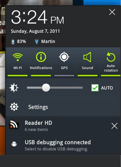
One of the larger changes to Honeycomb in this update is within the notifications – or as Samsung is calling it, the Quick Panel. The notifications in Honeycomb have always been one of the highlights of the platform. But in stock form, the same quick panel was a completely different page that was accessed by an unintuitive tap on a disguised button. Now all of your toggle settings (GPS, Sound, Wi-Fi, Notifications, Auto rotation, etc.) are available alongside your notifications. Samsung did feel the need to bump the font to an unnecessarily large size (which I find annoying), but overall the changes are very pleasing.
Another notable change within the System Bar that Samsung made are the soft buttons and color scheme. Back, Home and Task Switching look slightly different and are accompanied by a soft screenshot button. A very nice touch, if I may say so myself. And the color scheme is no longer black with neon. It's a dark gray with a lighter gray, accompanied by cyan and neon green accents.

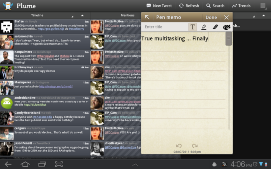
This is easily the best feature of the update. As you will notice, the System Bar has yet another addition: an up arrow in the middle. By either tapping or swiping from the edge up, a dock of six applications (Task manager, Calendar, World Clock, Pen memo, Calculator, Music player) will appear. These “mini apps” can be launched over running applications without stopping them. In other words, you can use both applications at the same time (scroll in the browser and type a note, etc.). Little else needs to be said about these mini applications except the dock is slow to appear sometimes and I wish there were a few more to choose from. Nonetheless, they are great and I expect more companies to jump on the "mini app" bandwagon for true multitasking.

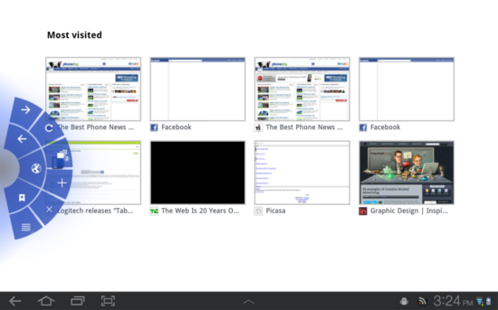
Aside from a few color changes, the browser has remained mostly unchanged as well. But I found it worth noting that hidden within the Settings for the Browser is a new Labs tab. These are some unproven features that are rather unique and give it a more Chrome-like feel. You can enable Google Instant, and much like the “New Tab” page in Chrome, your homepage can be set to view your most visited pages. But I found Quick controls to be the coolest feature of all. By enabling Quick controls, the browser goes full-screen (no address bar or quick access to tabs). To access your native controls, you have to swipe your thumb from the left or right edge on to the screen and the Quick controls dock appears. It's quite the novel idea and takes some getting used to, but after a few hours of using it, I couldn't go back.
Finally, Samsung's keyboard has not changed a lot, but some of the features surrounding it have. When a text field is selected, a tiny keyboard icon appears beside your notifications. If you tap this icon, a keyboard switcher will appear. Considering stock Honeycomb does not offer a universal way (one that works with every keyboard) to switch keyboards without navigating to the Settings application, this is a very nice addition.

Samsung's keyboard is mediocre at best and the text prediction is annoying, both because it rarely predicts the right word and because predictions disappear and reappear between each word. Also, it's rather laggy in use. Samsung did, however, include Swype in the update. Initially, I found it to be a bit absurd, Swyping on a 10-inch display – even in portrait, your finger has to travel too far for it to speed anything up. But then I noticed there is a dedicated button that shrinks the on-screen keyboard to about one-fourth the size, making it much easier to use.
Also, if you can deal with the bugs and lag of the Samsung keyboard, you will have access to one more unique feature: a clipboard. Unlike stock Android that only allows you copy one thing at a time, all screenshots and copied text are saved to the clipboard. I found it extremely useful, but I cannot stand the Samsung keyboard. I found it just as effective to use the keyboard switcher and to use an alternative keyboard for typing and the Samsung keyboard solely for the Clipboard.
Being an Android purist and generally only liking my Android in stock flavor, I was a bit skeptical of this update. But after spending two days using it, I love it. Performance has been spectacular and battery life seems to be slightly better. The transitions and flashy animations can be a bit much and really show how they can slow things down in the Mini Mode Tray, but overall my experience with TouchWiz UX has been spectacular.
I don't feel everyone will be a fan of the update, seeing as it adds quite a bit of bloat and makes some things look a bit cartoonish. That said, I feel Google should take some notes from some of the additions Samsung made: toggles with notifications, mini apps, full-screen browser, screenshot soft key and a keyboard switcher. The update smooths many of the rough edges that I wasn't really aware of in Honeycomb and makes it a truly polished and well-rounded platform.