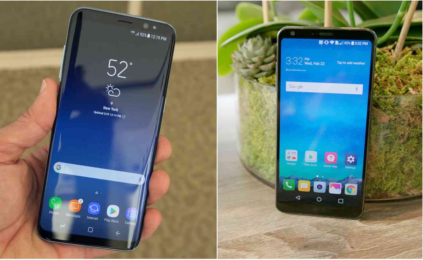
Slim bezels. Bezel-less. Whatever you want to call the latest trend in smartphones this year, it has a lot to do with getting rid of those pesky bezels. Both LG and Samsung have already placed a heavy focus on this aspect of their newest flagships, with more expected to follow over the course of the year. But while both companies ultimately share the same objective – increasing screen size without increasing the phone’s physical size by much – they both went about it in very different ways.
I find that I am easily convinced that smaller bezels are an olive branch of sorts for somebody like me. For years, I’ve been tirelessly fighting a losing battle against big smartphones. I thought my cause had a shot when Samsung introduced the original Galaxy Note back in 2011. Very few people thought that a phone with a screen as large as the Note’s, which measured in with a whopping (at the time) 5.3-inch display, would ever succeed past one generation.
Welp. Hindsight is 20/20.
The Note was just the beginning. Displays are now expected to be big, to the point where it isn’t uncommon for people to refer to a smartphone with a 5-inch display as “mini”. Mini! Meanwhile, while phone screens and their relative sizes continued to increase, my relatively smallish hands stayed the same. This trend did not bode well for me. Yes, I enjoy having a larger screen. No, I do not enjoy the amount of times my phone slips out of my hand because I had an insufficient grip on it, and as somebody who frequently reads the news just before bed, I’ve noticed a surge in the amount of times that I drop my phone on my face. Truly, I have no business owning a phone with a 5.5-inch display.
But perhaps now I do, considering that smaller bezels and taller devices should theoretically give a better grip on a smartphone with a larger screen. Yet, despite my enthusiasm for smartphones with smaller bezels (for the sake of compromise, as I realize small smartphones likely won’t make a comeback anytime soon) I still don’t have much enthusiasm for edged displays.
The LG G6 and the Samsung Galaxy S8 have different ways of slimming down their bezels. With the G6, there’s still some bezel there. Not much, but some. The S8, on the other hand, features the same sloped edges that are seen on the S6 and S7, which gives off the illusion that there aren’t any bezels at all. When not in use, it looks cool and futuristic. Beautiful, even. But when it’s in my hand, I find it… annoying. There’s the occasional finicky palm rejection, but mostly I just find that it’s visually impractical. My palms are always in the way, text is sometimes warped, and videos in landscape mode look warped as well. I also haven’t found the interactive edge panel to be of much use to me, either. Even the night clock isn’t that convenient. I just don’t like the sloped edges, and I’m not sure I ever will.
It’s a purely subjective opinion. There are people that absolutely love Samsung’s edged display. In my experience, though, I think having an edged display has only made me appreciate having some bezel a little more. Between the Galaxy S7 “flat” and the Galaxy S7 Edge, I much prefer the flat form factor, and it’s a shame that both Galaxy S8 devices have sloped edges. However, the G6 appears to be good alternative for those who feel that the edge displays are deal breakers.
It will be interesting to see what other smartphones will have down the line in regards to “curved” displays or “flat” ones – hopefully a healthy mix of both. For now, at least, there are a couple of good options to choose from no matter which type of “bezel-less” appeals most to you.