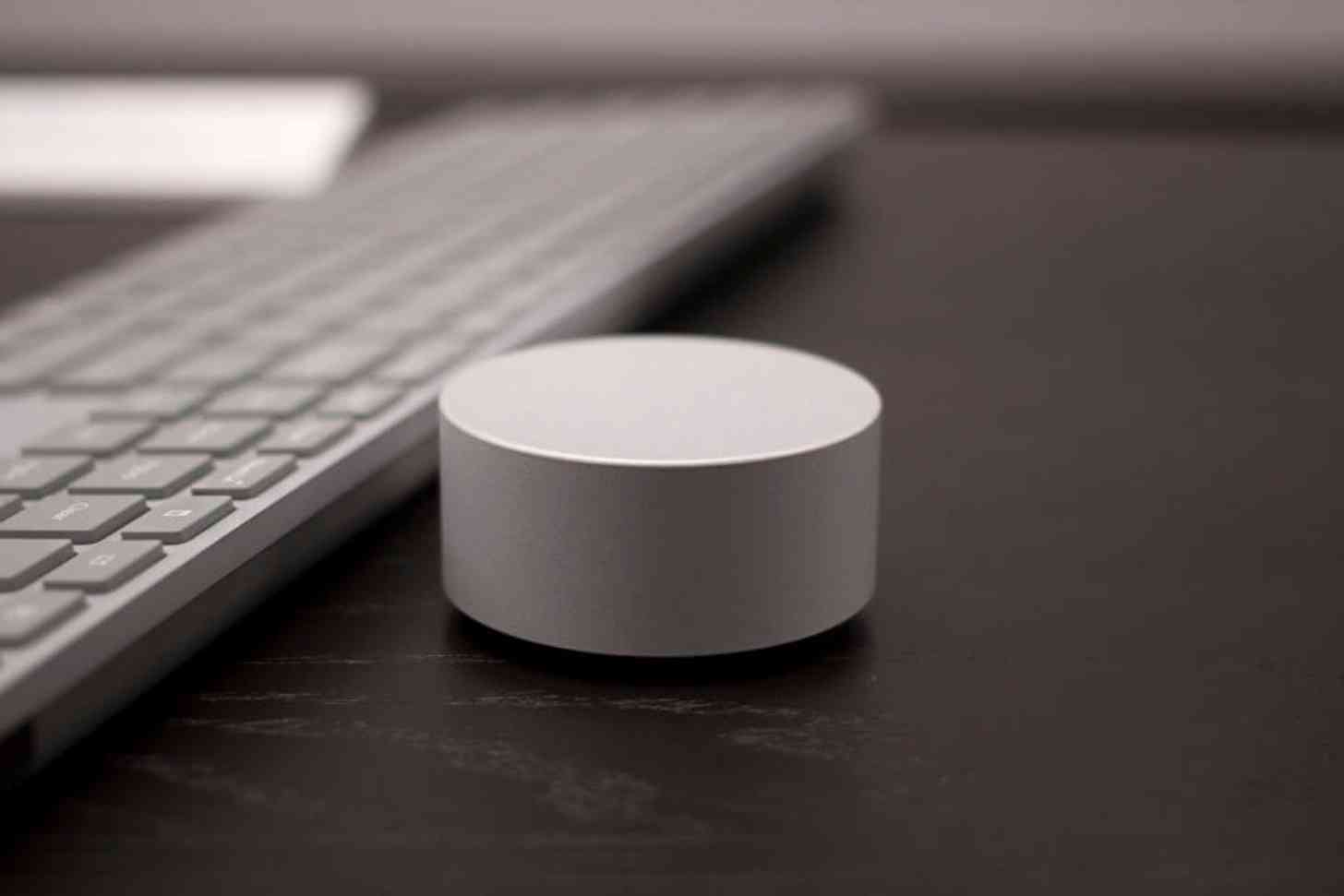
This week had nothing to do with smartphones and everything to do with computers, as both Microsoft and Apple had big events scheduled this week. With both events now over, it’s safe to properly reflect on everything that we’ve seen. For me, hands down the coolest thing to come from either event is the smallest and cheapest item: Microsoft’s Surface Dial.
Yesterday’s unveiling of the Microsoft Surface Studio was a pleasant surprise. The concept and design are simply remarkable, and if I had a cool $3,000 to drop or the artistic means to justify purchasing this device, I totally would. However, since I have neither, it would appear that I will simply just have to admire the Studio from afar.
Except for that isn’t entirely true as the Surface Dial, one of the highlighted accessories to accompany the announcement of the Studio, isn’t exclusive to the Studio at all. The Surface Dial is also compatible with the Microsoft Surface Pro 3, Surface Pro 4, and the Surface Book, which is excellent news for people who don’t necessarily have a need for all that the Studio offers. As somebody who piddles around with digital artwork as a hobby, this is good news for casual creatives like me.
The Surface Dial is an innovative approach to interacting with computers, allowing the wireless knob to seamlessly adjust an endless amount of aspects. As seen in the advertisement for the Studio, we can see that artists, in particular, will benefit from its functionality, as it allows for immersive switching between tools and color palettes without ever needing to lift the stylus from the screen.
But the Dial is useful for other purposes too, especially since Microsoft permits third-party support, which allows developers to create radial menus using the Dial specifically for their apps, so in theory, the Dial will be useful for more than just the creative audience.
The Dial’s design is simple but effective. With a “hockey puck” like design, there’s no partiality towards right or left-handed people, which is great. You can also use the Dial on the Studio or Surface’s screen, or you can use the physical device from a desk, which enables a digital version on the screen.
I’m also impressed with the Dial’s price. For something that appears to be so simple and innovative, I don’t know what I was expecting from the price – I think I originally pegged it as being around $200 but was pleasantly surprised to find that it’s only $99. It isn’t cheap by any means, but it’s more affordable than I would have thought it would be.
Between Microsoft’s and Apple’s announcements over the past couple of days, the Surface Dial is the device that sticks out to me as being the most impressive. I know that Apple fans are happy to finally have a new MacBook Pro, and the Touch Bar looks to be a useful and innovative addition in its own right. However, I have to say that the Dial, with its possibilities and compatibility with the Surface line in addition to the Studio, leaves me feeling inspired.
Readers, what are your thoughts on the Surface Dial? Do you think that the accessory has potential, or does it come off as a gimmick? Let us know your thoughts in the comments below!