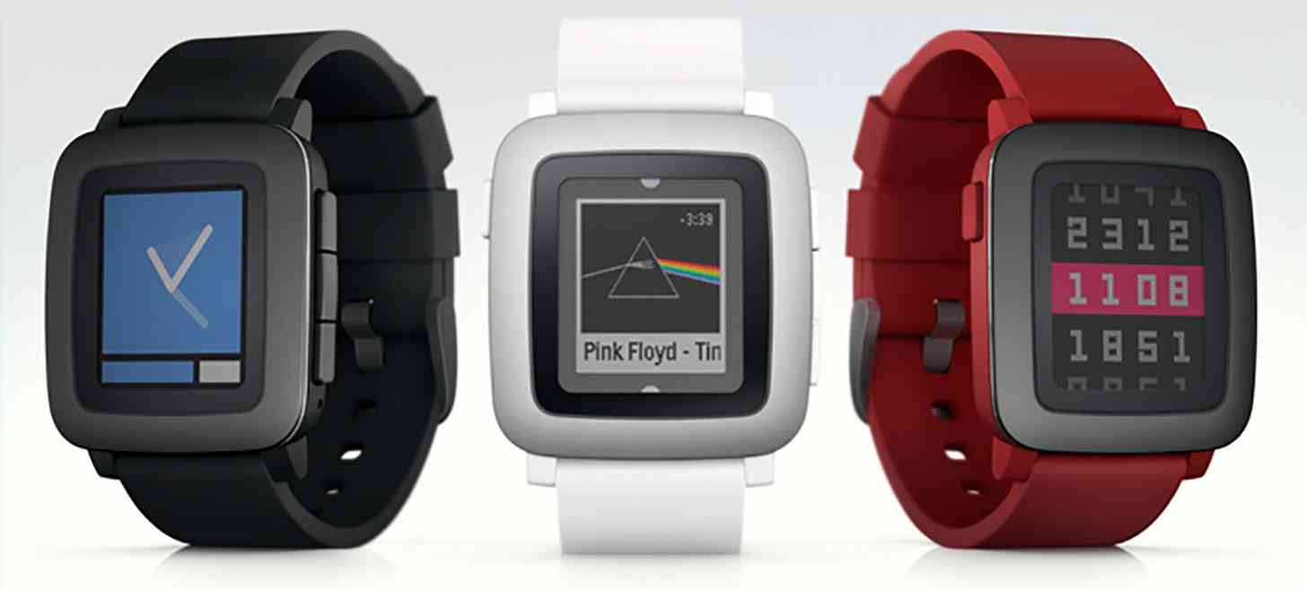
Here it is: the new Pebble smartwatch.
The Pebble Time is the new smartwatch from Pebble, the company that hit it big on Kickstarter with the original Pebble a couple of years ago. Just as expected, it’s got a new color e-paper display that’s always on. Pebble notes that since the Pebble Time’s display isn’t LCD or OLED, the device can achieve up to seven days of battery life on a single charge.
Another new feature of the Pebble Time is its microphone. You can use the mic to reply to incoming notifications or take voice notes. Pebble says that Android users can use voice to reply to most major Android apps, including SMS, Hangouts, Gmail, Facebook Messenger, WhatsApp, and “hundreds more.” However, iOS users can only use voice replies for Gmail notifications. Pebble says that it’s working to enable voice replies for additional apps.
The new Pebble Time itself is 20 percent thinner than the original Pebble, measuring 9.5mm thick. It’s got a curved body that’s water resistant and sports Gorilla Glass with a stainless steel bezel. Each unit comes with a silicone band, but any 22mm watch band will fit the Pebble Time. And Pebble says that it plans to release the 3D data that you’ll need to create straps, covers, and docks.
Additionally, Pebble Time has a “smart accessory port” that will let hardware developers create sensors and straps that connect directly to the smartwatch. Pebble says that it’ll share more information on this feature soon.

On the software side, Pebble Time has a new timeline interface that lays out your notifications, news, reminders, and events in a chronological order. The info is broken up into Past, Present, and Future sections. For example, you can view scores from yesterday’s football game in the Past, your steps taken in the Present, and the weather forecast for tomorrow in the Future. You can use one click to scroll through your information and upcoming events, or multiple clicks to dive deeper into a specific event.
If you’ve got a regular Pebble or Pebble Steel, fret not: Pebble says that its new Timeline interface will work with its older smartwatches. The company’s not ready to reveal exactly when that’ll happen, though.
Pebble Time is compatible with iOS 8 and up on the iPhone 4s and up. On the Android side, the new smartwatch works with devices running Android 4.0 or higher.
As for pricing, the Pebble Time’s regular price will be $199. To compare, the standard Pebble is $99, while the Pebble Steel is $199. Pebble Time currently has two Early Bird backing levels on its Kickstarter, one at $159 and one at $179. The former is already half full as of this writing, but that latter still has nearly 20,000 openings. Pebble Time is expected to begin shipping in May 2015.

So there’s the new Pebble smartwatch. The Pebble Time looks a bit nicer and more modern than the original Pebble thanks to its rounded design, but it’s not quite as classy-looking as the Steel. Meanwhile, its new Timeline interface seems like an interesting new take on smartwatch UI that might make it easier to find exactly the information that you’re looking for by scrolling through time rather than an app list or something similar. Now that attractive and similarly-priced Android Wear devices are here and the Apple Watch is right around the corner, I’ll be curious to see how the Pebble Time sells over the next month or so during its Kickstarter campaign.
What do you think of the Pebble Time? Are you going to back it on Kickstarter?