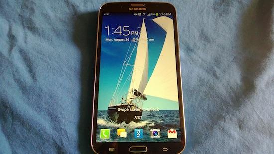
Earlier this month, I took a look at one of Samsung's many different tablets, the Galaxy Tab 3 8.0. It's another niche product, where Samsung hopes to win you over with its unique size, just in case any of the other sized Samsung-branded tablets don't do it for you. As you are well aware, Samsung's device lineup covers more than just tablets, and that's why we've got devices like the Galaxy S 4, the upcoming Galaxy Note III, and most recently the AT&T-branded Galaxy Mega 6.3.
If the Galaxy S 4's 5-inch display isn't big enough for you, but something like the Galaxy Tab 3 8.0 is too big, then maybe you're looking for something caught in between? That's Samsung's hope, it seems. But the question is, does the Galaxy Mega 6.3, with its huge display but mid-range internal specifications, fit the bill?
Let's find out.
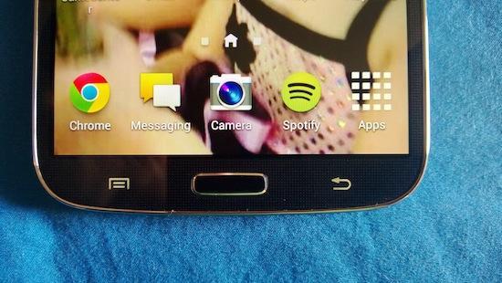
The Galaxy Mega 6.3 follows the same design language of just about every other Samsung-branded device that's been released this year, not counting the Galaxy S4 Active, more or less. But if you were to look at the Galaxy S 4 itself, or even the Galaxy Tab 3 8.0, and compare it to the Galaxy Mega 6.3, you'd feel comfortable in the similarities. If you like that sort of thing.
No doubt, the Galaxy Mega 6.3 is a lot of plastic and LCD. With its 6.3-inch display, it's a massive phone. And let's be clear right here and now, before we get too far into this, and while we're talking about the design and feature-set of the Galaxy Mega 6.3. This is supposed to be a phone. You're supposed to use it like you'd use the Galaxy S 4, because it has all the same features, and you can make phone calls. This is supposed to be a phone, more than a tablet. And, after using it, it's obvious that it's not even meant to be a "phablet."
Now, getting down to the nitty-gritty. The Galaxy Mega 6.3 features a 6.3-inch display, with a resolution of 720x1280. That means you'll get a pixel per inch count around 233. Interestingly enough, the fact that the Galaxy Mega 6.3 boasts a SC-LCD panel, instead of the practically standard AMOLED display, makes the Galaxy Mega 6.3 not a giant screen of saturated colors.
Above the display, you'll find the speaker grille, a Samsung logo, and a notification light tucked up towards the top-left (facing the device). There are a pair of sensors at the top-right, and then finally the 1.9-megapixel camera. Below the touchscreen, you'll find the regular physical Home button, with the Back button on the right, and the Menu button on the left. On my review unit, the Home button felt a bit loose in its setting, but it still provided plenty of travel and feedback, and it was responsive enough during usage.
The Galaxy Mega 6.3 breaks the Samsung-branded tablet button layout, and goes with the smartphone layout instead. Meaning, on the right side of the phone you'll find only the Power button, which is slightly raised along the edge, so you can find it easily enough just by sliding your finger along the ridge. On the top, you'll find the 3.5mm audio jack at the far left. And, on the left side, you'll find the volume rocker. At the bottom, the single micro-USB port.
On the back, the plastic panel is dominated by the 8MP camera at the top, with the single LED flash right below it. AT&T's minimalistic globe branding sits below that. At the bottom of the back plate there's the Galaxy MEGA brand.
You're either going to like the way the Galaxy Mega 6.3 looks, with its black plastic front-and-back build, or you won't. In truth, the Galaxy Mega 6.3 feels sturdy in the hand, and even if it is plastic, I don't think it felt like a toy like older Samsung-branded devices have. It is a fingerprint magnet, so you should be okay with seeing evidence of your fingers all over the back of the handset.
While Android 4.3 Jelly Bean may be the newest version of the mobile OS out there in the wild, Samsung is faulted for launching the Galaxy Mega 6.3 with Android 4.2.2. It still comes with the newest features, like lockscreen widgets, and the overall performance of the phone is smooth and steady.
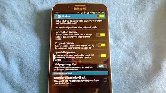
TouchWiz is TouchWiz, and there are no major differences between the Galaxy Mega 6.3 and, say, the Galaxy S 4. You'll still get a laundry list of features, tucked away inside menus for Air View and other gesture-based controls. Everything looks "normal" sized, despite the large display, and I think that works for the best for the device. Unlike the huge widgets and bigger app icons on the Galaxy Tab 3 8.0, the Galaxy Mega 6.3 looks normal when you turn it on and use it.
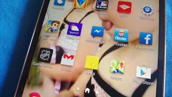
However, I will say that the overall size of the display does make the overall widget layout, as well as some app icon labels, act a bit funky. This could be just a personal nit-pick, but not being able to place the Spotify widget, for instance, in the center of the display was really annoying each and every time I tried to do it. Just being able to resize widgets would have been a nice bonus. And with app icon labels, some letters would fall into a second row, all by themselves. Like the NHL GameCenter app, where the 'r' at the end was all by its lonesome and just threw everything off.
However, the gripes end when you start dealing with overall performance for the Galaxy Mega 6.3. Despite the fact that the Mega 6.3 is running what many would consider "mid-range" specifications, it doesn't feel like a mid-range device. With its 1.7GHz dual-core Qualcomm Snapdragon 400 processor, many would probably expect the Galaxy Mega 6.3 to lag and stutter. But I honestly didn't notice any of it, after the initial boot up of the device, and after all my apps were synced and logged into.
The Galaxy Mega 6.3 has 16GB of built-in storage, and has a microSD card slot if you need more. There's 1.5GB of RAM, which seems to do just about what it needs to do, and nothing more. Unsurprisingly, games like Jetpack Joyride and Bejeweled Blitz had some minor lag issues, and sound didn't quite match up to the action on display. But it wasn't nearly as bad as I've experienced on other devices, so that's a bonus.
The 8-megapixel camera on the back of the Galaxy Mega 6.3 isn't terrible, but it's also not breathtaking, either. This led me to one of the more interesting debates I came across with the Mega 6.3, actually. Because with a tablet, I don't necessarily believe the back-side camera has to be that great, and the focus should be on the front-facing shooter. However, as I've said, the Mega 6.3 isn't a tablet, and that's why I think the rear camera should have been a bit better. I realize that the handset is technically a mid-range device, but I was still overall unimpressed with the shots I got from the camera. Both front and back.
The software keyboard is the standard Samsung variety, and with the large display it means you get the full number row above the regular keyboard. However, one of the more annoying things about the Samsung keyboard is that despite the fact it has auto-correct on, you have to actually choose the word you want, instead of the keyboard choosing the best word when you hit the space key. It slows down typing in a big way, and it's strikingly frustrating.
There is a large, shining light with the Galaxy Mega 6.3, though, and that's the battery. Measured in at 3,200mAh, it's just as big as you'd think it should be considering the device's size. The battery lasted all day, with heavy usage, and still had plenty of juice by the end of the night. And I mean around 9PM. The stand-by time is amazing as well. I never once felt worried about the battery throughout my time with the Galaxy Mega 6.3, and I tended to leave it disconnected from a charger, even when I was below 50% juice, without a second thought.
When my time with the Galaxy Mega 6.3 came to an end, I found myself asking the same question I had asked at the end of my Galaxy Tab 3 8.0 review: Why does this device exist? It shouldn't be surprising that I think this exists simply to exist, and to fill a niche. Like I said in the beginning, the Galaxy Mega 6.3 is for anyone who thinks the Galaxy S 4 is too small, but who needs something smaller than the Galaxy Tab 3 8.0.
With a handset this big, it will ultimately come down to what you need, and how big you believe the display needs to be. For me, personally, with a handset this size, I believe it would be better suited as a member of the Note family, and the S Pen would come in handy.
I will say that the Galaxy Mega 6.3 is priced accordingly on AT&T's network. At $149.99 with a new, two-year contract (and $479.99 without a contract), it's priced as a mid-range device, but not so much to undersell it. It's not going to go up against the HTC One, LG's G2, or even Samsung's Galaxy S 4 based on specifications alone (even with the huge display), and Samsung understands that. The price tag could make choosing the larger phone worth it to some.
The Good: The battery charges quickly, and lasts for a long time even with heavy usage; the display is crisp, and not overly saturated; microSD card support for extra storage; lightweight and sturdy.
The Bad: The cameras are mediocre at best; no S Pen or Note-inspired features to make use of the giant screen; unwieldy to use as a phone for extended periods of time.
The Verdict: While it may save you some dollars up front, I can't quite see the Galaxy Mega 6.3 being the go-to device for the general consumer. The Galaxy S 4's 5-inch display is big, an the Galaxy Mega 6.3 makes the Galaxy S 4 feel like a tiny baby in comparison. However, if you are aching to get your hands on a phone, and not a device that's even remotely trying to act like a tablet (in the software department), with a huge display, then I don't think you'd go wrong with the Galaxy Mega 6.3.