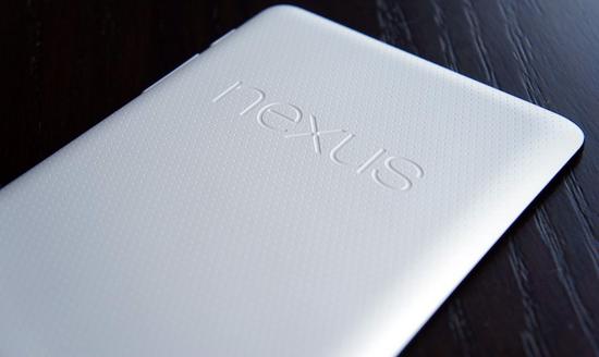
If you could pose any question to Matias Duarte, Google's Director of Android User Experience, what would it be? The followers of Duarte's Google+ page recently got that opportunity, and the executive chose some queries related to the consistency of the system buttons and status bar in Jelly Bean as well as the lack of microSD card support on Nexus devices. On the topic of system buttons and the status bar, Duarte explains that it goes back to muscle memory and keeping things consistent. The placement of the system buttons on devices like the Nexus line means that they're just as accessible for right-handers as they are for left-handers, and they're also always in the same place that users expect them to be.
On the topic of microSD card support, Duarte feels that while "everybody likes the idea of having an SD card," actually having one on a device is "just confusing for users." He goes on to say that with a microSD slot, users must select whether they want to store photos and other content on the actual device's memory or on their microSD card, and that things like deciding if there should be a setting or a prompt each time can complicate the situation. Avoiding expandable microSD storage means that users don't need to worry about things like managing volumes, Duarte says, allowing users to know how much space they're getting with a phone and helping them to decide which device model to choose.
The system buttons and status bar on Android 4.2 Jelly Bean are certainly different than they were with Android 3.0 Honeycomb, which featured navigation keys in the bottom right of the device's screen and status area in the lower right. The new setup, with the navigation keys in the middle of the bottom of the display and the status area up at the top, does make things more consistent with Jelly Bean on phones.
As for the microSD issue, Google is known for not offering microSD support on its Nexus devices, and that doesn't appear to be changing. It's something that's sure to be a deal breaker for some, but with services like Spotify, Rdio, Picasa and Dropbox, some users may be able to avoid storing too much stuff on their device's internal memory. Duarte's complete answers can be found below. What do you all think of his explanations? Are there any other questions you'd like to have answered?
Why did you make the system buttons and status bar consistent across all devices in Jelly Bean?
Consistency and usability are really important to us, and that’s something we strive to improve in every new version of Android. With Honeycomb we first introduced the idea of a completely onscreen navigation UI which gave us unprecedented flexibility in how that UI adapts and transforms - both when you turn the device in your hands and when the software changes and has different control needs. Now in Jelly Bean we’ve made the universal software navigation buttons and system bar consistent across all screen sizes.
This new configuration is based on usability research we did on all of the different form factors and screen sizes that Android runs on. What mattered most of all was muscle memory - keeping the buttons where you expect them, no matter how you hold the device.
Phones are almost always used in portrait mode, flip sideways occasionally, and never go upside down. As screen sizes get larger though, any which way goes. Imagine the frustration you’d feel if every time you picked up a tablet off the table ‘the wrong way up’ you found yourself reaching for a home button that wasn’t where you expect it to be? That irritation adds up and over time like a tiny grain of sand in your shoe and undermines the rest of your experience.
The Jelly Bean system bar always keeps the same 3 buttons where you expect them. This happens dynamically for every screen size, up until you get to small handheld screens where stacking the bars in landscape mode would leave too little vertical space.
The second thing we discovered was that there are almost as many different ways of holding our devices as there are people. In fact people love to use their Nexus so much that they use them for such long periods of time that having a single ‘correct grip’ is actually counter productive and increases hand strain. The Jelly Bean navigation buttons work equally well for left handers and right handers, one handed use, or two handed use, and for devices you’re carrying, resting on your knee, or putting on the table.
Last but not least, by unifying the design we are now able to put Notifications and Quick Settings right where you’d expect them, and only one swipe away.
Why don’t Nexus devices have SD cards?
Everybody likes the idea of having an SD card, but in reality it's just confusing for users.
If you’re saving photos, videos or music, where does it go? Is it on your phone? Or on your card? Should there be a setting? Prompt everytime? What happens to the experience when you swap out the card? It’s just too complicated.
We take a different approach. Your Nexus has a fixed amount of space and your apps just seamlessly use it for you without you ever having to worry about files or volumes or any of that techy nonsense left over from the paleolithic era of computing.
With a Nexus you know exactly how much storage you get upfront and you can decide what’s the right size for you. That’s simple and good for users.
Good questions! Keep 'em coming!
Via DroidDog, +Matias Duarte