The battle between Android and iOS is one for the history books. In truth, it all boils down to preference and what works best for the individual. Most of the opinions thrown back and forth between the two sides are mostly petty and nitpicky – each platform has its high and low points. One of said glaring low points for Android is the quality of applications available.
Let me take a minute to say that I'm a fan of both operating systems, and the app stores for one is filled with as much junk and poorly coded apps as the other. But when it comes down to it, Apple has more grip when it comes to quality control, and a good portion of the apps come out looking very nice. And don't get me wrong, Android has its fair share of beautiful apps. But a large portion of Android devs tend to favor function over beauty.
Generally, I'm easy to please. As long as an application functions properly and I can use it as intended, I'm usually happy. In fact, there aren't many apps for Android phones that I would complain about. My beef is almost entirely with Android tablet – or Honeycomb, soon to be Ice Cream Sandwich – apps.
Back before the official launch of Honeycomb, Andy Rubin took the stage in an interview with Walt Mossberg of AllThingsD to talk about the software update and the direction Android was headed. One of Rubin's main points that he made in the Interview was how developers will only have to code one app for all Android devices – the app is aware of the screen size and adjusts by switching interfaces accordingly. He goes on to explain how coding an application to do such requires minimal effort, since most tablet interfaces combine several "views" from the phone interface to make one, large display of content.
Early last month, Rubin took stage with Mossberg once again for an interview at the AsiaD conference in Hong Kong. Rubin reiterated the one-app-for-all-devices theory. I commend him for that, because it's something I firmly believe in. I absolutely hate having to purchase two separate applications, from the same developer, that do the same thing because I use different devices (or even different platforms). This theory only makes sense.
The problem? Google can't even follow through with their own theory. There are several native Google applications that serve as perfect examples: Google Voice, Google Reader, Google+, etc. Do these apps work on a tablet? Certainly. And they perform as they should. But the extra display space is completely wasted by an inefficient interface layout and the quality of experience is drastically worsened.
Update: It was brought to my attention that Google Reader has since been updated and now features an optimized interface. It's about time.
If nothing else, Google should have had these applications tablet-optimized before they ever launched on Honeycomb. Android tablets and optimized applications are slowly gaining traction. But Google can't seriously expect developers to be interested in development for tablets if they can't even manage to take the time to optimize their own apps for larger displays.
I get excited every time I see an update in Android Market for one of the aforementioned applications, in hopes that Google has finally formatted it to display properly on a tablet. And every time, I get frustrated when I open the updated app to find the display filled with oodles of white space.
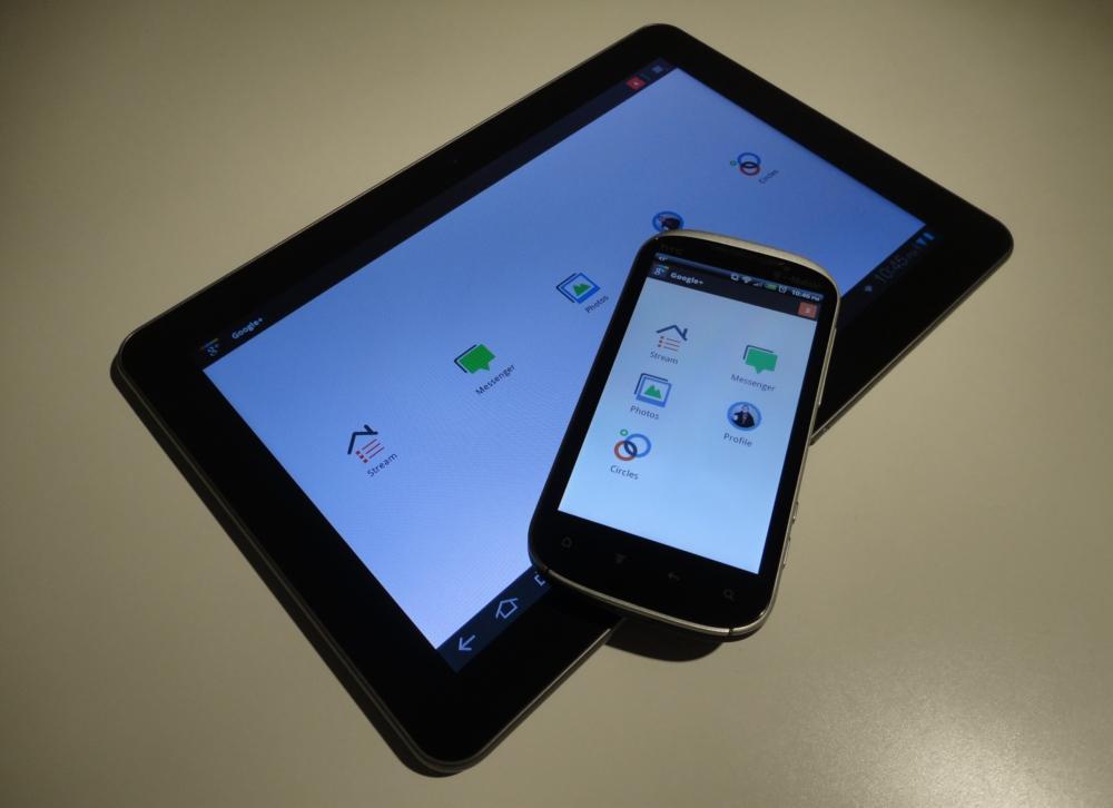
The Google+ application, pictured above (click for full size), is a prime example. As shown in the update yesterday, Google is obviously ramping up efforts in the design sector. It is easily one of the most well-designed and best looking mobile apps I've seen to date. However, launch the same application on a tablet and it's a totally different story. As you can see above, the exact same content that you are given on the phone (right) is displayed on the tablet (left), just scaled-up.
I have full faith in Google and Rubin. We know they can make some great tablet apps. Just look at Google Talk, Gmail and Android Market. And Rubin seems to be getting more proactive with Android as of late in mending any and all outstanding issues with the platform. That said, this is one that never should have happened to begin with. It's laughable, at best.