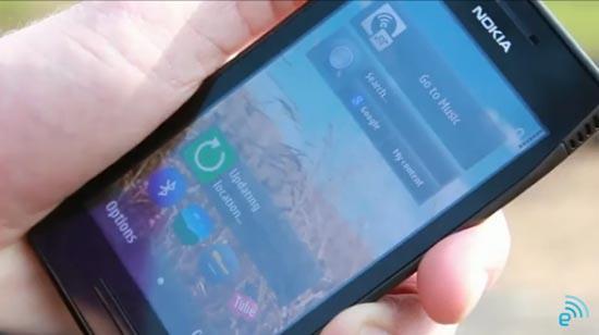
Earlier today a representative for 3 UK took some time out of his busy schedule to play around in a park. Okay, that’s only half true. While he was obviously having some fun in that park, he was also there to show off the newest version of Symbian, which he was able to do courtesy of Nokia’s X7 smartphone. The video isn’t long at all, and while there are probably plenty of improvements in this latest build of the mobile OS, the rep only shows off the new browser (kind of), home screen scrolling, and a virtual QWERTY keyboard. And while the video doesn’t go into great detail, I only had one thought after seeing it: good, but not great. And that got me thinking about what Symbian really needs to compete.
The update isn’t a ground-up overhaul of the mobile OS, but no one was expecting that from Nokia at this point. We knew that Symbian was still playing a role in Nokia’s portfolio for the next few months, and updates were part of the plan right from the start. We do get to see the new icons, and there’s some speculation that the new OS being shown off on video here is what the company was planning on announcing soon. If that’s true, hopefully the company shows off more the mobile OS has to offer than what this short video does.
As for the mobile OS itself, while I knew it wouldn’t be a huge makeover, I was still expecting something more. Not so much in the visual aesthetics, or even the way that Symbian operates. It’s almost like it’s an unnamed thing that Symbian is missing. Despite the fact that there are scrollable home screens, a fast Web browser, and new icons, it just doesn’t seem ready to go up against the likes of Android, or any other mobile OS out there. For some reason, when I see Symbian, I immediately think “office” or “work.” Much in the same way that I think the same thing when I see a BlackBerry’s home screen. The problem with that is, while Nokia is good for business, that’s not the main market they’re going after. I think that aesthetic appeal, which is noticeable right from the start, turns a lot of people off from the devices.
That got me thinking about what Symbian needs to do to actually compete, even if it’s only for a little while longer. And if it’s not a full mobile makeover, I don’t know what it is. As I watched the video, I was actually distracted by those new icons. They’re big and colorful, which may be great for some, but to me that just looks comical. It makes the device look like a working cartoon, which is a sharp contrast when you see the professional-looking widgets. For me, that just shows an inconsistency throughout the OS, and that’s definitely not what I’m looking for when I want to buy a new phone, or experience a new mobile OS.
Of course, there are all sorts of different things that each and every mobile operating system out there needs to improve. None of them are perfect, and each one of them will attract a different customer. While Symbian, even in its future incarnation may not attract my eye or attention, it’s probably more than enough to get current Symbian users excited about the future, and even drag a few new customers into the fold.
What do you think of the new build of Symbian? Will it be enough to take some jabs at the competition, or is it too little too late for Symbian? Let me know in the comments what you think Symbian needs to compete.