The Good: New physical QWERTY keyboard design that is wider and more spacious; solid build quality; TouchWiz UI with widgets and icons to use on three homescreens.
The Bad: Problems with the capacitive touchscreen.
The Verdict: The Samsung Flight 2 is a great messaging phone that is a worthy successor to the original Flight.

The Samsung Flight has long been one of my top messaging phones on AT&T. The Flight 2 brings a slightly different keyboard design and a new capacitive touchscreen. It is currently only available at Radio Shack and there is no word on if or when it will be sold in AT&T stores.
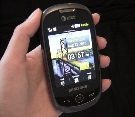
The Flight 2 features a 3-inch capacitive touchscreen display with a resolution of 240 x 400 pixels. Three inches seems to be a good size for standard messaging phones, and this one performed very well. Colors showed up well and text was easy to read. I did have a problem when swiping between the three homescreens though. When starting on a screen that had a widget on it, even if I didn't press very hard or do a long hold, when I swiped to the next screen, it would move the widget to that screen. This was very annoying, but I suppose it is pretty easy to work around.

The bottom of the front panel contains a Call/Send button, Back button, and an End/Power button. On the right side of the phone is the camera shutter button, the screen lock/unlock button, and the microUSB port. The left side is where you'll find the volume rocker buttons and then Task Menu button. The top of the phone contains a 3.5mm headphone jack. The phone isn't too big or bulky, though the physical keyboard does add some thickness. In all, it is 4.4-inches tall, 2.1-inches wide, and .5-inches thick and weighs 3.5 ounces.
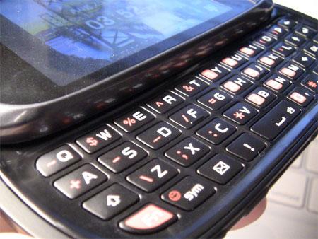
Sliding the top panel to the right reveals the physical keyboard. As mentioned in the Overview section, this keyboard is wider than the one on the original Flight. The keys are slightly raised, but not very much. They aren't quite as grippy as other messaging phone keyboards, but it was still very easy to type on. The spacebar is in it's own row, which is always nice to see. One thing that took some getting used to is the functionality of the Shift key. Pressing it once puts typing into Caps Lock, pressing it again, capitalizes only the first letter of the word you type, and pressing it a third time, puts the keyboard back on Caps Lock. If this sounds confusing, it is. This took a lot of time to get used to and one of the few downsides to the keyboard. Despite that, I enjoyed typing on the keyboard. One thing to note is that the phone does not have threaded text messaging.

Samsung's TouchWiz UI adds some flavor to the device with three different homescreens and customizable widgets and icons. The Main Menu is pretty standard, but it's simplistic and easy to navigate.
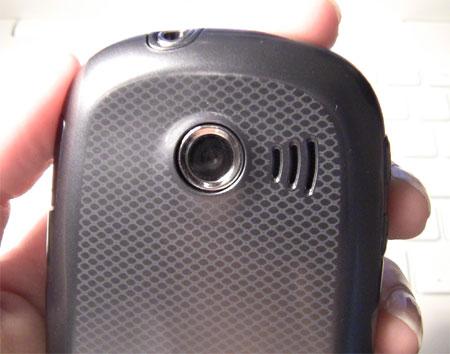
The Flight 2 has a 2-megapixel camera that captures video and has 4x digital zoom. Pictures were decent, though I wouldn't recommend using them for anything more than sending via MMS or to show your friends. The camera also has a night mode, self-timer, and face detection.

All of this is powered by a 1000 mAh battery. I managed to get about 2.5 days of standard use and then, when left on standby, it lasted about five days. Both of these are lower than AT&T's estimates, but are still very satisfactory.
The Flight 2 is a great standard messaging phone. It may not have the bells and whistles of the LG Vu Plus, but it also doesn't have the Vu Plus' $150 price tag. For someone who simply wants to send and receive a lot of text messages, the Flight 2 is perfect. It is currently available only at Radio Shack so go check it out and see it if suits you.