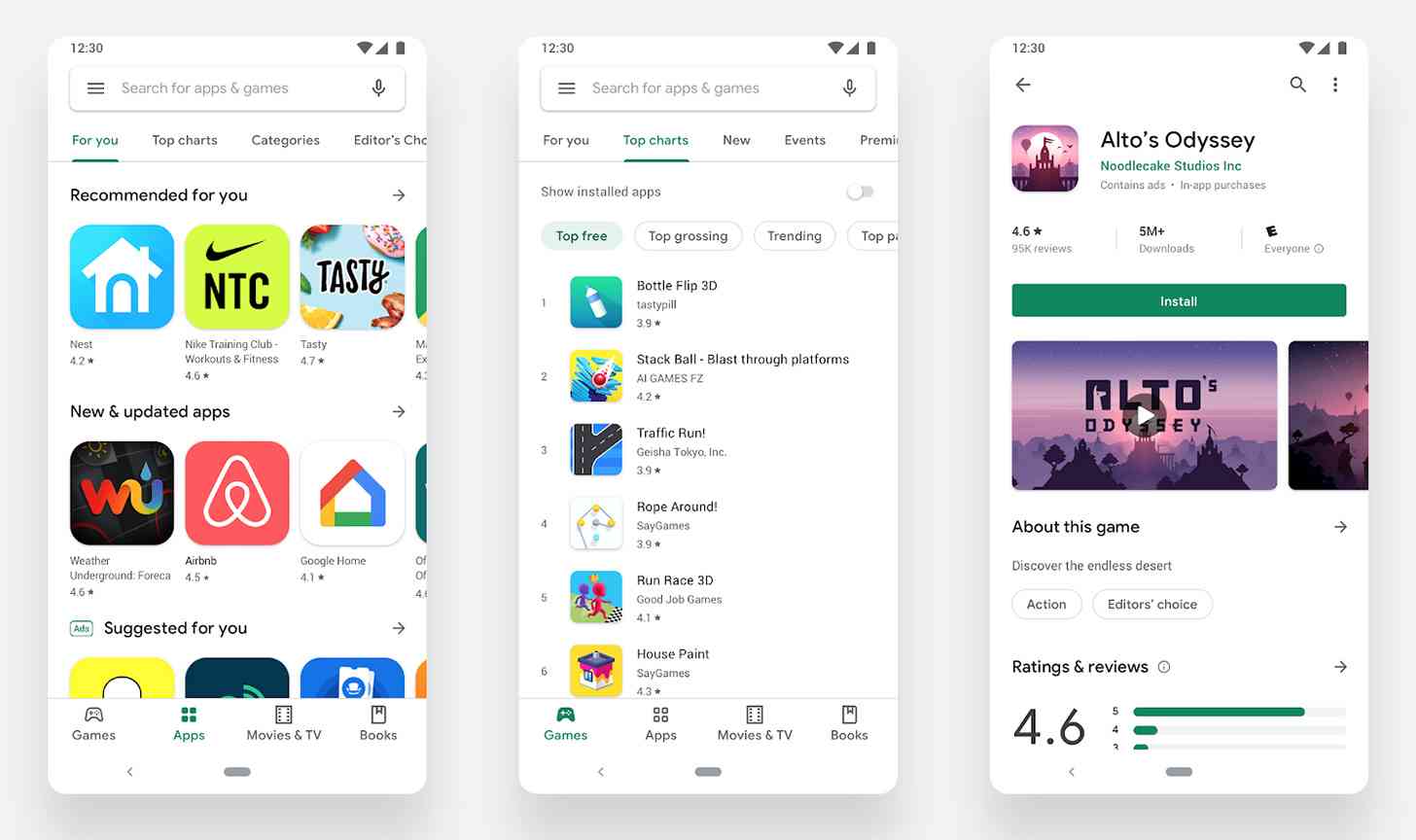
We first got wind of a new Material look for the Play Store a few months ago, and now it looks like it's finally rolling out.
Google today introduced a "complete visual redesign" of the Play Store. The new-look Play Store fits in with Google's Material design guidelines and has a more white, cleaner user interface.
Included in this Play Store refresh is a navigation bar at the bottom of the screen on phones and a new left navigation on tablets and Chrome OS. Google says that this will make browsing the Play Store faster and easier.
Also packed into the Play Store update are distinct sections for games and apps and a refreshed store listing page that shows richer app information at the top of each page and a more prominent call-to-action button. There's a new icon system with a uniform shape, too, that Google says will help content stand out over the user interface.
This update to the Play Store is a big change, but it should make browsing for and installing apps and games a bit easier. The bottom navigation bar ought to make moving around the Play Store easier when you're using the big screens that are popular in smartphones nowadays, and larger call-to-action buttons will make it easier to find and tap the "Install" button when you've found an app or game that you like.
What do you think of this new-look Play Store?