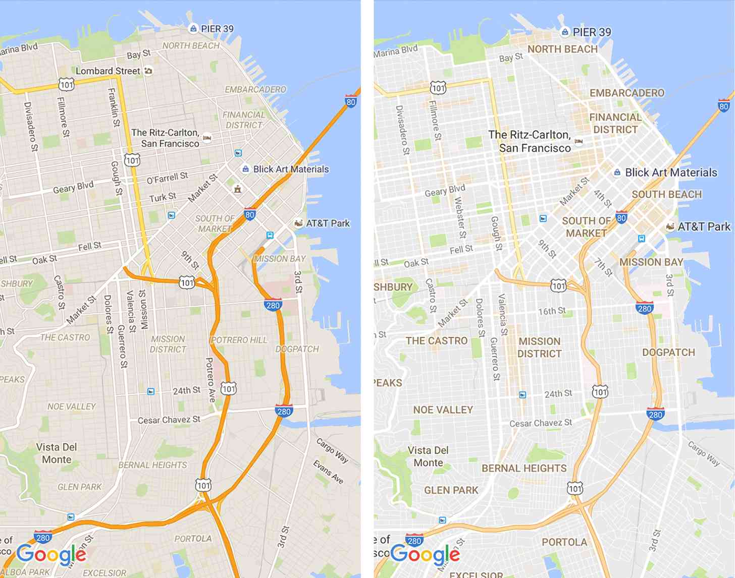
A Wi-Fi-only mode isn’t the only new feature that’s coming to Google Maps.
Google is now rolling out an updated Google Maps app with visual tweaks. For example, Google says that the new Google Maps has a cleaner look because the company “removed elements that aren’t absolutely required,” like the outlines on roads. Google has also improved the typography of road names, points of interest, transit stations, and more to make them easier to read. Up above you can see pre-update (left) and post-update (right) screenshots of Google Maps.

Also rolling out are orange shaded areas to indicate points of interest. When you find one of these areas, you can zoom in to get more information about the venue and then tap on it to learn even more.

Finally, a “more subtle and balanced” color scheme will help you quickly tell the difference between manmade and natural features and also to help you identify places like hospitals, schools, and highways. Above you can see a key that’ll show you what each color on the map represents.
Google Maps is a major mobile application, with tons of people on both Android and iOS relying on the app to navigate around places that they’ve never been. Being in a new place can be overwhelming, so it’s good that the app that lots of people use to find their way around new places is now easier to read, meaning that it’ll be easier for you to navigate an unfamiliar location.