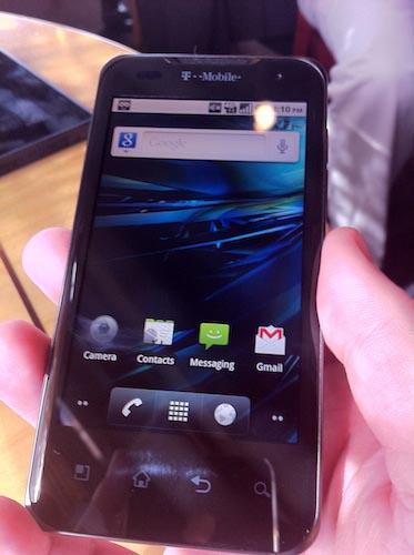
If we’re just looking at smartphones, the jump from Android 2.3 Gingerbread to Android 4.0 Ice Cream Sandwich is remarkably drastic. It is, without a doubt, a revolution and not just an evolution. The Ice Cream Sandwich update to Android brought a lot more attention to Google’s mobile operating system, and in a good way. It was polished, refined, and even a few aesthetic cues were downright eye-catching. (I find it hard to use the word “sexy,” so don’t mind me if I actively try to avoid it for at least a little while here.) Android 4.0 was the stock version of Android that didn’t look like a developer’s test device. It was, at least in my opinion, the version of Android I had been waiting for, without even realizing it.
Of course, looking at Android as a whole, we can’t just look at the smartphones that have become so prevalent in our lives. Tablets exist, too, and for a little while there Google tried to sneak in a version of Android that was built specifically for tablets, better known as Android 3.0 Honeycomb. If you were to look at Honeycomb and Ice Cream Sandwich, you’d understand where plenty of the newest features in 4.0 came from.
Google used their tablet-only OS as a jumping-off point for Android 4.0, borrowing plenty of features that made sense for the larger display and shoving them into our smartphone displays. I have one thing in mind: Virtual buttons.
Android 3.0 Honeycomb launched way back when, on May 10, 2011. It was on that day that we were introduced to virtual buttons in a big way, as it was the main navigational component to using the tablet-only operating system. No more physical or capacitive buttons, the options would be there at the bottom of the screen, always waiting for you. A great idea, especially for a tablet that has a larger display.

On December 16, 2011, Google unveiled Android 4.0 Ice Cream Sandwich and the newfangled virtual buttons on the Galaxy Nexus. Again, if you hadn’t been paying attention to Android 3.0, then seeing this shift from Android 2.3 was probably a little shocking. But in a good way, because the changes that Google made were definitely good.
But, the Galaxy Nexus only has a 4.65-inch display. The idea of putting virtual buttons on a display “that small” left some room for people to argue the usefulness, but obviously Google thought it was worth keeping. (It helps that phone sizes are getting bigger.) So now that Android 4.2 is out, virtual buttons are still part of the equation, at least as far as it goes for the Nexus 4.
Several manufacturers, like Motorola and Huawei have decided to keep up with Google’s plans, as they’ve all incorporated virtual buttons into their devices. Motorola’s newest handsets, the DROID RAZR M, along with the updated DROID RAZR HD and DROID RAZR MAXX HD all use virtual buttons, for instance. And Huawei’s monstrous Ascend Mate also packs virtual buttons, but considering its 6.1-inch display, can anyone say that’s a negative?
LG and HTC have been stalwarts in their lack of virtual buttons, though. In the case of HTC, which could have used the launch of their One X+ as an introduction to software keys within Sense UI (but decided to stick with it), their capacitive buttons seem to be the way of the future for the company. And then there’s LG, which uses the same button layout as Google’s virtual options, but chooses to use capacitive keys right below the display as well.
And then there’s Samsung. The company isn’t against using virtual buttons, obviously, as they’ve included them in their tablets running Android 4.0, but for their phones and devices between smartphones and tablets, they prefer their physical options. The capacitive buttons on the Galaxy Note II and Galaxy S III are obvious design choices, which tells me that Samsung would prefer to keep their devices as different from the competition as possible, even if that means forsaking one of the coolest new additions to the Android platform.
Everyone has an opinion about smartphones, about their features, and I know that virtual buttons are no different. Some can argue that including them takes up space on their display, but the buttons have the ability to disappear when using certain apps or watching videos. On the other hand, some would say that having capacitive buttons right below the display make it too easy to have an accidental button press. There are pros and cons for every situation, every hardware design decision, which is why I want to hear from you, Dear Reader.
I want to know which design choice you prefer. Do you like the virtual buttons? Do you think that’s a main design choice that manufacturers, including Samsung, should stick with? Or do you think hardware options should always be the number one choice for smartphone designers? Let me know!