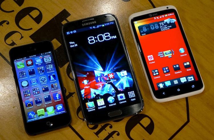
More so than just a form of mobile communication, utility and entertainment, phones have become, more or less, an extension of our bodies. The blinking and buzzing phone on the night stand is the first thing many of us reach for in the morning and the last thing we look at before falling asleep each night. We gaze into the backlit displays waiting and longing for new notifications or working through the old ones, and we constantly peruse digital content stores for new apps, games, books, movies and music.
But for some, one of the most important aspects of your phone is not what it can do, what the processor under the hood is or how many pixels the manufacturer managed to squeeze into the display. It's what the phone looks like – both on the outside and on the inside, the interface.
Beyond cases and stick-on skins, there isn't much you can do to customize the outward appearance of your phone. But the interface, the home screen, is a totally different story. It's what you look at every time you turn on your device, and it's imperative that you set it up in a way that is both visually appealing and intuitive to the way you work with your phone.
Sydney Myers, a former PhoneDogger, became a master at tweaking the interface of her various Android devices. And by just spending a few minutes on mycolorscreen.com, it's easy to see that some people go above and beyond to customize and make their home screens look beautiful while integrating functionality in some pretty clever designs. Others, however, take a more direct path and go through a quick, routine setup.
Earlier today, a colleague, Dustin Earley of Android and Me, tweeted a link to a thread from The Verge's forums that asked members to share their home screen setups for their Android, Windows Phone, iPhone and/or webOS phones. (Sorry, no BlackBerry, even though some people put hours of hard work into some pretty nice themes.) What I found is that there are tons of awesome wallpapers and clever home screen setups that look great yet don't look too difficult or time consuming to setup.
Typically, I remain very close to the out-of-the-box experience with my Android phones. Sometimes that's because I will continue using a phone I have reviewed, which I have to keep as close to stock as possible for the integrity of the review. After that, I don't usually feel like setting up the phone again.
Most of the time, though, I don't care enough anymore to put much effort into setting up home screens. I have found over the years that I get tired of everything very easily. By starting with something bland and boring, there is a good chance I will be neutral to the setup. If I spend a lot of time setting something up, I will later begin to nitpick and spend entirely too much time tweaking and rearranging.
Lately, I have been sticking to a very generic setup. I tend to place icons in almost the exact same place – off memory – across devices. I spend more time picking a wallpaper than anything. I find a few that I like and stick to them for several weeks … or sometimes even months.
After as the rest goes, I keep it very simple. For Android devices, utilities are generally to the right of the default home screen, social apps and communication apps are on the default page and entertainment apps (games, Netflix, Spotify, etc.) are to the left of the default home screen. I also use a couple basic widgets, like a digital clock, a battery meter and power controls. On iOS, I like to keep it to one home screen. Period. I group all similar apps in folders and important, frequently used apps are left solo. Other than that, there is no true rhyme or rhythm to the setup.
I don't take the time to make everything match or put everything in a particular order. I make group associations with apps, place everything important front and center and stick to a generic layout.
What about you, ladies and gents? Do you have an inspired home screen that took you hours (or days and weeks) to setup? Or, like me, do you just setup a device quickly and try to replicate the setup of your last device? Chime in below.