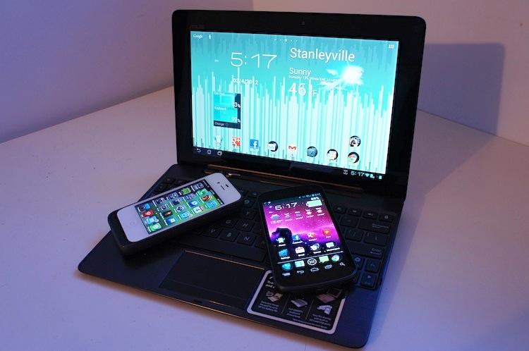
My absolute favorite thing to do after buying a new phone, aside from ripping all of the plastic off and making as much noise as possible, is setting the device up. I'm not talking about logging into all of my accounts and downloading all of the different applications I had on the previous device. That part is repetitive, boring and painstakingly annoying. No, I'm talking about getting to setup my home screens again.
Whether it's a new device or a phone I already own that I've decided to wipe and start fresh on – maybe by flashing a new ROM – I put a lot of thought and time into my home screen layout. It's like planning the layout of the furniture in your home right after moving into a new place – without all of the heavy lifting, of course. Much like the sofa and your enormous television should be strategically placed facing one another, you want to make sure your folders, icons and widgets (if applicable) are laid out in an efficient and visually pleasing manner.
If your most commonly used apps aren't easily accessible from the home screen, you may find yourself fumbling through several pages of applications just to find and launch one. And without the proper use of widgets (on Android at least), you will likely waste time launching applications instead of being able to quickly read at-a-glance information from the home screen.
I guess you could say it's like a personalized puzzle of sorts. Each device and each platform gets its own layout treatment based on how I use it.
My Android tablet's interface, for instance, is filled with lots of huge widgets and tons of folders. My main home screen displays the current weather and forecast, date, time, location and battery stats for the tablet and dock. And I have an array of folders, shortcuts for all of my most frequently used applications – there is a folder for my different app stores, browsers, games and instant messaging services. Swipe to the home screen to the left and you will find all of my productivity and entertainment tools. There I have folders for all of my RSS readers, cloud storage clients, music services, note taking apps, photo editing software and file explorers. There are also a couple widgets like a task manager, browser bookmarks and for cloud services. Lastly, to the far right home screen, I have my communication and scheduling information: a Google Voice widget, several Gmail widgets and the Calendar widget.
Despite using tons of widgets and always being on the prowl for new ones, I rarely ever use them. I will look at ones like the weather and time for reference. But with widgets like Google Reader or Gmail, I generally just use them to open the full app rather than reading the scrollable feeds from the home screen.
The home screen layout for my Nexus is very similar, just modified and condensed for the smaller display. There are fewer widgets and folders per home screen, but to the left is entertainment while the home screen to the right is productivity. I do this so the switch between them isn't too radical.
For my iPhone, however, things are quite different and much less organized. Unlike my Android devices' home screens, which generally switched around every few weeks, I haven't changed the layout of my iPhone's home screen since May of 2011. Instead of having a rhyme or reason, I've just let it go and try to remember where everything is. I use tons of folders for all similar or related applications. And if I download an application that I think I will use fairly often, I will make room for it on the first home screen. Other than that, applications just tend to pile up on more and more home screens, and I remember where they are. Nothing fancy here.
I don't currently use any Windows Phone devices. But when I did, I remember that I never felt remotely enticed to change the home screen around. Customization options are minimal and I would just use it exactly as it came out of the box. There is definitely room for improvement and a lot that can be done with Metro UI, but I never felt compelled to customize it any of the times I used it.
Interestingly enough, I used to spend more time on arranging the home screen than anything else when I was using a BlackBerry. I would actually take the time to create my own themes that catered to my icon layouts. A theme would take me anywhere from an hour to a couple days to perfect, depending on how in-depth I would make it, and I would usually make several per month. I guess you could say I was a bit anal about how my BlackBerry's home screen looked.
The worst part is that I'm a tad OCD. Like I said, I try my best to setup my home screen the same exact way it was on my last phone every time I buy a new one. But it never seems to work out that well. That said, I literally will not use the device until I feel that every icon and widget is exactly where it should be.
What I'm interested in, though, is how you guys and gals setup your home screens. Do you just use it as it is and kind of set it up as you go? Or, like me, do you obsess over how the icons and widgets are laid out and constantly find yourself rearranging them? If you want to share yours with me, shoot your screen captures to me on twitter (@PhoneDog_Taylor).