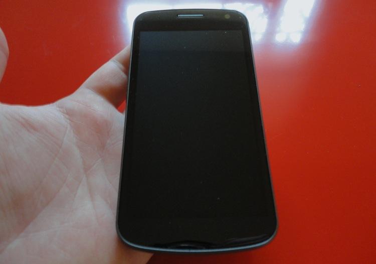
Mobile devices now come in a plethora of different flavors and sizes, each with its own unique twist. Judging from the outside, however, a lot of devices are really starting to look the same. To an untrained eye, the latest Motorola phone might be confused with a Samsung device. Or a new LG phone might be mistaken for an HTC-made phone.
Just over a month ago while eating Christmas dinner, a few family members asked me what phone I was carrying. Reluctantly (you may recall I was trying to disconnect and not talk about phones for a change), I pulled out my phone and showed it to them without saying a word. "Is that one of those new RAZRs? Or is that an iPhone?" Neither. It was a Galaxy Nexus.
And that's the point. To a lot of people, every phone looks identical and that's why branding is so important. By plastering a "Samsung" logo across the face of the device, there is no mistaking it for an iPhone or DROID RAZR upon closer inspection. Likewise, if that phone appeals to you and you see an AT&T logo across the face, you know exactly where to go to get one for yourself.
Some don't see it this way. Or they see it this way, but still find it atrocious and counterproductive. Bryce Daniel of our own iOS-specifc site, Today's iPhone, wrote a piece titled The logo problem: why iPhone works. The idea originated on a blog called MinimallyMinimal, which serves as an online journal for Andrew Kim, a former Google intern (among other things).
Kim notes how the Lumia 900 is a beautiful device ... or how it was before branding mucked it up. The face of the device now has three logos: a Nokia logo, an AT&T logo and a Windows Phone logo. The Nokia branding is located at the top left corner of the device, just above the display; the AT&T logo is on the right corner, directly beside the Nokia branding; and the Windows Phone logo is actually a capacitive home button. He goes on to compare this with several other Windows Phone devices, Android phones and BlackBerrys. And he used the iPhone, which has no branding on its face, as contrast, along with several other high-end products like a Mercedes, MacBook Pro and Nintendo DS – all of which have very minimal branding. Kim says:
"I think it's a fairly good metric to count the logos on a product to see its value. If it isn't yelling at you, there's a pretty good chance that it's confident that it's a good product," and, "If the product is iconic, friendly and innovative enough, it doesn't need to tell the user what it is; the user already knows. You can see a DS from a mile away and you immediately know what it is."
He calls the Lumia 900 an example of "inherent logo pollution" and says Microsoft's decision to use a Windows logo "completely puts him off."
He has a point, and I can see where he's coming from. But I can only agree with some of his points. Branding is important. Some devices are easily recognizable; thus they don't need to be plastered with logos. But just because a device has branding on it doesn't mean that it's a poor or low-quality product, or that the company is not confident in their product. Sure, it might take away from the beauty of a device, but it's free marketing. A trade-off.
I've noticed that a lot of Apple fans are minimalists and eat the minimalist branding up. But there are millions upon millions of people there who never give logos – no matter where they're located or how many – a second thought. Most will never pay attention to them at all.
Before the Galaxy Nexus, I never paid any attention to any branding. I've had countless BlackBerrys (which are known for their cluttered appearance), Android phones, Windows Phone devices and even iPhones. Not once did I ever stop to think, "I don't want this phone because it has too many logos on the front." But when you get a device like the Galaxy Nexus in your hands, which only has a display and a few camouflaged sensors and LEDs on the face, you realize just how cluttered and distasteful the typical device face is.
In recent memory, the only device that I can recall that bothered me with its branding was the Motorola XOOM on Verizon. The Motorola logo on the face (along with the aspect ratio) of the device made it feel awkward to hold it in any other orientation but landscape with the logo in the top left corner. Even then it didn't bother me enough to sell the device or avoid it from the start.
That said, there should be some sort of unwritten law on how much branding is too much. Kim believes that three logos on the face of the device is three logos too many. I, on the other hand, don't mind the occasional logo but feel that three may be a tad excessive. There is plenty of unused space on the back that's screaming for more attention. But nobody stares at the back of a phone for any amount of time, so branding on the battery door is more or less second-rate placement.
Within reason, no amount of logos on the face of a smartphone will keep me from buying it. So long as the display is nice, the rest of the specs check out and it isn't absolutely atrocious to look at, I really couldn't care less about branding. I know many of you will disagree – it seems most either hate it or are indifferent. Tell me, readers. Do you dislike branding on the face of your devices? How many logos are too many? One? Two? Three?