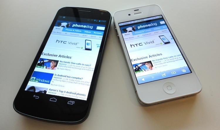
After writing about which platform has the best mobile browser yesterday, I inadvertently launched myself into to some endless debates with some friends and colleagues. We went on, back and forth, over the most petty and and insignificant features of each browser – it's those that really matter, after all – that make a specific one our favorite. During one of those exchanges, a very sore topic for me came up: mobile websites.
Let me preface by saying that I know there is a need for mobile versions of some sites. For better or for worse, they make browsing the web bearable for some devices. Not every phone can handle a full desktop site; likewise, not every site is optimized for use via mobile, especially heavily flash-ridden sites.
Now that that's out of the way, my problem with mobile sites, for the most part, is not design or function. If they're done right, I have no problem with them, even if some functionality is sacrificed for a better, smoother experience. Still, I prefer the full desktop version of a website if at all possible. The key phrase there is "if at all possible," and is where I have a problem.
The browser capabilities of smartphones has come leaps and bounds from where they were just two years ago – last year, even. Viewing a website in its full desktop version is fantastic on some phones. The Galaxy Nexus which I have been using primarily for the past week, for instance, offers up one of the best mobile browsing experiences to date. The 4.65-inch 720p display with Quick controls and Fullscreen (both found in the Labs section of Browser Settings) helps squeeze every last pixel out of the display for Web browsing use. This, paired with dynamic text rendering, means I have to zoom and pan less to view and read content on a site.
Back to that "if at all possible" phrase. When I'm browsing from my phone, a good portion of sites automatically revert to their mobile versions. Again, I understand this, and although I wish sites would let me choose which version I wanted before fully loading, scrolling to the bottom and finding the "Full Site" link isn't too much trouble. The problem is what happens after you click that link (granted it's even available) – one of three things will happen:
If scenario one happens, I'm peachy. But if number two or three occur, I generally get too frustrated to bother with fighting it and never visit the site again from my phone after. And I thought the included "Request desktop site" feature in Ice Cream Sandwich would help avoid the latter two scenarios, but that is clearly not the case. If number two or three occur, the built-in feature in the Android 4.0 browser effectively does nothing but refresh the current page.
A perfect example of this can be found by visiting Mashable.com from your smartphone. Don't get me wrong, their mobile site is fine and functions quite well. But as I've stated, since my phone can now handle a full site, I want the full experience. However, when you visit Mashable from a smartphone, it automatically takes you to the mobile site. After scrolling to the bottom and selecting the "Full Site" link, the page will actually load the full site. If you click on a link from the home page, you will be taken to a mobile page for that specific article. If you scroll to the bottom of the page once again and hit the link again, one of two things will happen: the page will simply refresh or you will be taken back to the full version of the home page. It's almost impossible to load a full desktop version of a Mashable article on a smartphone. Keep in mind, this is only one example.
And the problem isn't limited to phones either. In fact, smartphones are the lesser of the issue. The worst is when I'm browsing form my Galaxy Tab and having a mobile site persistently load. I know, there are hacks to make this a non-issue. Or you can enter "about:debug" in the Android browser address bar to access the developer Settings and choose your User Agent String.
But the point is that mobile sites aren't always the best mobile Web browsing experience, and not all of use prefer visiting a dumbed-down version of a website. If my phone is capable of handling the entire site, it's the full site I want. When visiting a site from your phone (at tablet should always load a full desktop site by default), users should always be prompted to choose between a full or mobile version of the site, with the option to remember preferences, of course.
I spoke with several colleagues how they feel about mobile sites, and their opinions were mostly on par with mine. David from TmoNews said, "I almost always revert [to the full site]," and our own Evan said, "I always use the full site." My pal Dustin Earley of Android and Me, however, said "If I had to generalize, I suppose I'd say mobile sites suck." He went on to say, though, "they're usually way faster, and sometimes look better in my opinion." If they're done right, they're great. And I agree. But still, like David and Evan, I always opt to the full site.
I'm curious, readers. Do you prefer mobile sites when you're browsing via mobile? Or do you always revert to the full desktop site? Does it grind your gears when you're continually redirected back to a mobile version?