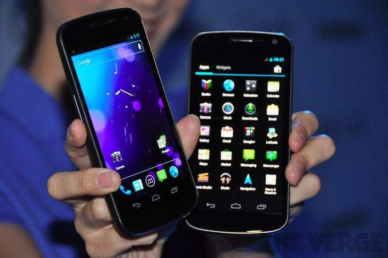
When Google and Samsung took the stage last Tuesday, there were several things about Android version 4.0 that we already knew. Since Ice Cream Sandwich is a fusion of tablet and smartphone software, we knew the phone UI was going to get a nice overhaul and that it would pull many elements of Honeycomb to smaller devices. And based on some leaks and rumors, we had a pretty good inclination that the physical button requirement was one of said elements and would eventually become a thing of the past.
Just as featured in Honeycomb, dedicated, soft buttons have made an appearance in the halo Ice Cream Sandwich device, which comes with only three total physical buttons: power and volume buttons. All of the navigating you will do on the upcoming Nexus will be controlled by three on-screen buttons that have a dedicated space at the bottom of the display.
To be honest, this is something I'm still on the fence about. I like the idea of no physical or capacitive buttons; it saves space, gives the device a more clean-cut, streamlined appearance and provides more software flexibility. That said, Google is only using these on-screen buttons at about half capacity and I have some gripes or ... concerns about them.
When we caught the first glimpse of Android's on-screen buttons in Ice Cream Sandwich, there were questions left unanswered. Are they dynamic? Do they change per application? Can they totally hide themselves?

Unfortunately, it appears as if little has changed between the soft buttons in the System Bar in Honeycomb and the buttons in ICS. If you've ever used a Honeycomb tablet you know that during certain events, like while watching a movie or playing a game, the buttons will "dim." The space is still dedicated to the buttons, but the area where they were has simply turned black with light gray radio buttons for placeholders. In the picture above, which is from the Android Developers reference website, you can clearly see that this is exactly what happens in Ice Cream Sandwich when the camera is in use and during other similar tasks.
It's one thing to take up a little space on a tablet's display for dedicated navigation soft buttons. With 10-inches of display space, a few measly buttons are nothing to cry over. But on a 4.65-inch display, there should be a way to totally hide them – sort of like hiding the address bar and tabs in the Browser in Honeycomb with Quick controls. The user should be able to toggle a setting in the Settings app to access these navigation buttons by swiping up from the bottom of the display. This would give the user both on-screen buttons without having to waste precious display space.
The counterargument here is that Google has bumped the display from 4.3- to 4.65-inches. Clearly to accommodate for the space that the buttons will take up, this larger screen will effectively give you roughly 4.3-inches of display to enjoy. But I say if you're going to call it a 4.65-inch display, let me use the full thing. Don't take up precious pixels with soft buttons without allowing them to totally hide away.
It is worth noting that Google has made the soft buttons for phones dynamic and stationary, unlike Honeycomb's System Bar. Instead of rotating with the rest of the UI into landscape mode, the soft buttons will remain at the bottom of the display, as pictured above. And they will rotate with the orientation, staying upright. Kudos to Google not enabling a landscape System Bar – that would have been terrible.
The good news is that soft buttons are a choice for the manufacturer. If an OEM still prefers to have physical or capacitive buttons post-Ice Cream Sandwich – granted it isn't a requirement from Google – they can continue to manufacture phones with buttons. Also, since some devs have created tweaks for Honeycomb tablets to effectively hide the System Bar as needed, and since the Galaxy Nexus will undoubtedly gain the attention of some of the greatest developers around, there's hope that a similar tweak will be made for the Nexus.
How do you guys and gals feel about the soft buttons in Ice Cream Sandwich? Do you wish there were a way to hide them and access them with a gesture? Will this make you stick it out for some other device with physical buttons to get its ICS update?
Images via This is my next, Android Developers