As expected, OnePlus today took the wraps off of a new logo and brand identity.
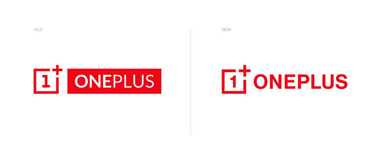
The new OnePlus logo makes a few changes to the brand we've gotten accustomed to in recent years. The "1" has been tweaked and gotten more curve, which OnePlus says will make it "more immediately recognizable". The plus is also slightly larger.

The weight of the word "OnePlus" has also been updated and made more consistent to improve the balance of the logo, and the solid box behind the word "OnePlus" has been dropped as well.
OnePlus's tagline "Never Settle" has gotten an updated look, too. It's also lost the solid boxes behind the words and it has gotten an updated font with upper and lower case letters rather than all upper case.

OnePlus has made itself a new typeface with the goal of creating a more functional font that's legible for long texts and can form words with the least amount of effort for the user.
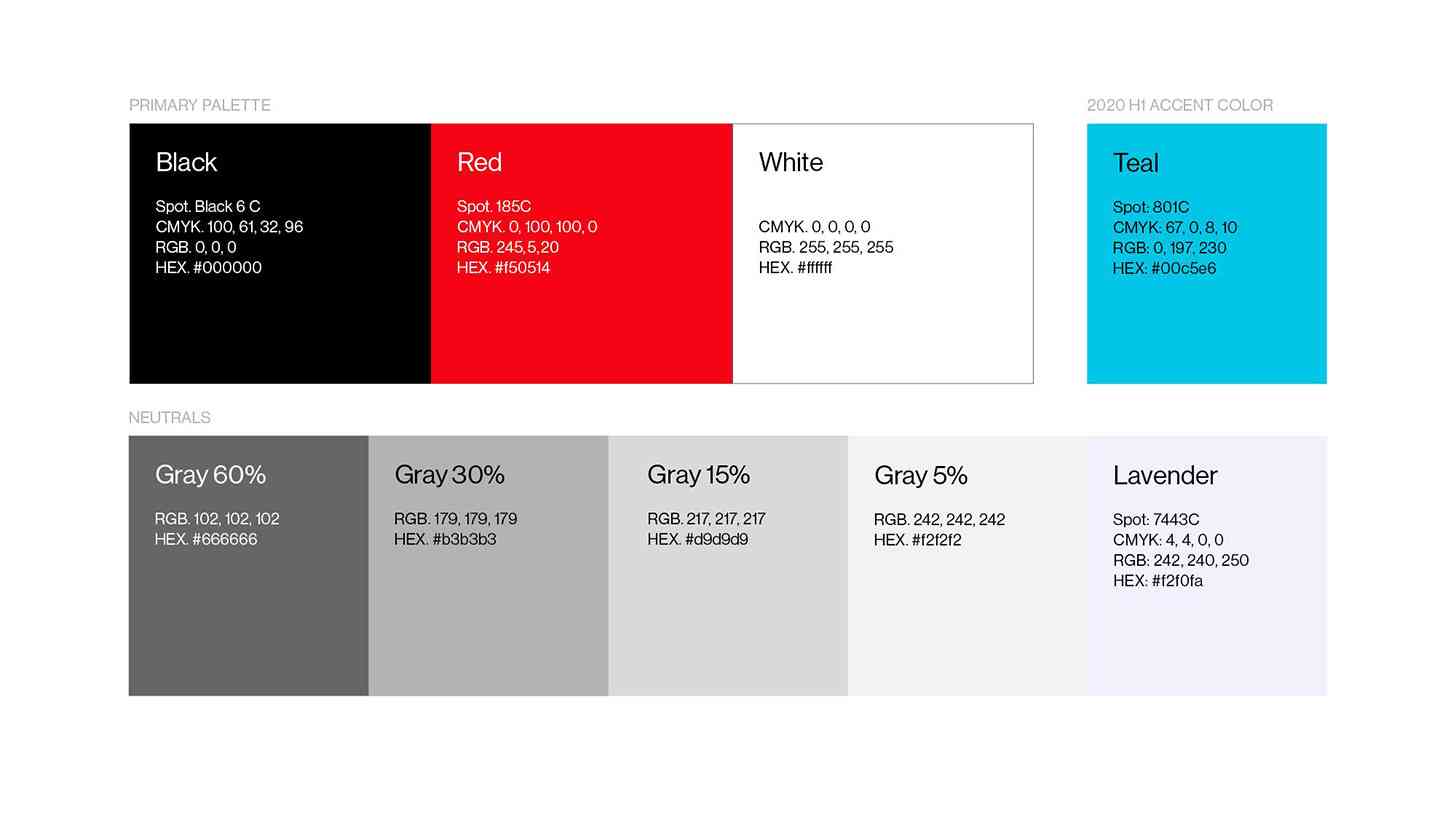
Despite the updated logo, OnePlus says that it's keeping the primary color palette of black, red, and white colors. It is introducing new accent colors to give itself more options to play with, though, including shades of gray, a lavender, and a teal hue.

As for why OnePlus is making these changes, it explains that its brand has remained largely untouched since OnePlus began in December 2013. The goal of this new brand is to shake things up and "better communicate" who the company is to those new to it.
What do you think of the new-look OnePlus?