Some would say the actual appearance of a mobile operating system's interface plays a major role in their opinion of it. For most of us who care to take the time to read and/or write about phones, that's probably true. If a phone's interface is not exactly appealing, the first thing I will do is make not of it publicly. And I probably won't use said software outside of a review window. Give me some gorgeous software, though, and I may adopt it as one of the many platforms I use regularly.
Perfect examples of such can be found in just the last three years. Many found Palm's webOS to be gorgeous and simple, which made a lot of people fall in love with it, even at its most infant state where it lacked the functionality to compete with more mature platforms. Others say Android is ugly and "engineered" or that recent versions are beautiful, and if nothing else, the customization options are widespread, meaning the end user can ultimately choose what their phone's interface looks like. And Apple's iOS has always been accepted as quaint and extremely polished. And the interface of Windows Phone, which marches to the beat of its own drum and has been under constant scrutiny since day one, has created a great divide amongst mobile users and might be the reason it has garnered such a small adoption worldwide in over 18 months.
For me, specifically, interface design is massively important. If I find something to be abhorrent, I simply will not use it. For example, I have trouble picking a Motorola device over, say, an HTC one. And prior to Sense 4, I would buy an HTC phone and immediately put stock Android on it to avoid having to use Sense 3.5 or earlier. I have a hard time wanting to use a Samsung phone with anything but stock software on it, too.
Windows Phone is troublesome for me as well, in that I find the two-tone, tiled interface to be a bit drab. On top of the platform lacking some of the functionality I need on any given day, the interface makes the software rather boring and unexciting to use.
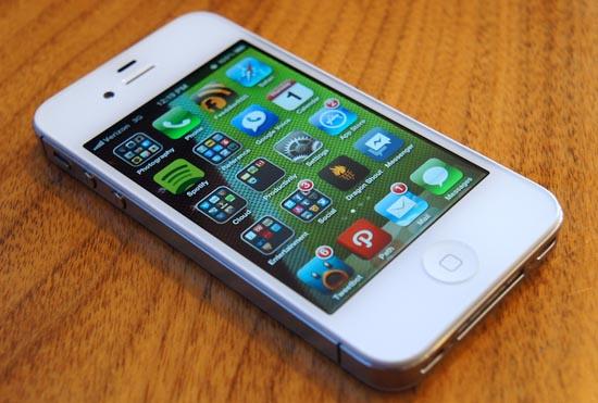
And then there's iOS. Some claim it's gorgeous. I, however, find myself torn over it. It's simple, no doubt. The entire interface is a grid of icons. I works, and it used to with style. But the interface has hardly changed in the past five years, so it has become somewhat dated over time. Apple has not changed the original grid, the overall framework of the OS or much of anything, and it's starting to take its toll on my take of the OS. I feel the interface has passed its time and could use a bit of a face-lift.

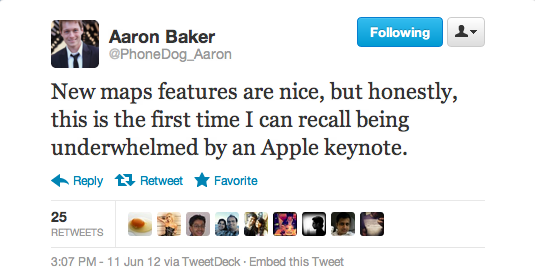
David Beren, Mr. TmoNews himself, and I were talking about this yesterday after the discussion of Apple having run its course came up on Twitter. This conversation was spurred by the underwhelming keynote on Monday. While I don't agree that this is the beginning of the end of Apple, there was definitely a different (somewhat strange) air to Monday's keynote. It didn't have the same excitement an Apple keynote normally has. It was long, drawn-out and mostly uneventful. Even our own Aaron Baker tweeted about it, saying it was the first time in recent memory that he was unimpressed by an Apple keynote.
For me, the keynote was hit and miss, especially when it came to iOS. Leading up to the announcement, I had written several pieces on the different features I was hoping for in the next iteration of the platform. In the most recent piece, I noted that I was hoping for turn-by-turn navigation, enhancements brought to Safari, a better notification system (even better than the haphazard Notification Center), an updated interface, more sharing options and better multitasking. Much to my surprise, three of those seven feature requests came in one form or another. Turn-by-turn navigation is built-into the new Maps and powered by TomTom. More sharing options came in the form of Facebook integration, which is nice, but not everything I was hoping for. And Safari now has a full screen mode in landscape and has tab sync across Apple devices via iCloud Tabs.
I can't say that I was surprised, but Apple missed one particular feature a lot of people were looking for this year: an interface refresh. It's been almost six years since the original iPhone launched and the interface looks, for the most part, identical.
I wasn't hoping Apple would deliver an entirely new, built-from-the-ground-up interface. I wasn't even truly expecting Apple would change anything at all. I was hoping, for their sake and for my love for iOS, that Apple would give us something new to love. Sure, enhancements to Siri are great and so is turn-by-turn navigation. (I navigated through unfamiliar parts of Charlotte yesterday using my iPhone, and I must say it was quite nice.) But I was really hoping Apple would change it up a bit, introduce a new color, a new icon layout arrangement … something, anything new.
Alas, they didn't. (Unless, of course, you want to count them changing the color of the status bar when you're in various native applications.)
For contrast, the Android development team has updated and altered the interface with every major update. This is both good and bad; the same goes for not updating the interface. On one hand, not updating an interface can make it stale. On the other hand, updating too much can make it difficult for users to get used to changes in new versions of software. A balance between the two extremes is ideal.
Albeit for the better, the changes in interfaces between Gingerbread and Honeycomb or Ice Cream Sandwich were radical. It took me weeks to get over long pressing blank spaces on home screens to add widgets. And I still find myself thumbing through the Settings app, expecting the old interface. But, in a way, these changes keep the OS fresh and new. It makes it feel like developers are truly making progress – there is a noticeable, visual difference between OS versions.
In the case of iOS, there is no visual indicator that is a dead giveaway for which version of software a user is running (unless you count things like Newsstand, Siri or Passbook). Each iteration looks almost identical, and the only way to truly tell which version a user is running is by paying a visit to the About section of the Settings app. In my experience, through all the iOS updates I've been through, the OS has become stale. It's in dire need of an interface refresh – just something to set it off again for another few years.
Then there is Windows Phone, which could go either way at this point. It isn't quite two-years-old yet, and the second major update is on the horizon, slated for launch near the end of the year. Windows Phone 8, or Apollo, is said to bring come major improvements to the platform, and we can only hope some of those are in the form of interface changes, such as more tile and background colors, bigger and smaller tiles, etc. It doesn't need anything major like a switch to icons and an app drawer, but something to let users know design and interface progress is being made.
No product is perfect, not even Apple's iPhone or mobile operating system. There are tiny changes we all would make to the interfaces of iOS, Android, Windows Phone and even webOS. And for the designers of said interfaces to believe they are anything but a work in progress is dreadfully wrong. In the same respect, UI is not the same as UX (or user experience) and the interface itself should only hold so much importance. Interface changes should be slight, barely noticeable (if at all) and not at the expense of a stellar UX.