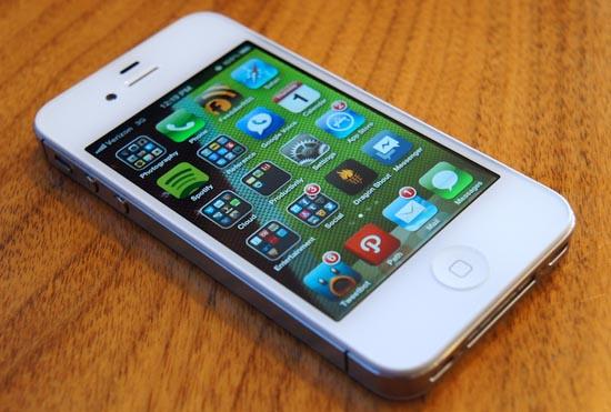
We've been expecting the next major iOS upgrade, predicting new features that may come and anticipating updates or redesigns of existing ones. Many expected the software upgrade, iOS 6, would be debuted at the Worldwide Developers Conference 2012, which kicks off tomorrow afternoon (morning for you west coasters). And the enormous iOS 6 banners that we're photographed on Friday evening all but confirm that iOS 6 will be unveiled at the conference.
What remains to be seen, however, are the actual changes the OS update will bring. Will Apple play this one conservatively like in past versions? Does it have a few tricks up its sleeve?
Whatever the case, there are things we all are hoping for, things we've been longing for since iOS version 1.0 or since last year's update. Some are, of course, more far-fetched than others. But no less, they're worth sharing. Here are the major changes I'm hoping for in this year's iOS update:
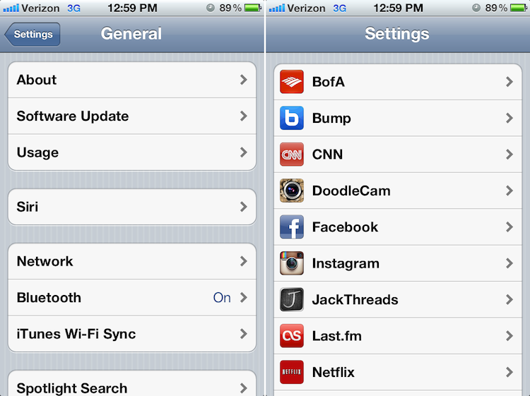
Since the very first version of iOS, very little has changed in terms of the interface. And more than once now, I have stated how iOS needs a face-lift. The overall look and feel of the OS is a bit drab and dated. The Settings app and standard app headers are beginning to look more and more like Windows 98 framework each and every day. And the home screen is still just a big grid of applications and folders.
There have been some rumors spreading of an updated color scheme to iOS 6, but I'm begging that Apple does more than just change the colors up. The operating system performs and works well – nearly flawlessly. But it's time Apple brings iOS out of 1998 and into the 21st century.
Oh, and please let the skeuomorphism die in iOS 6. It's neither cute nor useful.
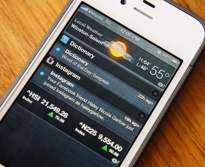
In response to the massive amounts of negative feedback, in iOS 5, Apple introduced a new and updated notification system. It replaced the obtrusive pop-up notification – that would always interrupt whatever your were doing when you received a new text message or other type of notification – with an updated one that resides at the top of the display. Also, instead of relying on badge notifications on icons, all unattended notifications are collected and displayed in Notification Center, an Android-like pull-down notification shade.
Notification Center was a noble attempt at better notifications for iOS. But the system as a whole feels like a half-hearted attempt. Without pulling Notification Center, there's no way to tell how many notifications are hidden in the shade. And there is nothing begging for users to pull Notification Center down. And the pop-up banner notifications still get in the way and are a pain to dismiss.
I would like to see at least the number of total unattended notifications displayed in the status bar. And I would like to see an easier way to dismiss banner notifications (or see them shift the entire interface down) rather than uncontrollably commandeering the top quarter-inch of my display.
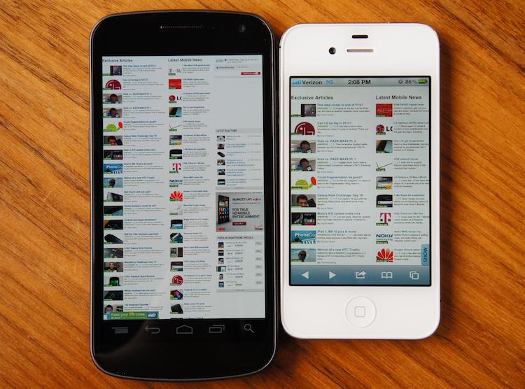
Back in February, Google released Chrome for Android, which implemented some awesome features in a mobile browser. And even the stock Ice Cream Sandwich browser came with features like Chrome bookmark sync.
At the risk of everyone throwing a red flag on Apple copying Google, this is where Apple could definitely take a few pointers from El Goog. I would like to see similar options in Safari for iOS. In fact, I would like to see a more robust browsing experience all around. For instance, it could use tab sync across iDevices and Macs, fullscreen mode, more sharing options, desktop site request, the ability to search a page for specific words or phrases, etc.
I don't really use Safari on my MacBook or iCloud. But I might have a reason to if Apple were to implement a tab sync option … or something to that effect.
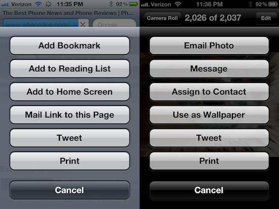
While I mentioned "more sharing options" above for Safari enhancements, it deserves a section of its own. One of the bigger rumored features for iOS 6 is Facebook integration. Don't get me wrong, that would be great. But I can think of at least 10 other services that I would rather see integrated over Facebook.
As I explained not long ago, the answer to this is Apple opening up sharing APIs instead of integrating a specific service throughout the operating system. However, this would require to put some power and control over the OS itself in the hands of third-party developers.
All I want is the ability to share Web pages, pictures and any other type of media from one app to any other application or service without having to incessantly switch back and forth between applications. Android can, why can't iOS?
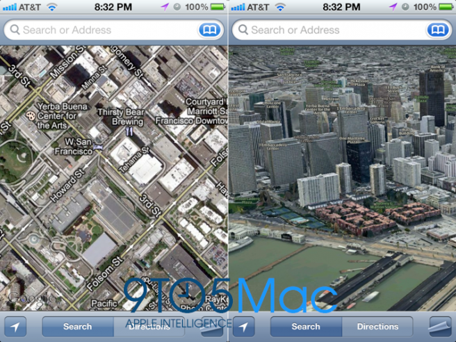
Another major feature that has been rumored for iOS 6 is an updated Maps experience. They are believed to be replacing Google Maps with their own set of 3D maps. What features these new maps will include is unknown. But I know what single feature I could seriously use on iOS: built-in, free turn-by-turn navigation.
This is one of the major reasons I always carry an active Android device. I can get turn-by-turn directions, completely free of charge, on Android. On iOS, I can get directions, but they are not spoken and it's a pain trying to use them to navigate an unfamiliar location and drive at the same time.
Come on, Apple. Fix this!
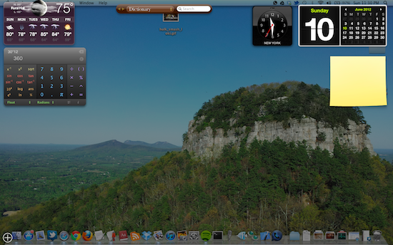
On my MacBook, one of the features I use more than I ever imagined I would is Mission Control. It's a page that I have setup with various widgets, like a calculator, dictionary/thesaurus, clock, calendar, notepad and weather. It can be accessed from any of my desktops, simply by dragging the mouse to the lower left corner.
I would like to see something like this in iOS 6. For example, long-pressing the home button could pull up a page with an iMessage widget, weather, Facebook or virtually any other info-packed widget.
Likewise, I would like to see a better task switcher method for the iPhone. The current method of double-tapping the home button certainly works. But clearing out all recent apps and switching back and forth between various apps can become tiresome. That said, I really enjoy the gesture-based task switching on the iPad. If Apple could implement three- or four-finger gestures on the iPhone for task switching, it would be fantastic.
These are just a few of the things I would like to see tomorrow. I'm almost positive most of them aren't going to happen. Hey, a man can dream, right? Anyway, I'm interested in hearing what you guys and gals are looking for from the iOS 6 announcement. Sound off below and tell us what changes you want to see in iOS 6.