Today's mobile application offerings are a far cry from just three years ago. In late April 2009, there were roughly 35,000 applications available for download in Apple's App Store. In March 2009, Google's Play Store, which was known as Android Market then, was home to a mere 2,300 applications. As of March 7, App Store has grown to a staggering 585,000 applications and the Play Store hit 450,000 application in February. Combined, the two stores now offer over one million mobile applications. Impressive, to say the least.
Of those million or so applications, a large number are made specifically for smartphones (and iPods), not their larger tablet counterparts.
Tablets have only gained acceptance on a large scale recently – the first iPad launched on April 3, 2010 and an army of high-end Android tablets followed beginning in 2011. And while Apple claims there are roughly 200,000 iPad apps in App Store, quite a few applications are not officially supported on the Apple tablet. The number of Android tablet apps is constantly growing, too, but still pales in comparison to its iOS foe.

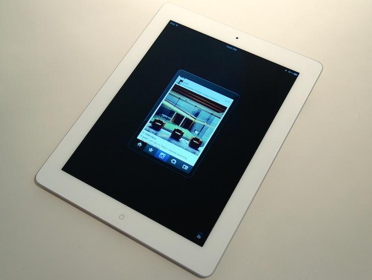
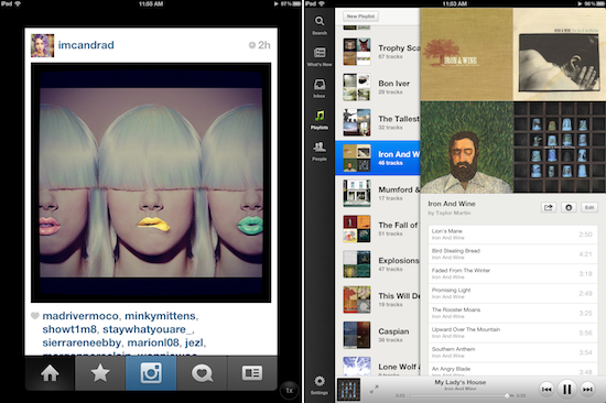
On the iPad, an iPhone (non-iPad) application can still be installed. But a lot of the high-quality experience you would get from using it on an iPhone is sacrificed. Instead of high-res graphics and a multi-paned interface like most iPad apps, you simply get a blown-up (2x) version of the iPhone application, which leads to a grainy, pixellated and poorly optimized interface. Instead of using the larger merged or split iPad keyboard, non-iPad apps use the iPhone keyboard. And as you can see above, applications that have no been optimized for the iPad (left) are still fully functional, but text is extremely large, graphics are usually pixellated and there is a ton of wasted space (look at the half-inch margin around the blown-up app). Spotify, which was updated to include iPad support and was released this morning, can be seen on the right in the above picture.

Android applications, on the other hand, tend to handle non-tablet apps differently, albeit not notably better. Ultimately, it depends on how the developer coded the application. But, usually, the application is simply stretched to fit the display, also resulting in a lot of wasted, unused space to the right of very small, left-aligned text. Much like on the iPad, you are given the option stretch the elements to fit the display, but it looks pretty horrid, too. A decent comparison is the Twitter for Android application (above on left) versus the optimized Plume application (right).
I (somewhat) jokingly tweeted Spotify asking where the iPad app was already. We had seen a couple leaks already, and we'd been hearing about it for some time now. And that tweet kick-started an interesting conversation between a couple colleagues and myself. Taylor Hatmaker (@ouroboring) of Tecca replied, saying that the Spotify application actually looked okay at 2x. I wouldn't know, though, because I remembered it wasn't optimized for the iPad at the time and deleted it immediately.
But this lead to a short discussion about function over form. Hatmaker asked her followers if they use non-tablet optimized apps on their iPads. Jon Mitchell (@JonMwords) of ReadWriteWeb responded saying, "I use a bunch. I sure wish they were tablet-optimized, though."
A few weeks back I noticed that my mother, who is almost as obsessed with tablets as I am, is always using blown-up iPhone applications on her new iPad. She did the same on her first-generation iPad. And she used non-tablet applications on her XOOM and ASUS Eee Pad Transformer.
It never fails. Every time I see it, my skin crawls. I cannot force myself to use an application not optimized for tablets on a tablet. I responded to Hatmaker's and Mitchell's tweets saying, "I just can't do it. I feel like I'm condoning a developer's apathy for tablets and tablet users." Mitchell made a very good point that it could definitely be developer exhaustion rather than apathy. But that doesn't change my stance.
I simply cannot force myself to use a non-tablet app on a tablet. It's unnerving. I will search for days – weeks, even – looking for an alternative or hoping and praying for the developer to update the app before I completely lose hope and resort to just using the app on a different device. On my Transformer Prime, for instance, I only use Facebook via Browser. You will never catch me using the poorly optimized Facebook for Android app on a tablet. Nor will I use Spotify from an Android tablet, simply for how disgustingly ugly the interface is.
There seem to be more people that side with Hatmaker and Mitchell than myself. Maybe I'm just too picky when it comes to applications, a stickler for interface design. But I've had no problem using ugly applications in the past. I think my main issue with tablet applications (or non-tablet apps, really) is the principle and lack of foresight from the developers. Tablets deserve a bit more credit and attention than some developers give.
Whatever the reason, I can't force myself to use them. But I'm interested in where you stand, people. Do you use non-tablet apps on your Android tablet or iPad? Or, like me, do the 2x feature and all the whitespace make you want to pull your hair out?