Apple released the official version of iOS 11 for eligible devices last Tuesday, September 19th. A few years ago I was keen to check out the betas before the official release, but this time around I decided I would rather just wait until the official, finalized version was available instead.
I already knew that iOS 11 would be more about refinement than excitement, so I knew that it wasn’t going to be something that would absolutely knock my socks off. However, despite knowing most of the features coming with iOS 11, I wasn’t prepared for how much the update would annoy me with its little design quirks that I just don’t find appealing.
The first thing I noticed was the new notification center. Instead of the frosted glass or blur effect that I had grown used to, I was greeted with my… lock screen? I thought it was a bug at first, but it turned out this was a feature. I’m not a fan. I tried to give it time so as to not respond with a knee-jerk reaction, but after almost a week I’m confident I’m used to it now – just not crazy about the way it looks, despite the extended functionality you get with it now.
The other thing I noticed was the new giant waste of space that apps in apps like Messages, Photos, Wallet, and Notes. There’s now a giant header on top of the app. Maybe it’s just because I’m used to iOS and have never had a need for these things, but it just feels like wasted space to me.
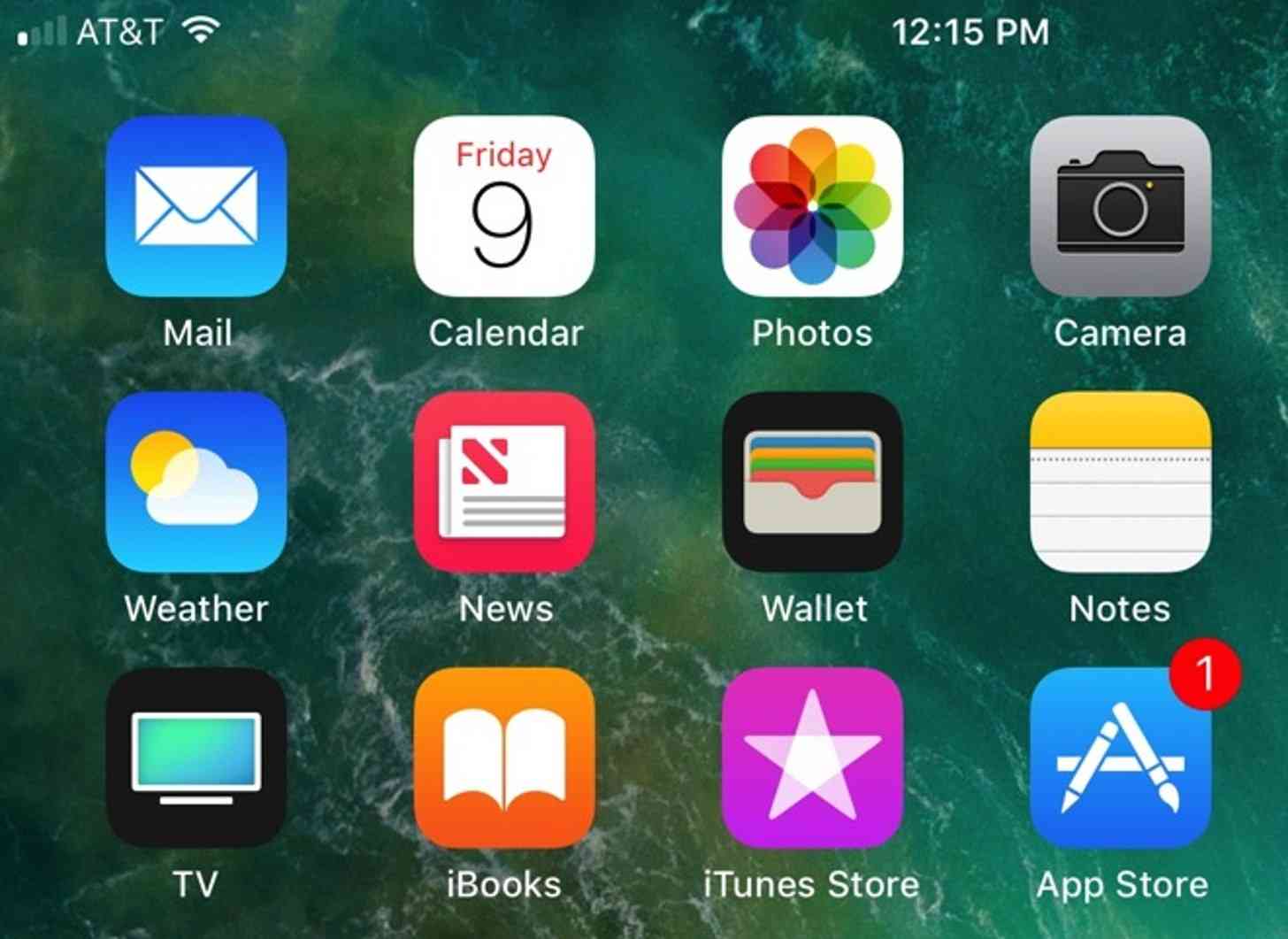
Those are the only two things I noticed that really bothered me. On the up side, I’m glad that the signal bars are back. Not that there was anything particularly wrong with the dots, but the bars seem to take up less space and look nicer in my opinion. The subtle changes to the passcode screen and the calculator are nice as well, and having an integrated Files app is pretty great, too.

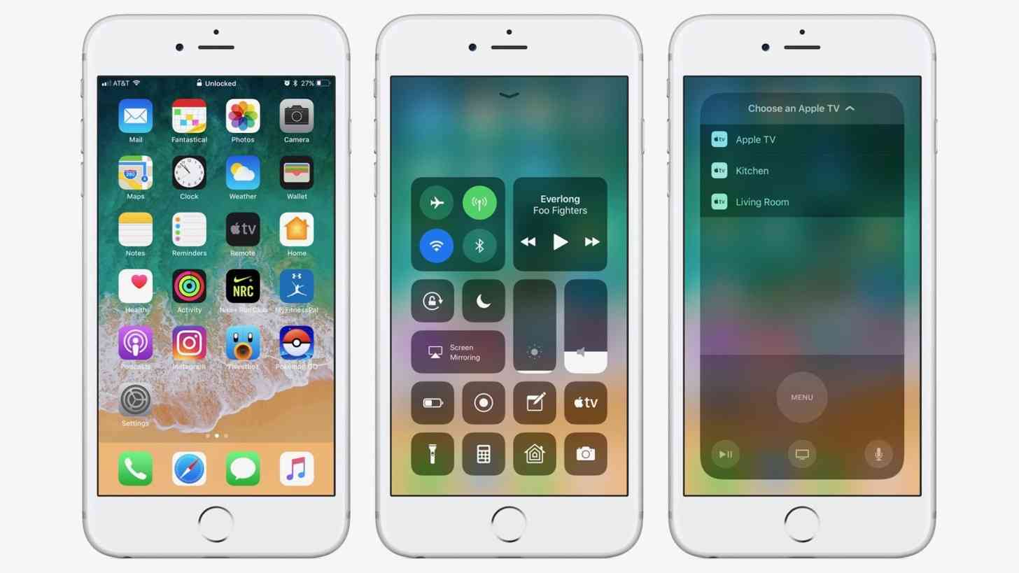
The ability to change Control Center is definitely a big plus from this update. I was elated with the Control Center when it was first unveiled, but being able to customize it is something that the feature was desperately lacking. I’ve already customized mine to my liking, and it has proved extremely handy (although I still toggle the Control Center on accident more often than I’d like just trying to scroll through pages).
Probably the coolest change to come with iOS 11 is the inclusion of ARKit, which I’m only just scratching the surface with (and probably won’t amount to much more than that on my small iPhone) but it is a really cool concept to have at your fingertips.
Most importantly, I haven’t noticed a significant change in battery life, which is always something I’m concerned about when a big update hits any of my phones no matter what operating system I’m using. My iPhone SE has so far proved to have excellent battery life over the course of a day despite its small size, and I was worried that iOS 11 might spoil that. The good news is that I haven’t noticed any change, which is fine by me as the battery life was already good in my opinion.
Overall, it has about the same number of pros and cons for me. I enjoy some of the content, but I’m less enthused about some of the design changes that came with it. In the end, as long as my battery life isn’t affected then I don’t have much to complain about; just some adjusting to do.
Readers, what are your thoughts on iOS 11? Are you a fan of the changes that came with iOS 11? Let us know your thoughts in the comments below!