The iPhone follows a cycle. Ever since the iPhone 3GS, Apple's shown that every other year we can expect a device that isn't necessarily completely groundbreaking, but does add a little bit of value to those who may want to get their hands on the latest piece of technology. The iPhone "S" model may now be the iPhone "s" model, but that doesn't mean a lot has changed. We're still on Apple's storyboard here, and we're still subject to the bi-yearly upgrade that doesn't change more than what's absolutely necessary.
With the iPhone 5s, Apple may have done a bit more than what's "absolutely necessary," or maybe not. Just like any other piece of technology that bears the title of "successor," there's a lot of comparisons, contrasts, and vitriol. Is it worth the money? Is it worth the effort put forth by the company to design and create it? Would Apple be better off just waiting every two years to upgrade their hardware? Is the iPhone 5s worth its weight in "gold?"
Let's find out.

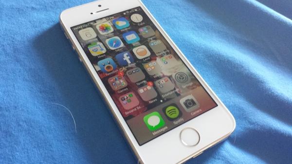
First things first: the iPhone 5s looks, at first glance, like an iPhone 5. Apple didn't make any real waves in the design department when it comes to the overall look and feel of their flagship device. However, it's when you get down to the details and really look at the device that you start noticing what, exactly, Apple changed.
The front of the device is "dominated" by a 4-inch touchscreen, as much as a phone with a 4-inch screen can be, anyway. The screen itself is a LED-backlit IPS LCD panel, with a resolution of 640x1136 and has a pixel per inch count around 326. Above that said panel, you'll find the speaker grille, the 1.2MP front-facing camera above that, and the front-facing sensor just to the left.
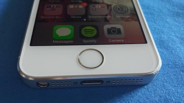
Below the touchscreen, there's the standard Home button, but it's not all that standard anymore. This time around it's a Sapphire surface, made that way so it doesn't induce scratches over time. Why? Because it's also a fingerprint scanner, which is designed to let you get things done --buy things-- faster. You can also use your fingerprint to unlock your phone, instead of having to press the Home button several times a day, or tap the Power button. We'll get to TouchID, the software married to the new Home button, shortly.
On the bottom of the iPhone 5s you'll find the proprietary Lightning port, which is meant to not only charge the device, but also work as a way to transfer files from your computer to the phone. You'll also find the 3.5mm audio jack near the left-side corner. Along the right side is the SIM card holder.
The top of the device holds just a single button near the right corner: the Power button. As usual, the button is raised just enough from the base of the phone to make it easy to find with a roaming finger. It offers great feedback and travel, and offers up a faint "click" sound when pressed just to make sure you know you're activating it.
Along the left side is where the majority of the buttons reside. You'll find the toggle switch, which can work as a way to mute your device if you so choose. Below that are the individual volume buttons, both of which are small circular activators. As with the Power button, they're raised enough to be easy to find and press, and offer plenty of feedback and travel. And hey, they click, too.
On the back of the iPhone 5s is the standard Apple logo near the top, while the 8-megapixel camera and the dual-LED flash are housed within the top-left curve. Near the bottom, you'll find the iPhone logo, along with the customary certification information.
The iPhone 5s is a paramount example of Apple's attention to detail. This is a phone that's made to not only win people over by its general aesthetic, but it's also meant to keep fans of good design coming back. The iPhone 5s is industrial design through and through, with clean, prominent lines. Simply put, it's still one of the best looking smartphones on the market, even as the competition starts to get hotter.

I wanted to wait on this review because of the software. I had been using iOS 7 through its issued betas since they began earlier this year on an iPhone 5, and my overall attitude towards the change was hit-or-miss. There were days when I liked it, and days that it drove me insane. I chalked most of this up to the fact it was beta software, and I knew that many of the bugs that Apple was suffering from, or even some design decisions that I didn't agree with, would stick around for a little while after the official release. So, I wanted to wait until the majority of the kinks were ironed out before I took a whack at Apple's newest smartphone.
Waiting paid off. As early adopters (of which I was one) started to clamor for changes and bug fixes, and Apple took notice, a few updates were issued and downloaded to those who needed them. Since then, and since the launch of the iPhone 5s and iOS 7, a lot of the issues have been eradicated, and iOS is back to being one of the most stable mobile operating systems available.
iOS 7 is a huge change for the platform created by Apple, both in good and bad ways. Some might say that the icons that Apple chose for some, if not most of its built-in apps aren't that great, but obviously that comes down to personal taste. A lot of the changes that Apple implemented come down to personal taste, actually.
But the functionality of these changes should be pretty straightforward. The alterations that Apple made to their Notification Center, for example. You're able to swipe between your Today screen to your All section, and over to your Missed category, which makes navigation a breeze. It also keeps things from getting cluttered, as it's not all on one screen and just stacked on top of another notification.
Control Center is the new way that Apple wants you to control your music, you screen brightness, as well as access things like Airplane mode, your Wi-Fi connectivity, as well as your Bluetooth settings. You can also activate things like your calculator app, the camera's LED to work as a flashlight, or even access the camera. It's accessible within any app, and it's smooth and painless in its efficacy.
The iPhone 5s is currently running iOS 7.0.4, and after all the necessary bumps to get up to this particular software version, the platform is far more stable than in previous versions. The 1.3GHz dual-core processor wasn't doing the software any favors, mind you, but now that there seems to be some kind of balance between the hardware and software again (something that Apple is known for), the experience is up to par with previous devices.
If you like using folders to throw your app icons into, then you'll be happy to know that you can have a whole laundry list of apps in folders now, as there isn't a limit. You could shove everything in one folder and limit your home screen usage altogether if you so chose. And if you're someone who uses the iPhone search function, it's as easy as swiping down on any home screen to access the function now. It's no longer a separate home screen.
TouchID. It's the new software that's meant to make you more secure on your device, while also making it easier to access and buy stuff from Apple's iTunes and App Store. In theory, and I'm sure on paper, it works great. In our usage, though, TouchID just stopped service a purpose outside of having a quicker, and hardware-pressing-free way of turning on our device. By pressing the TouchID-linked fingerprint to the Home button, you can unlock your device without having to press the Home button itself. It's quick, easy, and it makes worrying about breaking the Home button with so much usage almost obsolete.
However, when we'd try to buy new (or even previously purchased) apps from the App Store, it generally asked us to insert our password anyway. Despite having TouchID activated. Worse, it would scan the fingerprint needed after inserting the password. It would make sense if this was a form of two-form security, but there's no way to turn it off. Moreover, it would be completely random in its implementation. Sometimes it'd ask for a password, and sometimes it wouldn't. There didn't seem to be any rhyme or reason to it.
The keyboard has been changed in iOS as well, given a new aesthetic appeal, but the main function of the 'board hasn't changed nor has it suffered in quality. Even at our fastest speeds, words were caught and typed out accordingly. And when autocorrect was needed, the results were better more often than they were laughable.
The camera may have the same megapixels as the iPhone 5, but Apple certainly made improvements where improvements were needed. The images that the iPhone 5s produces are sharp and clear, and even its lowlight shots turn out well enough. And in situations where the light may not be perfect, the two-tone dual-LED makes such a huge difference that it's hard to want to use anything else.
Call quality and battery life are great and shady, respectively. While I used the iPhone 5s to make calls and receive them, I was told that I sounded quite clear, and I never had any issues with static or distortion. When I took calls in noisy areas, the person on the other end told me I was still coming in nice and clear. The battery life, though, is all over the place. One day it's great, lasting me more than all day with moderate to heavy usage. Other days, for seemingly no reason, the battery just doesn't seem to want to do its job much at all. It's good enough more often than not, though, easily last at least seven hours with moderate usage. We were able to make it from 7:00am to 9:00pm without any issues at all, with more than forty percent of the battery remaining.
The iPhone 5s may not be the device for someone who upgraded to the iPhone 5 last year, but it doesn't necessarily have to be, either. As usual, Apple changed what they knew they had to to get people excited about the device, from the processor, to the camera, to the inclusion of TouchID. It's certainly a fine upgrade for anyone who had hung not other iPhone 4S, and with the changes that Apple made, even those who want to ditch their iPhone 5 for the newer model can do so without feeling terrible about the decision.
With three options to choose from, both in color (white/silver, gold/white, space grey/black) and storage capacity (16GB/32GB/64GB), there are certainly options for those who need them. The price tags can be hefty for anyone wanting to forego a contract or payment plan, but that's certainly nothing new to the mobile industry for high-end, flagship devices.
In the end, there's no doubt that the iPhone 5s continues Apple's legacy for creating high-end devices, of which there should be plenty of attention geared towards. However, Apple continues its trend to making the bi-yearly upgrade questionably necessary for the regular market. Even for those who do like to upgrade every year. However, if you want a top-level camera, added security, and the newest software and new internals, the iPhone 5s won't steer you wrong.
The Good: Strong, sturdy design. Great display quality. Speedy and stable software. Amazing camera.
The Bad: Finicky battery. Still only a 4-inch display. TouchID still has kinks to work out.