One of the most talked about and mysterious devices of the year arrived on the market just last month, and since its official announcement we have had plenty of news, editorials and videos pop up about it here on PhoneDog. A device that is arguably considered to be the most overhyped phone of the year, Google and Motorola finally released their first device together since Google's acquisition of Motorola back in August of 2011 with mostly surprised reactions. Moto X, the first Google-Motorola device, could only be described as mid-to-high range at best when it comes to specifications. The phone that was supposed to be the "end all" of phones, everybody's dream device, turned out to be nothing more than a phone with a few defining features and a decent camera.
But once you push past all of the shattered hopes and disappointment that came for some with the phone's announcement and delve deeper into the actual device and how it works, what exactly do you find with Moto X? I myself was quite skeptical of the device once I heard of its "Always On" sensors. Why would I need a phone that's always on? And what about the battery life, an issue that most phones already have enough trouble dealing with - won't that suffer as well? These are all questions that we're able to answer throughout PhoneDog's written review of Motorola's Moto X. With that being said, let's begin!

Moto X is a relatively small device compared to others who share the same screen size, at least in height and width. The Moto X measures in at about 5-inches tall and 2.57-inches wide, making it both shorter and slightly narrower than my HTC One, which also has a screen size of 4.7-inches. This is mostly due to very small bezels, especially on the sides of the screen. However, despite the device being small, the Moto X manages to pack about 5 oz. of weight into it, giving it a little heft. Moto X is approximately 10.4mm thick, and also sports a curved back design. Although Moto X has plenty of design options for AT&T customers using Moto Maker, we went with the plain white design that is made out of a composite material. It has a cool matte feel to it, but it is also somewhat slippery without a case.
Looking at the actual design of the phone, you'll notice the front of the device has a pretty standard setup. You have the 4.7-inch screen and the earpiece placed not too far above it (remember, small bezels). To the direct left of the earpiece you'll see the proximity and ambient light sensor, and to the far (far) right of the earpiece you will see your 2-megapixel front-facing camera. Just below the screen is the microphone. You won't be seeing any capacitive buttons on this device, because the Moto X features virtual navigation buttons. On the underside of the device is the micro USB charging port, and that's it. The right side of the device features the volume rocker and the power button. Moving to the top of the device, you'll find the headphone jack, and just next to it you'll find another microphone (for Automatic Speech Recognition and assistance with noise cancellation). To the left you have the micro SIM card slot. The back of the device offers the most with the 10-megapixel "Clear Pixel" camera with an LED flash just below it. There is a speaker grille to the right of the camera, and a small circular concave area for the Motorola logo under [the camera]. Finally, we find carrier branding near the bottom and a third microphone just under and to the right of the carrier branding.
The device itself feels pretty solid. While the back of the device is made out of composite, the front frame of the device is a slightly protruding plastic and almost makes it look like the phone comes with a case on it (spoiler: it doesn’t). Most of the front of the device is made out of Corning Gorilla Glass, so the hope is that the device won't be as prone to cracks and damage when dropped, but of course it's always good to put a case on your device. That being said, with so many customization options from Motorola's Design Studio (again, AT&T customers only) it's going to be hard to bring yourself to put a case on this device unless it's something clear if you end up going that route.
Overall, the Moto X is a very clean looking device with a pretty standard design (at least for the white model), but it does feel great in the hand. Even with the slightly slippery matte finish on the back, the curved design helps to take care of that by fitting well in the palm of your hand.

And now we get to the good parts of the device, or for many people out there, the not-so-good parts. The Moto X disappointed many techies by being released with specs that were top-tier last year, which is a pretty long time ago for this industry. For a lot of people reading this review, the specs are more of a reminder of all of the things that could have been, but aren't. Fortunately, there is an upside to all of this, but we'll get to that later. First, the specs!
Moto X uses a Dual-core Snapdragon 1.7GHz Krait processor, and has 2GB of RAM. The 4.7-inches of screen feature a 720 x 1280 display, resulting in about 312 pixels per inch. You're able to choose between 16 and 32GB of internal storage, but unfortunately there is no option for an external microSD card, so for any extra storage you'll need to resort to using the cloud if you need to. The back of the device features a 10-megapixel "Clear Pixel" camera (it is competing with the HTC One’s “UltraPixel” camera by featuring larger sensors in order to focus on taking good photos in low-lit situations) on the back and a 2-megapixel camera on the front. The device ships with Android 4.2.2 (Jelly Bean) but will be upgradeable to Android 4.3 "soon".
While the specs may have been disappointing for some, the rest of what the device has to offer seems to teach us the age old lesson to not judge a book by its cover.
Motorola has been touting the fact that Moto X will basically be your personal assistant without having to do so much as touch your device. The device has a couple of "Always On" sensors that are able to tell when your phone is in use and when you are speaking to it. While it sounds scary (or at least, it did to me) it actually turned out to be quite a pleasant experience.
Of course, one of the better aspects of Moto X is that it features a very lightly skinned version of Android. Motorola's UI is probably the closest you can get to stock Android without actually being stock. Even if it does only feature a dual-core processor, it runs the device smoothly and without lag.
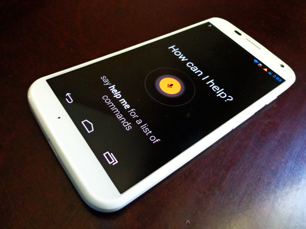
And then of course, you have what makes the Moto X such a special device: Touchless Control. Touchless Control isn't like Samsung's version of “touchless” control where you use things like Air Gesture, Smart Pause, or using any of those physical indications that you want to do something without actually touching the phone. Moto X takes a different route and decides that maybe Touchless Control should be completely touchless, as in you don't even need to pick up your phone in order to control certain functions of the device. Moto X's touchless controls use the power of your voice to control the device.
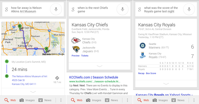
If I want to know the weather, all I have to do is say "OK, Google Now" and ask the phone what the weather is like. Moto X looks up the weather in my area and voila! Google Now will tell me what the weather is like, and I didn't have to touch my device once. An information card also pops up on your screen with more information related to your query if it’s available. You can ask it almost anything that you would normally Google Search, and most of the time the results are pretty accurate. Aside from the weather, it also properly give me directions to the art museum nearby, the score of the Royals game the night before and the next time the Chiefs will be playing a game. Pretty cool stuff.
However, I did find that Touchless Controls were a bit awkward; you can't use any other phrase other than "OK, Google Now," to get the prompt to come up. It does feel strange to have to say that every time I have a question, and it also feels a bit unnatural. It would be cool if Moto X had been able to use more of a "people" name. It was also only useful when it came to Google searches. Everything within the phone like making phone calls, sending text messages or sending e-mails were all more complicated to accomplish. It wasn't as simple as "Call Mom" and the phone would connect you to Mom. It would look up all of the contacts with "Mom" in it and you would select which one you wanted. On the other hand, at least if it misunderstands you, you have the chance to correct yourself beforehand.

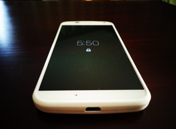
There were two other features that really stood out to me about Moto X that I liked. The first one is Active Display, which basically means that you don't have to press your power button to check the time or notifications anymore. All of those sensors that Moto X has within the device are able to read when you're likely to be looking at your screen, like when you take it out of your pocket, purse or merely just picking it up from a table. Active Display will show a simple black screen with the time and an icon of either a lock that you can swipe down to unlock, or a notification icon that you can press down to preview. It's actually pretty awesome.
The second feature that I liked was part of the camera. The 10-megapixel Clear Pixel camera itself is pretty good on its own for both well-lit and low-lit situations, but there was a certain feature that I was most pleased to see present. I have said before that Zoe is my favorite camera setting in the HTC One because it takes a small video and creates snippets that you can then choose a single frame from. The Moto X has a similar feature, except for it's much easier in the fact that you just hold down your finger on the screen as it snaps picture after picture to get that one perfect shot that you've been looking for - and you can hold it down for as long as you need to. Of course, you'll be deleting a lot of pictures as well, but it's still one of my favorite features.
I wish I hadn't been so hasty to judge the Moto X because of all of those sensors they were talking up, because I think this device is actually very comparable to my HTC One in terms of usability. I found myself really enjoying both the form factor and the extra features, of which I was sure that I would hate. The battery life was phenomenal and the camera took great pictures.
Despite the mid-range specs, I found that Moto X performed quite well. The one thing really holding back the Moto X is the initial price on-contract at $199. For that same price you could be picking up a phone with way better specs, but from a basic consumer standpoint the features are probably worth the money more than the specs. And, to be fair, the lower specs don't really seem to make a huge difference on how this device performs, because I still found myself surprised at how much I enjoyed the device. Still, Moto X could have picked up a lot more traction if it had been priced more moderately.
The Good: Big screen, small form factor; good camera overall; Active Display is a convenient way of displaying time or notifications when you need it; great battery life; Touchless Controls are great for Googling on the go; close to stock Android.
The Bad: "OK, Google Now" can be awkward to use; Touchless Controls could use more integration with basic phone functions like voice calls and messaging; no microSD card slot; Not a great price compared to higher end phones that share the same price tag.
The Verdict: Moto X is actually a really cool little phone that packs a big screen. While the specs might not be the highest, it still runs the device as smoothly as butter, likely do the light skinning over Android. Although I was quick to assume that Touchless Control was completely gimmicky and I would never use it, I actually found myself using it more often than not when I needed quick info. Active Display is also one of the coolest "innovative" features that I've seen in a device in a while. The Moto X's Clear Pixel camera is also really nice for taking photos in different environments, and even though it might not excel beautifully in low-lit situations, it still does a decent job. If features are your thing and specs don't really matter, the Moto X could very well be worth $199. But if specs are still of somewhat importance to you when it comes to how a device is priced, you may want to wait a little longer for a price to drop before picking up this device.