
There's a Key Lime Pie-size hole in the Android ecosystem, and Jelly Bean hasn't filled the gap. Jelly Bean has suited me well for the past five months, but that doesn't mean I'm not getting bored with it. I'm looking for more quick settings in the notification pull-down bar, an overhaul to the app drawer to add more icons per page, and a maximum CPU-clock speed to negate Project Butter's battery drain effect.
Having said this, Android 4.2.2 brings increased standby time (in my experience), and group messaging support via MMS. I'd venture to say that these are long overdue for the operating system, and as a whole, represent a drastic effect in how I use my phone. You can find the full changelog for Android 4.2.2 here.
But there's something missing from Android Jelly Bean that I usually only notice when Google releases the next iteration of their mobile operating system. Jelly Bean is bar-none the most fluid and polished attempt created, yet once Aaron Baker mentioned it was "bland and visually boring" in his Nexus 4 Challenge review videos, I started to notice it as well.
Don't get me wrong, reader. I love Jelly Bean's transitions, fluidity, and power. It's my favorite mobile operating system experience available. There's only one problem with it; It's not as fun to use as Ubuntu for Phone which I just spent the better part of 8 hours toying with.
Before I dive deep into my impressions of the Ubuntu experience, I have a story about the last time I was this excited to flash a ROM. (Yes, I realize I flashed an OS, not a ROM, but it's my first time flashing an OS, so I can only compare the experience to ROM's.)
It was on my HTC Inspire 4G for AT&T about three years ago. It was a stock HTC Sense ROM compiled by Mike1986, an XDA Developer who is known for his light and stock Sense ROM's. The result? Android Revolution HD. It was a cherry-picked Sense ROM with the carrier bloat removed to maximize the amount of RAM available. It was smooth, with minimal lag, and superb battery life to boot. It had just the right amount of speed tweaks and a wonderful kernel that was undervolted to provide superb standby battery time (which helped the measly 1,230mAh battery on-board). Dreamy.
But Android Revolution HD doesn't even compare to what I've just experienced. Canonical founder Mark Shuttleworth should be proud. I've just taken the Ubuntu Developer Preview on my Sprint Galaxy Nexus (codename ToroPlus) for a spin, and I'm hooked. It's a port from the Verizon version (Toro) and though it isn't perfect, it's far from terrible. I'd even go as far to say that it's worthy of a daily driver if you can live without network connectivity, a keyboard, and SMS. (I'm adventurous.)
Being that this is a Developer Preview, there are many "dead" apps and functions. For instance, the keyboard is extremely unpredictable. The search function does not work. You cannot slide through the status bar to "sweep" through system functions like settings, battery, and clock - you must individually tap them.
Anyway...special thanks to the XDA member who ported it to the Sprint model, Kdb424, and the Ubuntu OS team. Only a quick Factory Reset and two downloadable files flashed through the latest version of TWRP (Team Win Recovery Project), and you can try out Ubuntu for yourself! (I assume no responsibility if your cat explodes, your significant other leaves you for someone younger, or if you burn your cookies during the flash.)
Here's the thread.
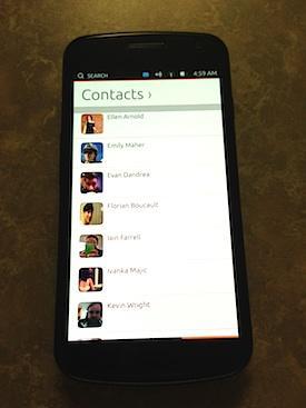
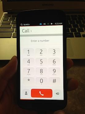
My first impressions of Ubuntu are extremely positive. There are some things that I admit to being innately positive about (and flashing a new ROM, or in this case, an OS, is one of them). Having said this, I am confident that with some simple instructions, anyone can pick up a Ubuntu-powered smartphone and enjoy the experience. It's fluid and there are no surprises. It's what an operating system in 2013 should be.
However, there's definitely a learning curve which should only be compared to BlackBerry's latest OS, BB10. I believe BlackBerry's stateside reception of the operating system and gestures will be akin to what we can expect from a Ubuntu for phones launch.
I haven't experienced anything like this before. If you have a Jailbroken iPhone or BlackBerry Q10/Z10, you might be accustomed to gestures, but I believe the Ubuntu gestures could take you by surprise.
With a quick swipe from the left side of the screen, you are greeted with a vertical dashboard. You can access the browser, camera, and phone apps from here (and more). This is available from the lock screen, too. In other words, there's no need for pesky third-party applications (like Widget Locker) to allow the user to go directly into an app from the lock screen (though this shouldn't stop the developers from customizing the Ubuntu lock screen).
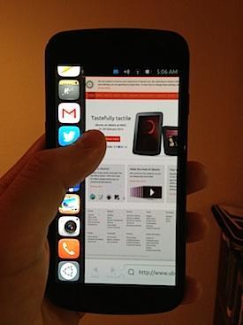
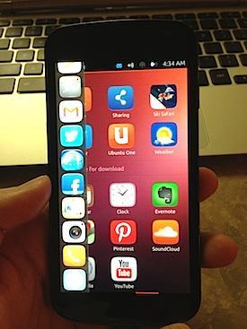
While on the lock screen, a swipe from the right pushes you through to the home screen. It's equivalent to unlocking your smartphone and feels safe. I don't think you can accidentally unlock a phone running Ubuntu's OS because it is so reassuringly simple, and tight. This gesture is consistent throughout the OS, and is equivalent to "back" on any Android, iOS, or Windows Phone device. You just get used to it and it makes so much sense as a gesture.
The days of tapping a capacitive, or on-screen button are beginning to show their age.
If you're in an app like the browser, you can swipe from the right edge inwards to get to your last viewed application. In other words, not only is it "back" in the traditional sense, this gesture controls your multi-tasking experience. The more you swipe backwards, the more open applications you are greeted with. The best part about it is they are stored in cache as active applications, so you don't ever lose your place. They're always "on." Multi-tasking feels more natural, but it feels less organized as compared to Android.
You'd swipe up in applications to enable options (like a menu) on any screen to get to your menu (except for the home screen). To get to your traditional settings menu, pull down from the top of the screen like you would to pull down the notifications bar. You can hold and swipe from left to right and toggle through your system functions (WiFi, sound, battery, time, and messages). These features were not functional in this Developer Preview of Ubuntu.
Lastly, since there are no physical or on-screen buttons on devices running Ubuntu for Phone, you get to your home screen one of two ways. The first way is to do a full swipe from the left edge inwards to the right side. The home screen just pops up at you. It feels fresh and reassuring knowing you can do this at any time, in any application, and on any screen. The second way is to swipe from the left side inwards and hold anywhere on the screen. This will enable the quick settings menu and at the bottom, is the Ubuntu logo. Sliding down to the logo and releasing will push you back to the home screen.
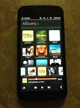
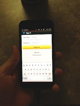
Once I grew accustomed to Ubuntu and the touch-based gestures, I quickly found my favorite Ubuntu app: the Gallery. The gallery is simple on Android. Depending on your version of Android, it's a horizontal or vertical horizon of on-screen options. Yet, in Ubuntu, it's both. Your left-most column separates photos (and presumably videos) by date. Once the date is selected, you'd slide (on-screen) horizontally to manage and view your images. It's second nature and makes me wonder why the Android gallery is as bland and cold as it is. As compared to Apple's iOS Gallery, it's extraterrestrial - it feels that advanced.
The best part about Ubuntu for Phone is not any single piece alone; It's the value presented. In the official video on the Ubuntu homepage, you can see the benefits of having the desktop version of Ubuntu and the mobile version. Data and actions performed on the desktop-OS are mirrored onto the phone version of Ubuntu. The end result is not unlike Asus' attempt with the PadFone 2 and accompanying tablet's sync when docked, and un-docked.
Overall, the experience is akin in fluidity to Android 4.2 Jelly Bean.
Having played with Ubuntu for the better part of 8 hours, I can say with authority that it is not ready for mainstream use. It has its bugs and lags like any other beta. Likewise, it's not supposed to be ready...and it's a preview version. It's not the full version that was showcased at CES last month, or the version that is on display at Mobile World Congress in Barcelona this week.
In other words, it's right on track. And for what it's worth, I think Ubuntu is ahead of schedule.
As the everyday user gets comfortable with Android 4.2 Jelly Bean and it's overlays (Sense, TouchWiz, etc.), Ubuntu is a logical launchpad towards the future. Both operating systems are Linux-based and optimized for dual-core processors. Both Android and Ubuntu use 400-500mb of RAM and are considered relatively "light." In other words, if you have many applications open at the same time like I do, you won't experience any hiccups or delays while transitioning between them. And lastly, both Android and Ubuntu feel powerful; you never question the next step. You know where you are when you use Ubuntu. It's more of an experience than simply an interface.
This power of constantly knowing where to go next, how to get there, and understanding that it's a legitimate option, is the future of mobile computing.
We have come to a point where the software experience of our mobile computers have been exceeded by the performance of the processors powering them. Is the future of software being limited by Android and iOS? Are you excited for Ubuntu for Phone, a new approach to mobile computing? One thing is certain, I believe it is the freshest way to use your phone, and I can only imagine what the full version running atop the next Nexus, or Motorola X Phone could do to the competition.
Image via Iheartubuntu.