Notifications are one of those areas that will probably always have to keep evolving. Much like every piece of technology, you’ll never be able to make everyone happy with the way that notifications are implemented. Especially when it comes to our smartphones. But one trend that seems to be catching on, courtesy of Android, is the notification shade. And by “catching on,” I mean that Apple now uses it. The shade is a great way to see all your notifications when you need to, but hide them when you don’t. But not all shades are designed the same.
Which is a good thing, because not all shades should look the same. However, they shouldn’t be cluttered, either.
This is something that Android both suffers from, as well as doesn’t have to worry about. If you were to look at a Galaxy Nexus right now, running stock Android, or a Nexus 4, you’d be able to see how Google has made significant upgrades to the notification shade. It’s streamlined, and there are hidden options based on the information displayed therein. With expandable controls in Android 4.2 Jelly Bean, your notification shade is a suite of features, all hidden behind a thin veil.
With Android, people want to be able to have access to settings as easily as possible. When I use Android, I’m guilty of the same thing. I usually put a power widget on one screen or another, and ever since those options have become a bit more prevalent in the notification shade, I’ve used them from time to time. But to be honest, after using a few of the most recently released Samsung-based devices, I couldn’t want to stay further away from the notification shade.
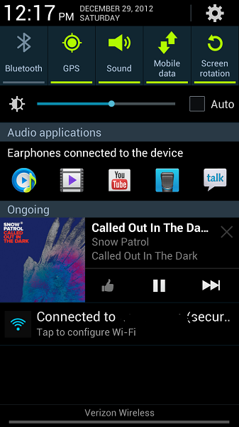
It’s become a mess. Even on a device like the Galaxy Note II, with a huge 5.5-inch display, the notification shade has so many options in there that it can be hard to look at. As you can see from the image right above, the notification shade has so much going on. Yes, there’s some nice music controls in there, but above and below that is insanity.

You’ve got the quick settings options at the very top, along with the date and time above that. Then a brightness setting, and then an entire row of icons that are suggested to you because you’re listening to music through headphones. Below the music box, you’ve got an on-going notification that you’re connected to WiFi, and the network name. As I said, there’s so much going on.
If we look at the notification shade for, say, iOS, there’s a pretty clear difference. Yes, Apple’s notification shade isn’t wholly original, but at least it’s clean. Keeping each notification grouped, the weather up at the top (if that’s how you like it), and no huge quick settings options. (Yet. Who knows what will happen with iOS 7, right?)
I know that having the quick settings options in the notification shade are really handy, especially if you just want to turn down the brightness on your phone, but I wish there was a way to get that done without cluttering up the shade itself. In the case of the Samsung-based notification shade above, I think we could probably get rid of that persistent WiFi network notification. And, while it’s a cool idea, I think getting rid of that row of “other apps” could be a huge benefit, too.
Which phone do you use, and does it use a notification shade? If it does, do you think it’s a mess, with too many options? Or is it just right? Let me know!