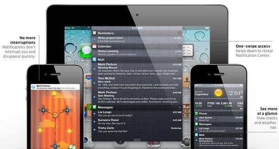
So the wait is finally over. For anyone that has been anticipating their first glimpse of Apple’s newest version to iOS, the mobile platform that exists on the iPad, iPhone, and iPod Touch, yesterday was a big day. Apple took time out of their busy schedule to showcase iOS 5 (and plenty of other new products, of course), and bring to the table the next generation of iDevices and their mobile software. But even with all of the rumors and speculation swirling about, I don’t think anyone could have guessed that the announcements made by Apple would be so shockingly similar to what we’re already seeing in the mobile market.
Actually, that last sentence can be altered a bit. Yes, the similarities between iOS 5 and what we’re already seeing in the mobile market are apparent, but they don’t stop there. We are also seeing Apple bring new innovations to iOS 5 that other companies have announced for their mobile platforms as well. The argument here is a simple one: these new features are common sense, and are simply integrating more social feeds and networks into the mobile ecosystem. But the similarities are still present, and these aren’t going to go unnoticed.
The most apparent, and the one that some folks will probably be most upset about, is Apple’s “new” drop-down notification “shade.” This doesn’t just look similar to Android’s own version; we can safely say that it is the same thing. This can be said pretty confidently because it’s a drop-down shade where you can find all your notifications. Sure, Apple’s put widgets in that same drop-down shade, but having accessible options isn’t missing in Android’s version. And with notifications now present on the lock screen in iOS 5, with the ability to jump right into the corresponding application with a touch of a finger, even Samsung’s proprietary TouchWiz user interface is being thrown into the mix. (Coincidence?)
There’s no arguing that Apple’s iPhone OS had to change its notification system. Many people were happy with it with the launch of the original iPhone, but by 2009 people were calling it archaic. So it’s no surprise to see Apple getting around to changing it. Unfortunately, the similarities don’t stop here. With the new notification system, new messages, or other notifications, appear at the top of your iDevice’s display. You can even dismiss them if you so choose. The problem here is that this is exactly how Microsoft’s Windows Phone implements their “toaster” notifications. You can even dismiss the notifications in a similar way.
And then there’s iMessage, which we’ve already talked about. And while some may say that making a BlackBerry Messenger contender is a good thing, as it builds competition and innovation, it would be hard to believe that Apple didn’t just create iMessage to take BBM out of the equation altogether. But, making an already existing feature, but making it better is a tactic that Apple knows, and does very well. But finally (for this article), there’s also the new features for the camera in iOS 5. There’s still no hardware button for taking a snapshot on your iPhone, iPad, or iPod Touch, but now you can use the volume ‘up’ key to take a photo, so it’s essentially the same thing. Furthermore, there’s a camera option right on the lock screen which will load up the camera from the lock screen. The similarities here aren’t hard to miss. Windows Phone has a dedicated camera key that will wake up the phone from sleep and activate the camera, or from the lock screen if you choose.
In today’s market, getting away from similarities between one platform and another is pretty difficult. However, I think this is the same situation between Research In Motion and HP, after the BlackBerry PlayBook officially launched. HP wasn’t quiet about pointing out the similarities between the PlayBook’s QNX Software mobile OS and HP’s webOS, and I wasn’t surprised to see Joe Belfiore of Microsoft projecting via Twitter that he was “flattered” by Apple’s iOS 5 announcements.
So it begs the question: did Apple really do any innovating this time around with the release of iOS 5? Of the 200 new features in iOS 5, are the main features worthy of saying that Apple actually innovated and created new elements for iOS 5? Or did they just take the best features of other mobile platforms and slide them into their own mobile platform? Let me know what you think in the comments below.