If Megan Fox can have a Motorola Devour, then you should be able to have one too. And you can! Available since February 25th, the Motorola Devour is available for $99 at Best Buy locations across the US. That being said, I've been working with one, and have a few first impressions of the device.
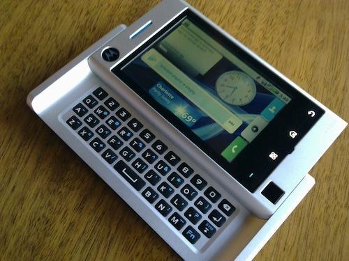
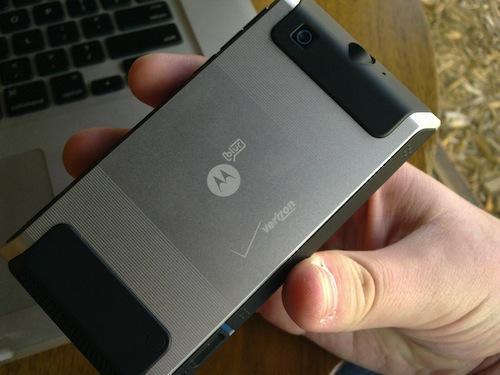
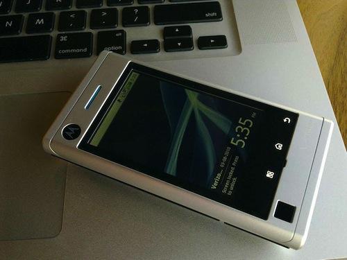
At 4.55" tall by 2.4" wide by .61" thick, the Devour is much larger than it looks in pictures. It holds its own against other smartphones on the market when it comes to size, and it feels good in the hand as well. Though it's not as brash as the DROID when it comes to the sharp angles, you can see some similarities in the two devices. The metal body is very nice, and makes the device look more expensive than it really is.
The Devour has a 600 MHz processor, and overall performance has been decent, with little to no lag. With that in mind, it leads to the next topic...MOTOBLUR. I'm not sure how I feel about MOTOBLUR. On one hand, I like the concept of being able to organize everything in one place, but on the other hand, BLUR can feel like that strobe light at the club. In other words, I often felt like it was too much going on at once. If you so desire, you can customize, add, and remove the widgets to your liking, so there's something you can do if the colors, text, and imagery becomes a blur (pun intended).
The QWERTY keyboard works well, though it's not the best keyboard I've used by any means. The keys are raised and curved slightly, making it relatively easy to feel them, but they're a bit too squishy for my liking. As such, I've found myself using the on-screen keyboard more than the physical QWERTY. This is probably where I'll break with every other journalist in the tech sphere, but I prefer the DROID's keyboard to the Devour's keyboard, due to the DROID's flat QWERTY configuration and non-separated keys. The optical trackpad was a nice touch, though I often questioned the need for it.
I really like the battery configuration on the Devour (and to a larger extent, the unibody construction). Instead of a flimsy battery cover, the battery loads from the side, cutting down on manufacturing inconsistencies for a better build quality overall. The sliding mechanism is decent, though there was a bit of wobble in my unit. Again, I prefer the do-it-yourself slider on the DROID versus the mechanized sliding found on the Devour, but it's something you should try out for yourself.
If you're seeking a Motorola CLIQ variant on Verizon, this is your device. Otherwise, given the proximity in regards to pricing, my recommendation would be to choose the DROID over the Devour. Stay tuned for my full review of the device, coming soon!

