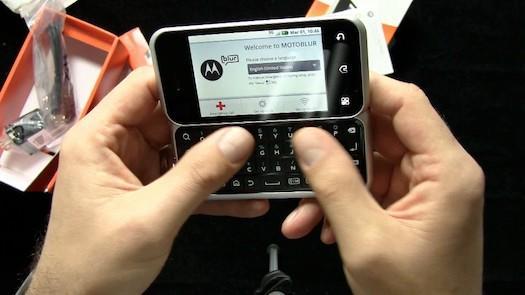
AT&T's first Android device, the Motorola Backflip, showed up at my doorstep this morning thanks to FedEx. The unboxing video is uploading, so in the meantime I've got a few out of the box first impressions for you.

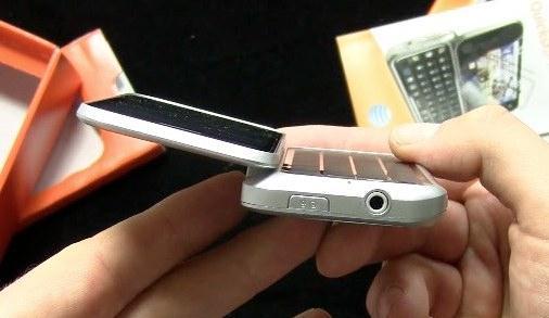
Everyone's asking about the design: Gimmick? Useful? Well, it's kind of both. I'm not so sure that "keyboard on the outside" will be the next big thing in smartphone design, but it's kind of interesting and it kind of works.
Design Pros:
- Big, roomy QWERTY board
- Trackpad on the back of the display is responsive and fairly intuitive to use
- Camera mounted on the flippable QWERTY board means the camera can face in (self-portraits) or out (normal photos)
Design Cons:
- QWERTY and touchscreen both remain exposed when phone is "closed up" and out of use
- When the phone is folded open, I keep accidentally tapping the trackpad when I reach to tap the touchscreen
- I wish the display was larger. The QWERTY board is so nice and wide that it actually makes the display feel smallish.

Otherwise:
- The design definitely allows for a larger QWERTY board, and the QWERTY is pretty good. Nicer action than Droid, if not quite as good as the best HTCs and LGs, but plenty wide and roomy.
- The phone itself is kind of laggy. Imagine using a Motorola CLIQ on T-Mobile, and you'll know what it's like to use this device. They're basically the same in terms of what MotoBlur and Android feel like.
- For some reason the touchscreen on Backflip feels a bit "grippier" and less smooth to flick and scroll on than the Devour's display.
- While Backflip is silver colored, the body is plastic and not aluminum like Devour. On the one hand, that means Backflip isn't as luxurious feeling. On the other hand, that also means it's lighter.
- This phone begs for some kind of video chat app. As I mentioned above, the camera is mounted on the QWERTY board and the QWERTY board flips from front to back, making self-portraits super easy (and addictive).

Unboxing video coming soon!