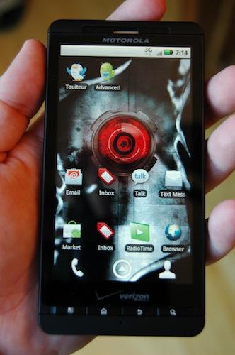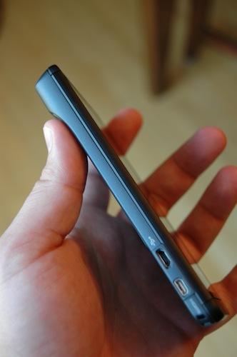
To my delight, FedEx delivered the Droid X yesterday and I’ve enjoyed every minute of using it since. By now, I’m sure you've all read about its specs, but if you’ve been living under a rock, I’ll recap: 4.3-inch display, 1 GHz Texas Instruments processor, Android 2.1 (soon to get an update to 2.2), 5.0 inches tall by 2.6 inches wide by 0.4 inches thick, and 5.47 ounces in weight.
When I first opened the FedEx box I was a bit surprised at how small the packaging was for such a large device. Upon opening the package, I noticed that Motorola didn’t give the device any additional padding on the top, bottom or face, as these three sides of the device were flush with the cardboard on the packaging. I know the trend is towards environmentally conscious packaging, but this design sure doesn’t provide much protection, especially for the glass screen.

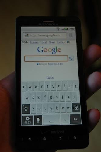
Upon turning the device on and making my way through the setup of the device, I was simply amazed at how much the additional inch of screen real estate improved the vertical-oriented typing experience, which is my preferred method of text input even on the much smaller screen of the HTC Droid Eris. The screen seemed bright and as sensitive as I’ve experienced on an Android device from any manufacturer, although still not quite as sensitive as on the iPhone or iPod Touch. Screen sensitivity is something I would really like to see Android phone manufacturers continue to improve upon.
I was initially over-stimulated by all of the red and blue colored, boxy Motorola widgets (or MOTOBLUR widgets as they are commonly referred). They were on every panel of the homescreen and many of them didn’t provide much in the way of usefulness. I attempted to use the Social Networking widget to view Twitter updates, but I quickly became frustrated by the manner in which they are presented for viewing…one tweet at a time. If I followed only a handful of people who didn’t update their status very often, this wouldn’t be such a problem, but consumers who’ve been using any of the many great Twitter apps in the Market and who are used to scrolling through their tweets with ease and speed will be annoyed at the pace of viewing tweets via this widget. I quickly removed all of the Motorola informational widgets except the calendar and messaging widget, which I have set to only show calendar entries and emails from one exchange account.
Most of the screen transitions are very smooth and fast, as they should be on a device of this caliber. One transition element in particular, bothers me. When scrolling through the homescreen panels, the shortcut icons at the very bottom of the screen for the dialer, launcher, and contacts disappear and a series of dots representing the various homescreen panels appears along with a shortcut to the main panel. Once I stopped scrolling through the panels, it took at least three to four seconds for the dialer/launcher/contacts shortcuts to re-appear. Several times, I wished I could open the launcher while scrolling only to stop and wait until the option was available. It took me awhile to realize I could hit the physical home button twice consecutively, about a second apart, to open the launcher (oddly, a swift double-tap opened the voice command app). I don’t want to make it sound like this is a major problem, because it is not, just something that mildly frustrated me a time or two.
Battery life seems a bit weak, likely attributable to my drastic increase in use (both work and play) of the Droid X over my daily workhorse, the Eris. I’ll have more to report regarding battery life in a subsequent column.

The build quality on the Droid X is fantastic. There is no wobble to the battery compartment door whatsoever. I was initially skeptical of the camera ‘hump’ and wrote as much in an earlier column, but I was pleasantly surprised that the hump made holding the device a bit easier, both while using apps as well as making calls. The Droid X was lighter than I had imagined it to be as well. I had no problems with pocketability of the device, whether in my pants, dress shirt or suit pocket.
They say you never get a second chance to make a first impression and the Droid X definitely does not need a second chance. Color me impressed.