2018 is wrapping up here shortly and it's felt like this is the Year of the Notch. Sure, Essential and Apple actually introduced the design decision last year, but it hasn't been until this year that it's become the dominant design element for a lot of phones out there. Notches and chins in some cases, which is really awesome.
Not really.
As I write this up I've had to make some changes to the smartphone I use every day. I'm no longer using my blue iPhone XR and instead have switched to the Pixel 3. My immediate takeaway is that the Pixel 3 feels like a toy in comparison, which isn't great. But, more than that, I can officially say that I've grown fully accustomed to big smartphones and I don't want to ever go back to something smaller.
And then there are the bezels. I didn't think this would actually bother me all that much, but it does. I'm not a fan of bezels anymore at all. And while I can tell you that I still hate the notch, I think I've come to terms with it, too. (I recently realized that I don't watch a lot of video content on my phone, so oh well.) I'm already counting down the time until I can have my phone with little-to-no bezels.
But that notch is still dumb, and I can't help but wonder when Apple is going to move away from the design. We obviously know that the notch facilitates the TrueDepth camera system, which makes it so newer iPhone owners can use Face ID. (More on this in a future write-up.) But Apple has to have a vision where that notch isn't necessary. So could we see something like what Samsung has already developed, where there are small cutouts in the display itself?
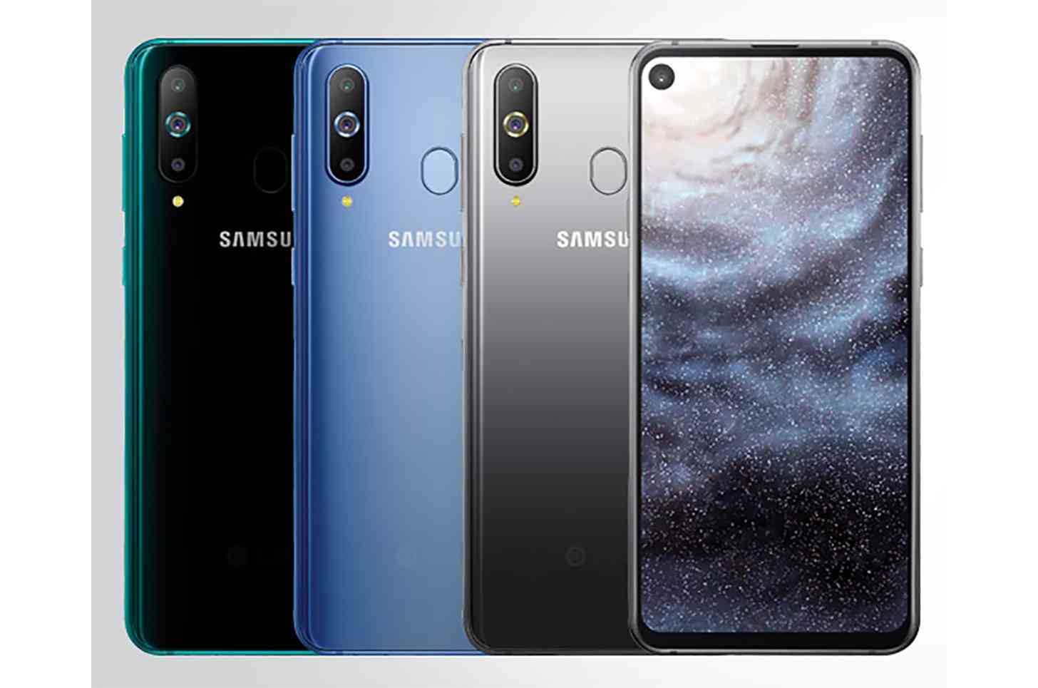
Samsung introduced a series of new designs coming soon, starting, apparently, with the "Infinity-O" design. This is a punch-out in the display, small and mostly out of the way. It's right there in the corner and seems like it might be okay for the most part -- even if it will definitely look like a hole is being punched into whatever you're looking at. Is that better than a notch? Maybe! I imagine this is something that will come down to actually seeing it in person and in action.
I am curious about it, though. Partly because I want to see what Samsung adopts for its upcoming flagship, the Galaxy S10. What type of design will the company go with for its newest Infinity Display on its premiere handset for (early) 2019?
Samsung doesn't appear to be moving towards a future where it adopts a slide-out design for its smartphone lineup, so we probably won't see a pop-out camera on a Galaxy-branded smartphone anytime soon. So these designs may be the next best thing. It's certainly an interesting idea, to say the least, and one we'll be seeing a lot of beyond Samsung throughout 2019 I'm sure.
But, what about you? Where do you stand on this design? Are you a fan of the Infinity-O punch-hole design? Do you prefer the notch? Or would a small bezel on the top of the screen, something like the current Infinity Display design (without the chin) be the best possible solution? Let me know!