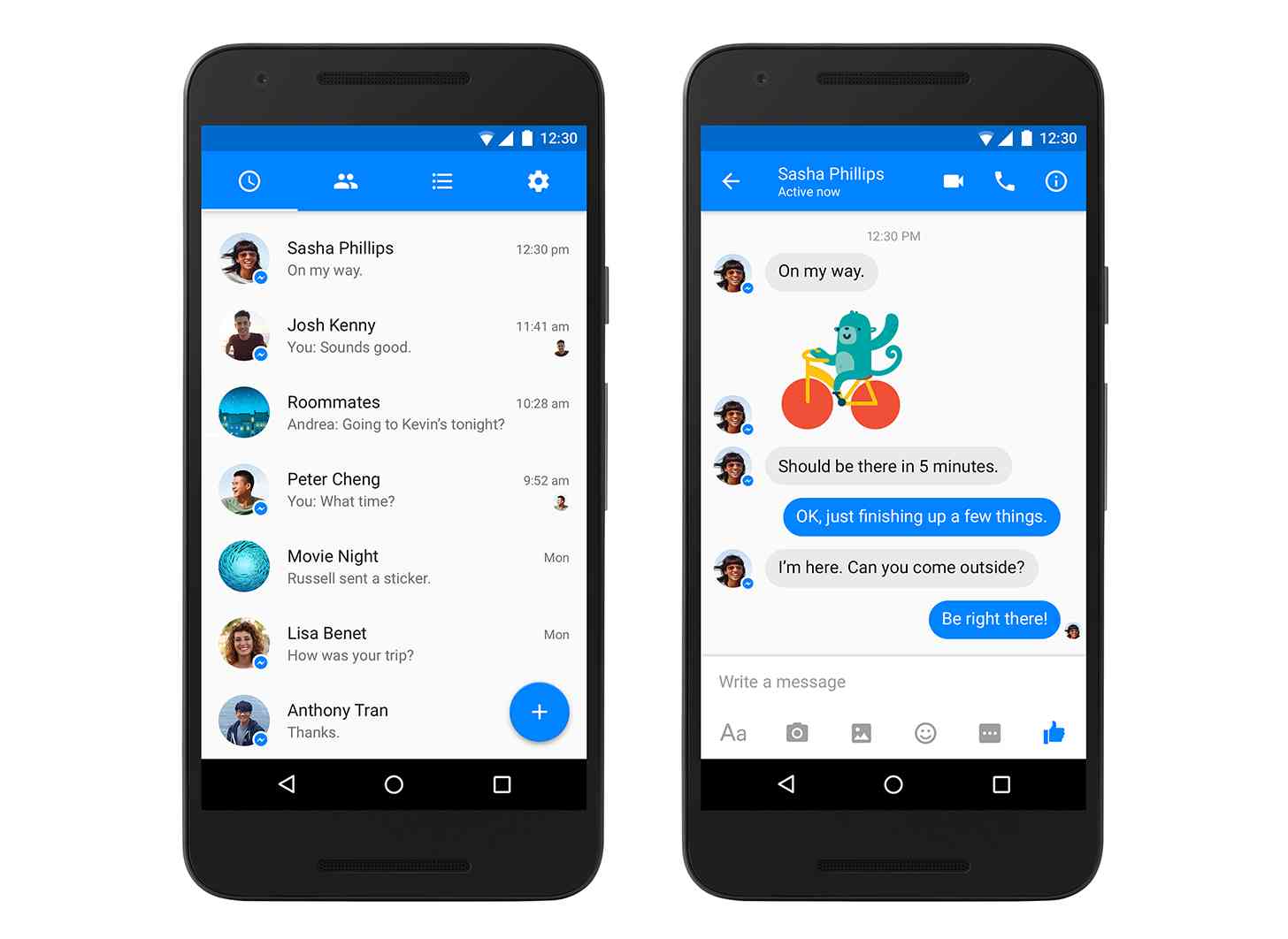
Remember that Material Design look that we saw Facebook Messenger testing back in January? Well it’s now official, and it’s rolling out to everyone.
An update to Messenger for Android is now rolling out with a refreshed design in tow. The update brings Messenger more in line with Google’s Material Design, complete with a floating action button. The update also tweaks the status bar at the top of the app, turning it Facebook blue.
Facebook is also working on more design changes for Messenger that'll roll out in the coming weeks.
Material Design has been on Android for a while now, but Facebook explains its delay in bringing that look to Messenger by saying that it “took every precaution” to ensure that the app’s hundreds of millions of users would like the new look. The good news is that that new look is finally here, and I have to say that it does indeed look a lot better than the old app. Better late than never, right?
Keep an eye out for this Messenger update as it rolls out to users. What do you all think of this new-look Facebook Messenger app?