Copy's such a dirty word, isn't it? Especially when you're talking about anything that deal with something creative. And let's be honest, that's normally where you see it creep out. It doesn't matter if it's our smartphones we're talking about, or the software therein. A lot of people came together to create that thing, and in today's day-and-age, that usually means you're going to hear someone somewhere yell, "That's copying!"
We've seen it so many times it's just not worth counting. We've seen it in small ways all the way up to the top, between two technological giants. People take this stuff seriously, and they should. Their creativity is why consumers buy the products, and if someone starts encroaching on those ideas, or outright taking them, there's some legitimate reasons to be upset.
We're not ever going to stop seeing things get influenced by other things. It just won't happen, especially not when we're dealing with consumer-facing products. When we watch a device launch with a set of custom options, or a brand new feature set, or a proprietary interface and experience, there's a toss-up whether or not it's going to become a fan favorite. And if it does? If the new things get talked about, plus one'd across the Internet, and generally loved from every angle, you're going to see others take some influences from that.
The idea, though, is to not copy. You should create and expand, so that your product is different at the end of the day.
iOS introduced its Notification Center not too long ago, and as you can imagine there was all sorts of clamor about the feature's similarities to the notification shade that's been built into Android since day one. And for obvious reasons. Notification Center is similar to Android's shade, yes, but Apple made it its own. If you drop down Notification Center and the notification shade in Android, you'll see they look, and function, different in important ways.
Simply put, Notification Center would look wrong in Android, and the Android notification shade would look wrong in iOS.
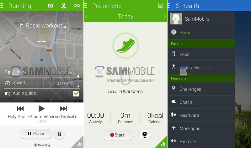
I bring all of this up because of Samsung, and their repeatedly leaked new user interface. While nothing has been confirmed yet, obviously, we're starting to see enough of it now that it's turning into a pretty safe bet. (But, feel free to surprise the world anyway, Sammy.) We've seen the company's new Life Times, along with the rumored update to S Voice. And, most recently, we saw the new S Health app.

All of these new apps bear the same look and feel to one another, but quite a different approach than what we've seen of their current versions. S Voice, S Health, and WatchOn have all been given a facelift, into a far flatter design scheme. They retain the colors that have been so prominent in TouchWiz in the past, but there's no denying it looks quite different than what Samsung has released in years prior.
And with each new leak, I see the same thing: Windows Phone! People are pointing out the flat design, the hard edges, and the extravagant colors as indicators that Samsung is now copying Windows Phone. I'll be the first to tell you that Microsoft's user interface for Windows Phone is great. I've been a fan of it right from the start. And I've seen other things out there that have made me think of Windows Phone, absolutely.
However, this is not one of those times. Right from the start, with the leak of Life Times and S Voice, I only thought one thing: Google. And now with S Health's and WatchOn's revamps making their way 'round the 'net, I see the same thing: Google. These new changes to Samsung's in-house apps scream Google's Card UI, and the overall interface change that we've seen over the last few years. When I look at S Health, I see Google Play.
Rumors that Samsung had made agreements with Google to bring TouchWiz more in line with the Cupertino-based company's view of their mobile OS seem to be coming true, as far as I'm concerned. If this new look is going to be the new TouchWiz moving forward, I'm okay with the changes. Because it just screams Google to me.
I want less TouchWiz, yes, but I want less TouchWiz in its current state. I absolutely want Samsung to change the way the user interface looks and feels, and if these leaks bear fruit, I'm very excited what the company has in store for us this year. And, just to say it, if you want to make the argument that Google copied Microsoft's Windows Phone interface for its own Card UI, and by extension Samsung is doing the same thing, well . . . That's up to you. I just don't think that's a worthy conversation.
I hope these leaks pan out, but what do you think? Are you on board with these types of changes when it comes to TouchWiz, or do you think they're playing too heavily into Google's own design cues? Should Samsung still be trying to stand out, or will they have to depend on their hardware more than ever before? Let me know what you think!