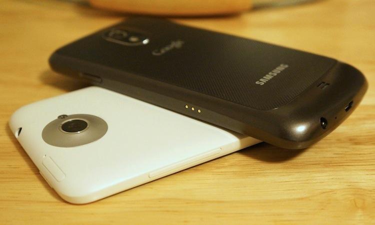
When it comes to preferences for smartphones, there are a million little idiosyncrasies with each device that you will never learn until your get your hands on them. After a few days, you may learn how much you hate how stiff the volume rocker is. Or you might find after several months of staring at it that you cannot stand the parchment look of the HD Super AMOLED display. I'm talking about the tiny, barely discernible characteristics of a particular handset that go unnoticed in a review period, or the oddities that only bother you, not the hundreds of thousands of other people with the same device.
For me, those oddities are generally few and far between. I may be a stickler when it comes to hardware and design – I love unibodies far more than I probably should. But there are only a select few characteristics of a device that will completely drive me up a wall. The parchment look of the HD Super AMOLED display (which uses a PenTile Matrix subpixel layout versus the typical RGB stripe), for one, now gets under my skin immediately. And creaky or squeaky hardware can do me in pretty quickly, too.
But there is one that has become more and more prevalent the more I use different handsets, especially now that I am using two devices that lie on opposite ends of the spectrum when it comes down to this specific matter: button and port placement.
Take the HTC One X in hand. It feels absolutely great. It looks great. It's a beautiful, well-designed piece of hardware, and the software compliments it almost perfectly. All-around, it is one of my favorite handsets to date – though I'm still not a huge fan of the camera.
But the button and port layout is completely whack. The power button is positioned on the top right edge, out of reach of any digits from a typical grip. The volume rocker is on the right edge, exactly where the thumb will rest with a right hand grip or where the left index and middle fingers will rest with the other hand. On the left edge is the micro USB port, which is inverted (meaning it is flipped upside down, with the seam side up) and the 3.5mm headphone jack is on the top left corner.
Some people probably get used to this layout within days of using the device. It's just the way it is. But having come from six months or so with Samsung devices, I quickly learned that I seriously prefer the button and port layout featured on the Galaxy Nexus more than any other device.
How is it different? Better yet, how is it any … better?
As far as hardware goes, the Galaxy Nexus is far inferior. The materials it is composed of are cheap and the paint flakes off with little to no effort. It's super lightweight and simply doesn't feel sturdy in the hand. That said, it does feel extremely comfortable, which could be attributed to the curved nature of the device. But it could also be because one rarely has to adjust their grip to use any of the buttons on the device.
The power button rests towards the upper corner of the right edge, a perfect fit for the users right thumb or left index finger. The volume rocker is directly across from the power button, which fits the left thumb or right index or middle fingers perfectly. Holding the device in the right hand, you can take a screen capture by squeezing with your middle finger (on the bottom half of the volume rocker) and thumb (on the power button). Both the 3.5mm headphone jack and micro USB port are on the bottom edge, keeping them out of the way of fingers when adjusting your grip.
By contrast, taking a screen shot (which I admittedly do too often) with the One X requires either two hands or adjusting to a rather unwieldy, unsafe grip. And even after three months with the One X, I still find myself trying to jam the micro USB charging cable in right-side-up from time to time.
As minor as all of this may sound, these are some things that I have found that is increasingly bothersome to me. It's the little finishing touches that truly add polish to a device. While I absolutely love the HTC One X, I find myself reaching for the Galaxy Nexus more and more – for two reasons. One, I prefer stock Jelly Bean to Android 4.0 with Sense 4. And I prefer the button and port placement on the Nexus far more than that of the One X.
Tell me, readers. Does button placement or, likewise, port placement bother you at all? Do you care if the power button is placed on the top edge of a device. Or do you like it to be on the right edge? What about the micro USB port? 3.5mm headphone jack? Volume rocker? Sound off and share your button and port placement preferences in the comment section below!