Last June, Apple took the stage for their annual Worldwide Developers Conference and made several new hardware and software announcements to developers and fanatics alike. Updated MacBooks and iPods were revealed, along with an upgrade version of their mobile platform, iOS. Among over 200 new features in iOS 5, one that stuck out more so than others was the new notification system, which was appropriately dubbed Notification Center.
It's no secret that notifications in iOS 4 (and earlier) were an eyesore. The glossy blue pop-ups were obtrusive and annoying. Regardless of what you were doing on your phone, the pop-up notifications had a way of popping-up at the worst time and in incessant, unavoidable bursts.
For iOS 5, Apple hired a popular iOS developer Peter Hajas, who had come up with a better implementation called Mobile Notifier and offered it to jailbreak users via Cydia, to work on the archaic notification system. Instead of popping up in the middle of the display, these banner notifications drop down from the top of the display and only cover a small portion of the top of the screen. They show for a few seconds and disappear. They're definitely a step in the right direction, but they still get in the way quite often. And although they're relatively easy to dismiss (drag your finger down from the top of the display and flick it back up), successive notifications can get rather annoying.
But another problem with notifications in iOS was that there was no designated space for ignored notifications to go. They were all truncated to little red badges that cling to the top right corner of their respective application icons on the home screen.
That's where Notification Center shines ... sort of.
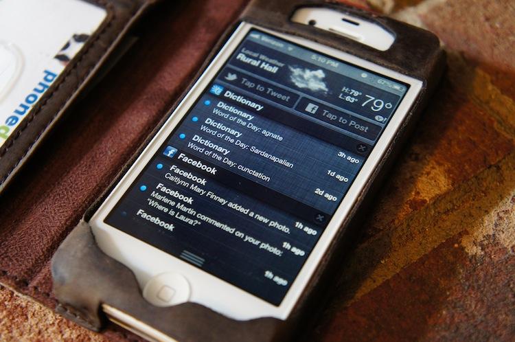
Notification Center aggregates all unattended notifications into a single, scrollable page. It is a pull-down shade that is accessed much like the notification shade in Android – simply pull it down from the top of the screen and flick it back up when you're done.
The problem? It feels like an afterthought ... because it is. It doesn't match or suit the operating system in any way, and it doesn't do notifications any justice. There is no indicator that tells you how many or what kind of notifications are hanging around in Notification Center. There is nothing that entices users to check it. And there is a long list of things I would change about it, given the opportunity.
For me, Notification Center is an overflowing mess of month- and week-old notifications. It's a lost, forgotten section of my iPhone that is completely out of control. It's like one of those long list of household chores you don't want to look at – an overgrown lawn, a sink full of dirty dishes or an overflowing laundry hamper. And without having to walk past it every day like a sink full of dishes – without an indicator telling me there's something in there begging for my attention – I never even give it a glance. It's safe to say Notification Center is easily one of the new features debuted in iOS 5 that I use the least.
This time around, Apple added some functionality to Notification Center, adding the ability for users to tweet and update their Facebook status directly from the Notification Center drop-down shade. I like the idea – it's one that users have been begging for since the iOS 5 announcement and one that several developers have made possible through jailbreaking.
However, there's a way Apple could make Notification Center much better – even worth using. Maybe. Drop the Notification Center moniker (a stretch, I know), call it Dashboard and fill it to the brim with user-definable widgets.

(Update: A commenter pointed out a mistake I made. I have incorrectly been referring to the widget space on OS X as Mission Control. This space is actually called Dashboard. Mission Control is an expanded view of all your desktops and running applications. Minor mix-up. My apologies.)
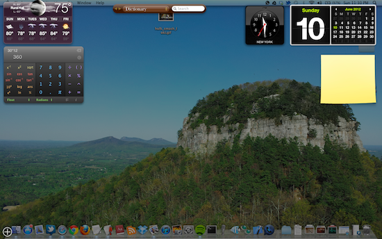
On OS X, Dashboard (pictured above) is a space of the OS designated specifically for widgets. They come in all shapes and sizes: calculator, calendar, weather, notes, dictionary search, etc. They are definable by the user and make it relatively easy to switch back and forth between making some quick calculations or referencing a Thesaurus query and browsing the Web. And similar functionality could be made possible by way of Notification Center.
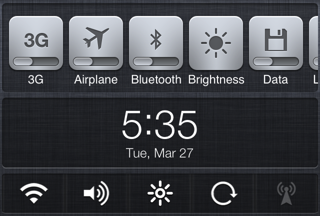
In fact, it has already been done by at least one developer. A Cydia mod titled NCSettings brings some of the more common settings option to Notification Center as toggle switches and shortcuts. (You can see an example of such below.)

A sore point for iOS that has picking at my patience for some time now – aside from it's mediocre notification system, of course – is how many steps it requires to change or toggle some frequented settings, such as Wi-Fi, Bluetooth and even brightness settings. On Android, these very settings can be toggled in the notification shade, on the home screen or in the Settings app. On iOS, they are only available in the Settings app, and while iOS 6 has done a decent job of bringing some of the more common settings to the very front page of Settings, it still requires switching between apps and more steps than it should just to toggle Wi-Fi or brightness settings.
With NCSettings, all of these things can be accessed straight from Notification Center. Adding toggles alone would warrant visiting Notification Center more frequently, but that's not the only improvement it needs. It needs more widgets: notes, dictionary, calculator, etc. And it needs to be more like Dashboard than a place for notifications. Frankly, I wouldn't mind not having any notifications in the pull-down shade at all. I'd rather see it be a place solely for widgets. Or maybe it could be tabulated and have a page for settings/widgets and a separate page for notifications.
Either way, Notification Center, in its current state is only a fraction of what it could and should be. And I still have my fingers crossed for more functionality and customizability to be brought to it this year.
It's a long shot, but Apple will revisit their iOS 6 announcement in the fall, when they announce the next iPhone, and there's hope they might squeeze in a few more features. For me, this one would be huge. I'm not holding my breath, of course. But my fingers are crossed. It'd be nice to have a reason to use Notification Center be able to use Dashboard on my shiny new iPhone come September/October.