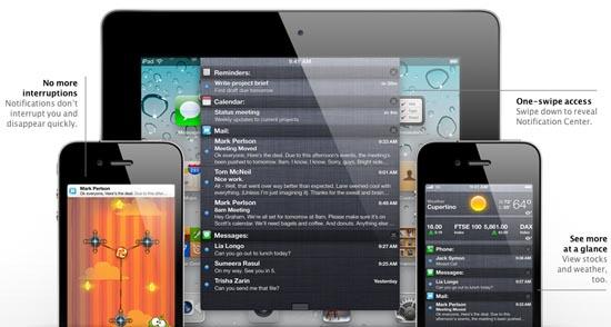
It’s been a little bit of time since Apple officially unveiled their latest version of the ridiculously popular iOS mobile platform, better known as iOS 5. Since then, we’ve seen a few releases of the mobile operating system’s beta versions (the most recent being beta 3), and with each subsequent release those who are able to get their hands on the latest build are able to see just what iOS 5 has in store, and how it feels on their iDevice. These folks get to determine if the wait for iOS 5 was worth it, and if all those “new” features for the platform are worth the anticipation. With my time with iOS 5, I can say that while all the other features are great in their own right, it’s the notification shade in iOS 5 that seems completely out of place.
There are plenty of other features to be excited about in iOS 5; specifically, if you’re a fan of messaging other folks who don’t live in the same country as you, but that have an iDevice without having to pay international fees (iMessage makes it free), then Apple’s new messaging service is perfect for you. If you like a brand new notification system in iOS, then 5 has what you’re looking for. Unfortunately, while the notification shade is a great idea in theory, it just doesn’t work with iOS at all.
Android’s notification shade is a bit different than Apple’s, at least the stock Android notification shade, anyway. For those who have used a few custom ROMs out there, or specific proprietary user interfaces, then you know that Apple’s implementation of “grouped” notifications isn’t anything brand new. But, let’s face it: the notification shade in Android, no matter its implementation, works. And it works because of the entire notification system. It goes hand-in-hand.
Reason being is that your phone’s notifications are sitting pretty at the top of your display in that fancy notification bar. Whether or not your preferred user interface has “badges” or some other notification on specific applications (like messaging or email or missed calls), it doesn’t change the fact that your notification bar is always there, ready to tell you what type of notifications you have waiting for you. From there, you simply drag your finger down and you’ve got yourself the notification shade, sometimes showing you in detail what that notification bar was hinting at.
That’s not the case with iOS 5. Yes, there are badges on specific applications that tell you that you have a notification, but other than that there’s nothing reminding you that you’ve got a notification. There isn’t a notification bar up there, telling you that you have an email waiting for you – no, that’s left to the badge on the email application’s icon, and that’s it. But, the notification is sitting in the Notification Center (Apple’s fancy word for the notification shade). Not that you’d ever know it was in there, considering there’s no notification bar at the top, letting you know.
This isn’t even about whether or not Apple “did it right,” or if the Notification Center “just works.” It does work, and there’s nothing really wrong with it. It works, it displays your notifications in a nice, grouped fashion, and it’s a quick and easy way to check what the weather is in your local area (or keep tabs on your stocks, thanks to the active ticker). However, without a notification bar up there, I don’t see why the shade was included.
Whether or not Apple “innovated” in the majority of its features list for iOS 5 is a point that many people would probably love to argue about for days and days. But, to be honest, while I think there really are plenty of features to be excited about in iOS 5, the notification shade is not one of them. To me, it’s completely out of whack with iOS 5, and it just doesn’t need to be there. Keep the brand new notification system, because it literally is magical when compared to notifications in any previous version of iOS. However, Notification Center doesn’t need to be there at all.
What do you think of Apple’s implementation of the notification shade? If you’ve had a chance to use it, do you think it’s a natural addition to iOS, or do you think Apple should have kept it out? Let me know in the comments below.