If there is one thing I like about iOS notifications, it's that they are now somewhat customizable and viewable from the lock screen. If your phone is locked and you receive some notifications, the display will light up and show all the new notifications directly from the lock screen, similarly to Notification Center. And a swipe from left to right on one of said notifications will open directly to the respective application and, most of the time, straight to the message or missed notification itself.
Android, however, has had a better notification system since day one. All notifications have always been aggregated to a universal notification shade that can be accessed by a swipe down from the top of the display. And recently, Google developers have added several new functions to the much-adored shade.
For example, swiping a notification left or right from the shade will dismiss the notification. A two-finger gesture downwards over a notification will expand said notification and reveal more information (if the developer of respective app added expanding notification abilities). Actions can be performed on some notifications, like screen captures, directly from the notification shade. And, as of Android 4.2, a two-finger gesture downward from the top of the display reveals a Quick Settings shade.
With the exception of a few mishaps that led to developers littering notification shades with advertisements, the Android notification system has always been a pleasure to use. It's definitely matured and become more aesthetically pleasing of late, but it has always been quite functional and true to its nature.
The one area where Android notifications come up a bit short, though, has always been on the lock screen. Unlike with iOS, if your Android device receives a notification while in standby, the display will not light up, and there are no immediately available notifications displayed upon hitting the power button. Some custom versions of Android will display missed calls and text messages on the lock screen in the form of an unopened envelope or red phone symbol, but there is little to no additional information viewable without having to unlock the device.
Most of the time, I don't immediately respond to missed notifications. Periodically, however, I do like to check what I've missed at a glance. And, as silly as it may sound, this is one of the main reasons I still carry the iPhone around with me. If I just want to glance at what I've missed, I can tap the iPhone power button spend a second or two reading and hit the button again.
For what it's worth, Google added the ability to access the notification shade from the lock screen in Android 4.0 (Ice Cream Sandwich). And in the most recent version, 4.2 (or Jelly Bean), lock screen widgets have been added to the mix, too.
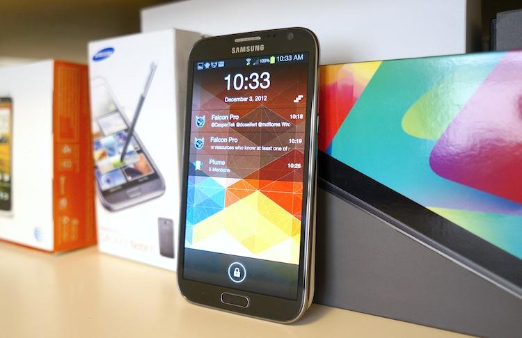
However, this morning, Lifehacker featured a (relatively) new premium lock screen replacement for Android devices, LockerPro. Basically, it takes the information that would generally only be displayed in the notification shade and displays it on the lock screen, similarly to how iOS handles notifications in standby. A swipe from left to right will open the notification and a swipe in the other direction will dismiss. Or you can tap the Dismiss All (three staggered, horizontal lines) button in the upper left corner, if that's more your speed. Best of all, the display lights up when a message is received or a notification occurs.

LockerPro also works within the system while the display is on. It handles incoming notifications with banners, much like that of iOS or the old webOS notification system. Swiping a banner from left to right will dismiss the notification, swiping from right to left will dismiss all notifications and a tap will open the current notification.
For $2.86, it's not a bad deal, especially since I love how iOS handles lock screen notifications and this essentially gives me that experience on any Android devices. That said, I almost detest how much LockerPro looks like iOS – it would have been relatively easy to give it a unique interface. Not to mention, it's not as fluid or smooth as iOS (that's the app itself, not the phone) and has a few glitches I'm trying to get to the bottom of, such as duplicate notifications for some Twitter mentions and emails.
Still, I've tried a handful of lock screen replacements in my day, and LockerPro is easily the best one yet. It doesn't give me all sorts of lock screen utility that I don't want or need. It legitimately and appropriately addresses a problem with Android I've had for some time, and it does so with flying colors.
Update: I've come across one problem with this application. It replaces your launcher as the default launcher, which isn't a problem. It links directly to the launcher you're currently using anyway. But the issue is that is causes some hesitation when unlocking the device.
Do you use a lock screen replacement application like LockerPro or WidgetLocker, readers? Do you have a problem with the way Android handles lock screen notifications? Share your sentiments below!