
In the mobile space, there are two types of software updates: incremental, updates that fix bugs and stave the raging mob of pitchfork-wielding users and there are major updates that bring a horde of notable new features and functionality. (To be fair, some updates straddle that line, but generally fall to one side for one reason or another.)
Apple, for example, has been creeping along with iOS for the last six years, throwing in tiny odds and ends features left and right and fixing minor bugs along the way. Overall, the software hasn't changed all that much – at least not on the end user front.
Google, on the other hand, has made leaps and bounds to improve Android. I can't even begin to explain how much more attractive and user friendly the interface is. And Google has added useful features galore! The last two updates, for instance, were considered minor updates, 4.1 and 4.2 (both Jelly Bean) from 4.0 Ice Cream Sandwich. Some of the more notable features of those two updates were: Project Butter (serious performance and graphics improvements), beautiful expandable notifications, Android Beam for picture and video, a new interface for tablets, multiple user support, lock screen widgets, Daydream, Quick Controls, better external monitor support, trace keyboard with predictive input and major improvements to the camera app.
A few days ago, though, I got to thinking about the future of Android and what the next update may bring. It's likely another six months out, of course – Google will probably stick to announcing new versions of Android at its I/O developers conference in June. No less, the Android development team has done a bang-up job of adding quality features and answering user requests.
So I asked myself what features Android is still lacking. Is there anything I still miss or desire when I'm using Android? Or are there features that drive me up the wall? You bet. But they're few and far between, and they're growing more scarce with every update. After days of thought, below is a list of the changes I hope the next Android update brings.
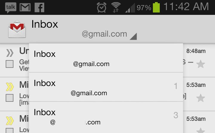
First and foremost, I started out as a BlackBerry user. And over the course of five years with a BlackBerry in my right hand, I grew very fond of the way BlackBerry handled incoming messages and notifications. Every new message – SMS, MMS, BBM, email, Facebook, Twitter or literally anything else – was aggregated to a universal inbox.
In that respect, Android is very different. Every different type of notification is aggregated to the notification shade (something BlackBerry didn't have until BlackBerry 6), but dealing with separate notifications will take you to their respective applications. What's worse is having more than one Gmail account. I always have anywhere from four to six Gmail accounts on my phones. And to clear out the unread notifications on each of those requires opening each individual inbox. On BlackBerry, I could clear all notifications – from SMS to email – in one fell swoop.
As sandboxed as Google has strives to keep Android applications, I know a true universal inbox is a pipe dream. If nothing else, though, I would love to see a universal Gmail inbox. (Another high hope, I know. It hasn't happened on the Web client, why would it on Android first?)

I'm a stickler for button and port placement. I absolutely despise the power button being placed on the top edge of a phone, especially since phones continue to grow in size. Take the HTC DROID DNA, for instance. To tap the power button on HTC's 5-inch non-Phablet, the user has to "choke-up" and reach with their index finger, then switch their grip to the bottom of the phone so they can drag the ring to unlock. In short, it's not very user friendly.
But power buttons play a key role; they (usually) keep the phone from turning on in your pocket and butt dialing people. There's a way around this, however. Research In Motion showed off a cool feature of BlackBerry 10 at the BlackBerry Jam conference where the user can simply drag their finger from the bottom bezel upwards over the display to unlock and power on the device in a single, quick swipe. (This, for the record, was also possible on the PlayBook.)
And one week ago, Jolla demoed Sailfish, a MeeGo-based OS. In the demo, the guy demonstrating performed a double-tap on the display to wake the phone. Something like this would remove the need to use a power button (except for a full power down or cycle). Then I wouldn't care where the button is placed.
Battery life on Android devices is still, in general, poor. With devices like the Samsung Galaxy Note II and Motorola DROID RAZR MAXX HD which feature 3,100mAh and 3,300mAh batteries, respectively, things are looking up. The Galaxy Note II easily lasts a day and a half in my normal use.
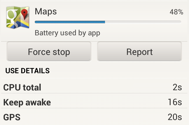
That said, there are still software enhancements that could be added to stock Android to improve battery life. I have experienced more rogue applications that inexplicably cause severe battery drain on Android than on any other mobile platform. Maybe the system could seek out rogue apps and isolate and disable them automatically. Take the Maps screen capture above, for example. Maps accounted for 48 percent of the battery drain – from 100 percent to 81 over an hour and a half of standby – having only been active for two seconds by mistake.
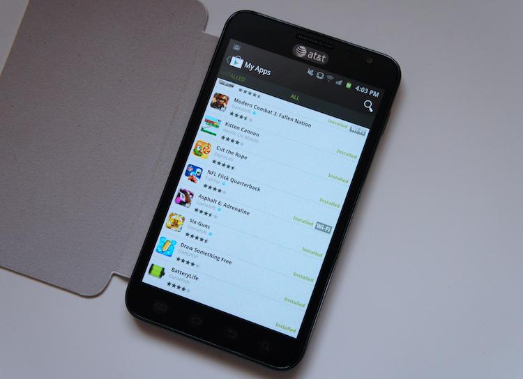
One of the worst experiences I always have with Android is setting up my device. It's a laborious process of downloading 50 or 60 applications and switching between LastPass and said apps to copy my passwords and login.
There isn't much that can be done about side-stepping logins. I'm okay with that. But if you use some of Google's offered cloud services, Android is supposed to remember the applications you had installed on you last device and install them on your new device. If you go through a ton of phones, the process gets confused and sometimes loads the wrong applications from the wrong past device.
Installing the applications one by one is laborious and time-consuming. You can install applications using the Play Store from your computer, but that's time-consuming and not always reliable. I want the option to "check" all the applications I want to install and "Accept & download" once. Think: shopping cart. If you were purchasing applications, it would lump multiple applications into a single payment.
If you ask me, this option is long overdue. It would give the Play Store a more shopping-like feel.
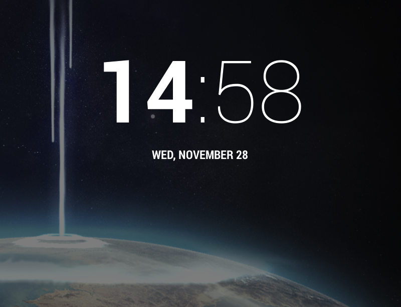
In the latest update, Android 4.2, the lock screen clock and the Clock app were slightly changed. The hours are typeface Roboto Bold while the minutes and colon were left as Roboto Narrow. It's hideous. The first time I saw it, I thought something went wrong in the update. Alas, I was wrong and it's just that ugly by default. (See above, in the screen capture provided by @PDTechHD.)
Please. For my sanity, change this, Google!
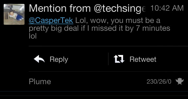
In Android 4.1, Google introduced expanding notifications. In 4.2, Google added Quick Settings. I love both features and expand notifications all the time. But it would be great to have the ability to expand all notifications and add a quick reply option. For instance, swiping the notification right might dismiss the notification while a swipe to the left will open a quick reply window within the notification shade. Multiple notifications – such as three Gmail notifications – could be separated into three different entities within the expanded notification, so they could also be used with the quick reply feature.
This Plume notification is a great example, except hitting Reply or Retweet will take you out of the notification shade and to a pop-up compose window for Plume. That's acceptable for a third-party application, though. I would love to see a similar option made for Gmail, SMS, Google Voice, etc.
Android's notification shade is, by far, the best centralized notification system on any current mobile platform. Adding quick reply and expand all would set it over the top.
Are there any features you would like to see in a future Android update? If so, sound off in the comments section below!