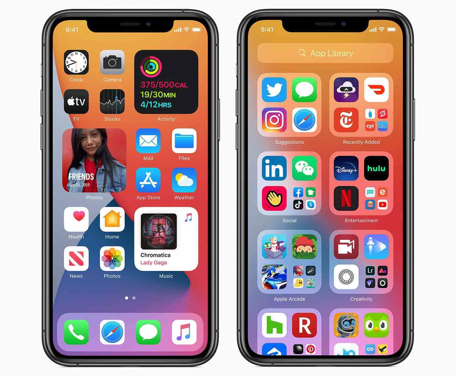
With the arrival of iOS 14, users can finally customize their Home screen beyond just organizing by something like app icon color. What's more, it even goes beyond the use of a more robust widgets system, too. Thanks to the Shortcuts app, a lot of people out there in the wild have implemented some pretty wild customized Home screens.
I've seen a lot of Windows 95 builds out there, which is just wild to me.
Using Shortcuts and third-party apps to customize app icons, and effectively build custom themes, is great, it's also pretty time consuming. It can also be pretty frustrating, too, especially if you're a longtime iOS user who doesn't actively want to dig that deep and tweak anything.
The results are pretty great. Along with those Windows 95-themed builds I've seen anime-inspired builds, along with app icons and widgets that promote autumn, sports teams, and much, much more. Many of them are eye-catching in the best possible ways, and some of them have even almost inspired me enough to give it a shot myself.
But, even when I use Android and have a seemingly infinite amount of resources to customize, I don't do much. Some well placed widgets here and there for the information I want or need at a glance, and then the app icons I launch on a regular basis. Nothing crazy. So while I've come close to diving into iOS 14 customization, I haven't quite gone through with it yet.
I am curious to see if this new element to iOS, which has definitely found a following on social media platforms like TikTok, is something you've started using quite a bit. Have you taken a liking to any particular themes and/or customization options? Have you gone full-tilt in customizing your iOS 14 Home screen, or not so much? Let me know!