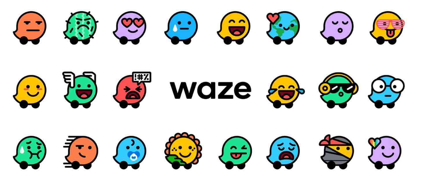
Waze has been helping people get directions and traffic info for years now, and today the long-running app is getting a refreshed design.
The new-look Waze utilizes a range of colors with the goal of helping to make the service "friendly, organic, and joyful." Waze explains that it's utilizing grid-based elements that'll give it a consistency across assets and also brings the community-built map, an important feature of Waze, into its designs.

Another major new feature of the Waze redesign is Moods. With it, Waze says that it wants to "reflect how users feel on the road" because even though a bunch of drivers may be in the same situation, they may all feel differently.
Waze is offering users 30 different Moods to start, and the company says that that's just the beginning.
Waze is available on Android and iPhone. What do you think of the app's refreshed design?