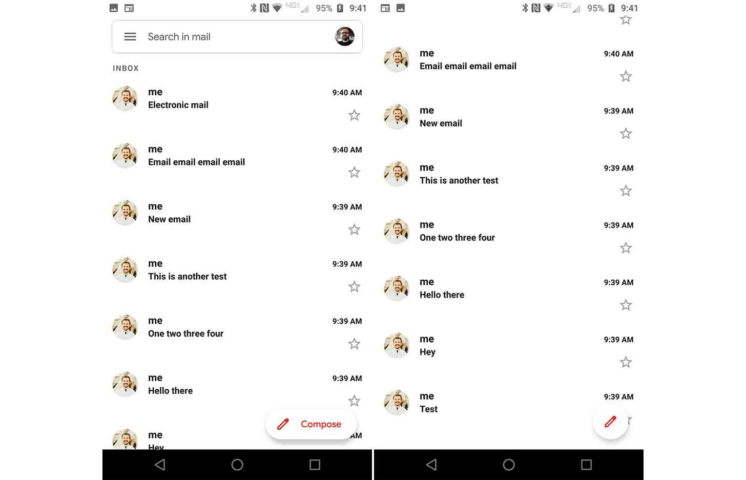
Gmail for Android is getting a bit of a design tweak.
Google this week updated the compose button in the Gmail app for Android. Spotted by 9to5Google, the new button is pill-shaped and includes a red pencil and the word "Compose", but when you scroll, it shrinks into a smaller circle with just the red pencil.

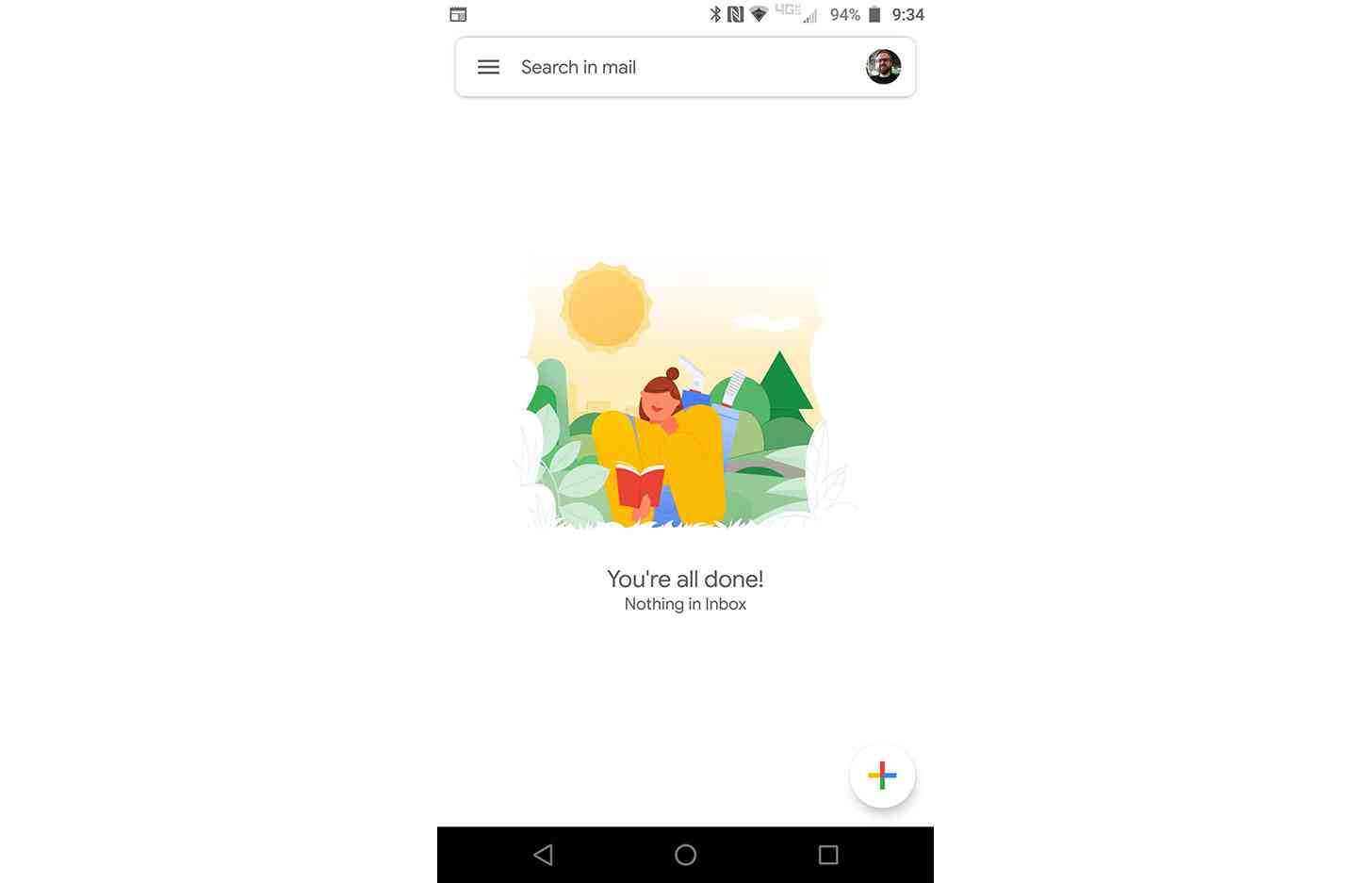
Previously, the compose button was a circle with a plus sign that featured the colors blue, red, yellow, and green — the four colors of the Google logo. You can see it below.
While this is a small design change, it's a notable one considering that Gmail is one of the most widely used apps on Android. The new button fits in much better with the Gmail app, using a pencil for writing a message and opting for an all-red icon that matches the Gmail logo.
