About a month ago, we heard that the Android Auto redesign that Google announced at I/O had begun rolling out. Google responded at the time by saying that it was still working on the update, but now it looks like it's finally, really starting hitting.
Several Android Auto users say that they've received the redesigned Android Auto UI. These include some folks on Reddit as well as some Android Police readers.
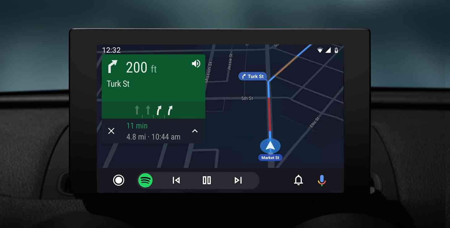
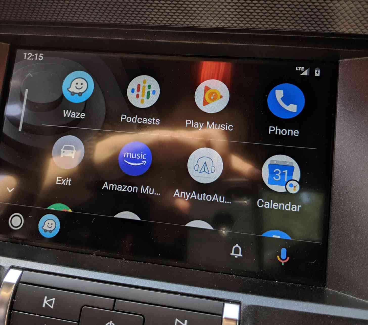
The update brings with it a dark theme, colorful accents, and easier-to-read fonts, all of which should help increase readability. Also included is a new navigation bar that will show you turn-by-turn directions and let you control your apps and phone from one screen. Finally, a new notification center will show your recent calls, messages, and other alerts.
Google hasn't officially announced the rollout, but some users have had luck forcing the new UI by updating to the newest version of the Android Auto app (v4.5.5928), clearing the app cache and data, and then force-closing and re-opening the app. If this works, you should see a "Try the new Android Auto" toggle in the app's settings.

This looks like a pretty nice Android Auto update. The goal of car UIs like Android Auto and Apple CarPlay is to make your interface easy to use while you're driving so that you're not stuck staring at the screen and instead can stare at the road, and so an update that improves the readability of Android Auto is a good thing.
When you get this new-look Android Auto, be sure to let us know what you think!