Yesterday, Apple officially announced a lot of new things, including a brand new flagship iPhone called the iPhone X. As I wrote about yesterday, depending on how well you had stayed caught up with the rumor mill, there might not have been a lot of new information conveyed to you. But for those who willfully remained in the dark, there were some exciting elements.
Basically, Apple has seen fit to finally draw in all of the important and most-requested features to the iPhone line, and the smartphone is better for it. But there are still questions that the iPhone X will have to answer all on its own, some that could very well go the wrong way for some users.
Namely, interacting with the software and the physical design of the handset.
On the software front, Apple has to prove that moving to a gesture-based future is the right one, because the company has removed the physical Home button -- something people have been using for ten years now. On stage Apple executives made it look easy enough, but that isn't a surprise. It will be interesting to see how well users adopt it. For me, personally, I love gestures and I'm fine with the Home button being gone. I am not fine with the changes to Control Center, though, but we'll get to that in a separate article.
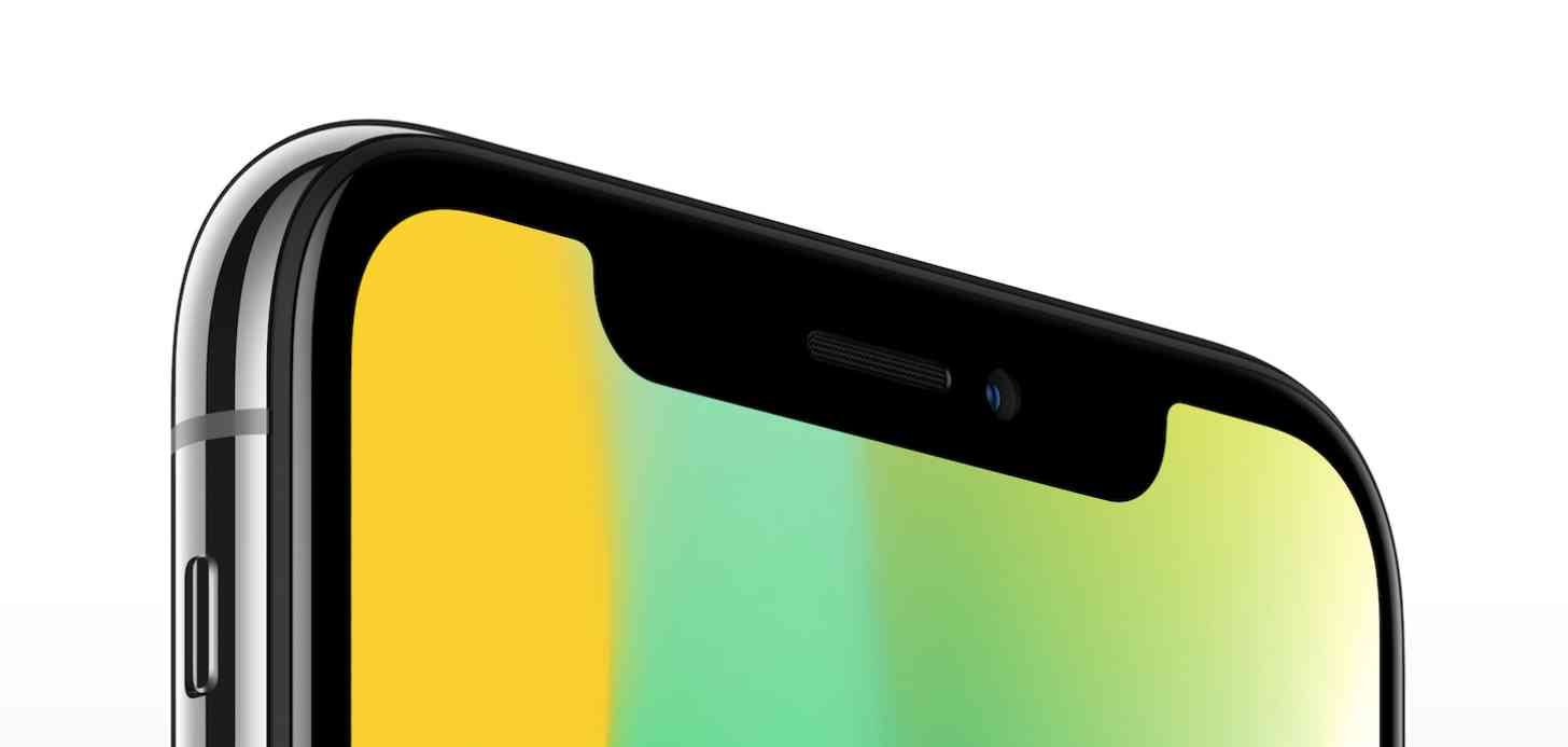
The hardware design, known as the "notch design," is probably the biggest question mark at this point. I didn't like the design at first, mostly because back before Apple announced the phone I was afraid that the company would simply block off that top section of the phone with a black bar or something, not really taking advantage of the full display. But, now that it's official I'm starting to come around to it.
At least I was until I started seeing actual photos and videos being played on it. Web pages will be fine (even if there are some questionable choice made for landscape mode), but watching a movie, looking at photos, or maybe even playing a game seems like it will be really, really intrusive. I don't have any doubt that, eventually, after a lot of use, it's something a user would get used to, but I'm just wondering why we need to get used to it when other design choices probably could've been made.
Then again, I'm already seeing "Apple copied Samsung!" all over the place already, when they clearly didn't, so maybe the notch design is for the best.
I'm going to have to come to a decision quickly, because I don't think stock for the iPhone X is going to be all that plentiful, even with a month "delay" for its launch. I honestly don't even know if I'm really ready to get rid of Touch ID, either. But, what about you? Are you a fan of the notch design? Do you think you'll be annoyed by the sensor bar interjecting into content? Let me know!