Ahead of the announcement of the iPhone 7 and iPhone 7 Plus, expectations were pretty low as far as design was concerned. All of the leaks and rumors suggested that Apple would be effectively “taking a break” from any real changes when it came to the overall design of this year’s iPhone, and that it would be a similar handset to the iPhone 6s – and the iPhone 6.
Apple has itself to blame for this, simply because we’re creatures of habit and the company set us up in a nice little routine. We simply didn’t just want Apple to have a bold new design for the iPhone 7, something different from last year’s handset, but we expected it, because that’s what the company has done for years now. Introduce a design, release it again with more impressive software/hardware features in the next year, and then launch a handset with a redesigned body after that (with new software and hardware tricks for good measure).
Of course, it should go without saying that it’s Apple’s phone, and release cycle, so they can do whatever they want. They don’t have to stick to any patterns.
But the end result was actually quite a bit different when it comes to specific parts. Yes, the iPhone 7 shares overall design similarities to the two previous iPhone generations, but it also makes some stark differences that certainly make it stand out.
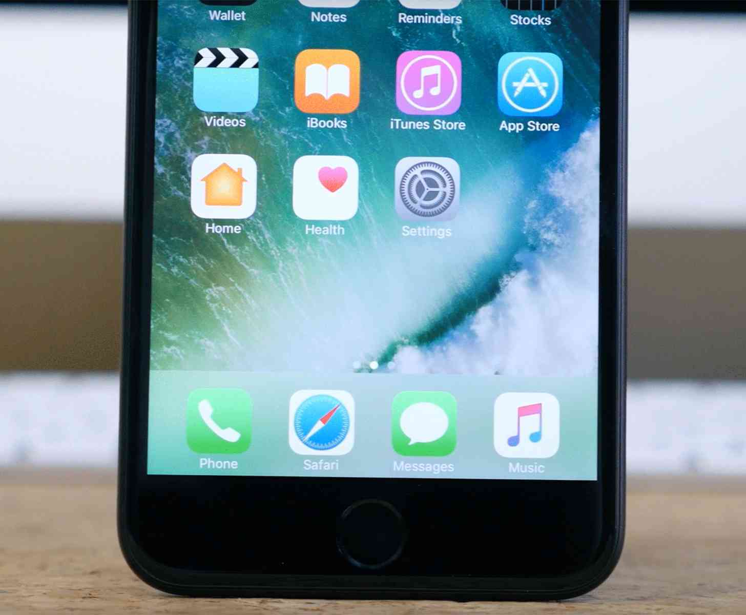
One of those was the new Home button that isn’t a button at all. The company brought over its haptic feedback from the Force Touch trackpad present in the 12-inch MacBook, and the newer MacBook Pro models, and implemented it in the one feature that hasn’t changed the longest.
The Home button on the front of the iPhone helps give the device its familiar aesthetic. You know it’s an iPhone by looking at it. But everything changes eventually, and here we are with a sensor that looks like a button, just to keep up with the aesthetic, but isn’t a button at all.
The new iPhones have been out now for a month, which means those who’ve picked up the latest Apple flagships have had time to find out if they like the new Home button-not-a-button or not. I’m genuinely curious how iPhone owners are adapting to the new design choice.
Are you a fan of the new Home sensor? Or would you prefer to see Apple make a return to the actual button? Do you think this design decision is a sign of things to come in future iPhones? Let me know!