Recently I made the switch from the iPhone 5s over to the Sony Xperia Z3 Compact. Although I initially had no intention of leaving my 5s so soon, the charging port failed and I had decided to take the opportunity to jump to something newer. For the most part, I was very pleased with the Compact. Little did I know that a single drop would, for the first time in several years, actually break the screen of my device and rendered the whole thing rather useless. I’m going to write it off as a one-time thing, though, because the spot where it broke was the one small area where there was no screen protector (just above the earpiece) and it nicked the corner of a chair. Still a bummer, though.
Regardless, that brings me here. I’ve gone back to iOS via the iPhone 6 for the time being, and just as I had noticed things that I missed about iOS within Android when I switched, I’ve noticed certain things that I miss about Android in iOS. One of the most noticeable things that I miss is Android’s notification center – or, in the very least, certain aspects about it.
iOS has made improvements to its notification center over the past couple of years, but there’s still a pretty steep learning curve when it comes to the notification center. In fact, I realized that I use my notification center a lot less in iOS than I do in Android, and that mostly boils down to how Android presents notifications - and offers immediate solutions - over iOS.
One of the main ways to see what you’ve missed in iOS is for a red bubble (or "badges") to appear over the application with missed notifications, like so:

Android phones, on the other hand, have always had a small notification icon sitting in the status bar itself. Although it can sometimes get cluttered up there (message, e-mail, Facebook, game notifications, etc.) it was a good reminder (or motivation) to check or clean out the notifications. iOS does not have these. For iOS, I will often forget that I even have stuff sitting there in the “Notification” section of the notification center, and when I eventually do remember to check, there’s a very long laundry list of apps that need to be checked or cleared.
And speaking of cleared, I would love to have a “Clear All” option.
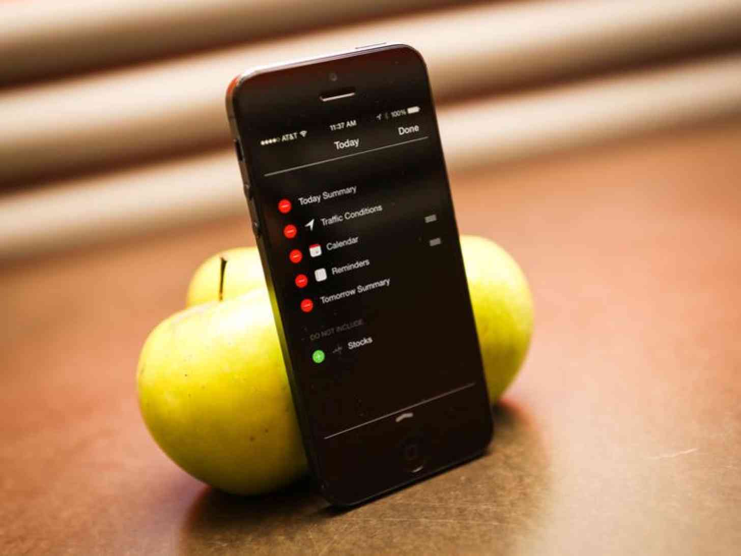
I also think that the "Today" portion of the notification could stand to be more informational. As it stands now, the information I see here is too vague. I get that it's information for "Today", but when it comes to certain widgets I feel like more could be said. Weather only gives me the temperature for the day and current weather conditions, which is great and all but I could also look out the window or something. A 5-day forecast would be great. It also tells me that I have one all-day event scheduled for tomorrow. That's also great, but it would be even greater if it could remind me exactly what that event is. The "Today" screen could be a lot more useful than it currently is.
Finally, Apple could also make what you can do with the notification center clearer – particularly when it comes to quick replies for messages. You can do a quick reply to a missed text message in the notification center (if you remember to check your notification center for it) but only if you swipe the message to the right. And only if you know you can swipe the message from the right to do so – it does not prompt you beforehand. iOS is a system that people look to for simplicity and stability; the features it includes for convenience should be as straightforward as possible.
Yes, most of these suggestions are trivial. I don’t hate iOS’s notification system, but it could certainly be improved upon. Since iOS 9 is rumored to be stabilizing the OS over anything else, I’m not expecting anything extravagant. With that in mind, I think the notification center could stand for a few changes here and there, and I don’t think it’s too far-fetched to think that it could happen – even if it means borrowing a few ideas from Android, or wherever.