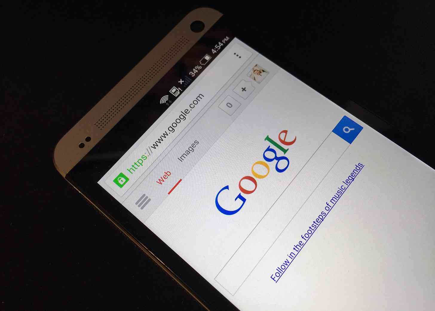
In the months following the launch of Android 5.0, Google updated many of its apps to fit in with Lollipop’s Material Design. Now it looks like Google might be making its mobile web design more Material, too.
Android Police has acquired a screenshot of a new Google mobile web search results page that appears to be in testing. As you can tell in the comparison images below (old is left, new is right), the new mobile results page places the Google logo front and center and gives both the search box and search type sections a more Material look. The results themselves look largely unchanged.

Google hasn’t made any announcements about these mobile search results changes, and the new look doesn’t appear to be showing up for everyone, so it’s unclear when or if this redesign will roll out for everyone. I think that the new-look mobile search results page looks better than the current one, though, so hopefully Google does indeed give it to us all. Considering how heavily El Goog’s been pushing Material Design, I certainly wouldn’t be surprised to see it happen.
What do you think of this new mobile Google search results page?